V0 website UX review
A scan-backed analysis of how V0 performs across usability, visual clarity, and UX best practices. Use it as a reference for what to borrow, what to question, and what to test on your own site.
Sensei score: 73 out of 100
Aesthetic
80Practices
77How V0 looks
The verdict
A capable interface held back by unclear entry points
V0 scores 73/100 overall—a strong result anchored by confident aesthetic design (80/100) but constrained by functional ambiguity (63/100). The page presents a product built for speed and flexibility, yet the way users are invited to engage with it remains muddled. The gap between the aesthetic layer and the functional layer suggests a design that looks polished but doesn't clearly communicate what to do next or how the system responds.
Observed UX signals
- Majorfunctional
Task Clarity
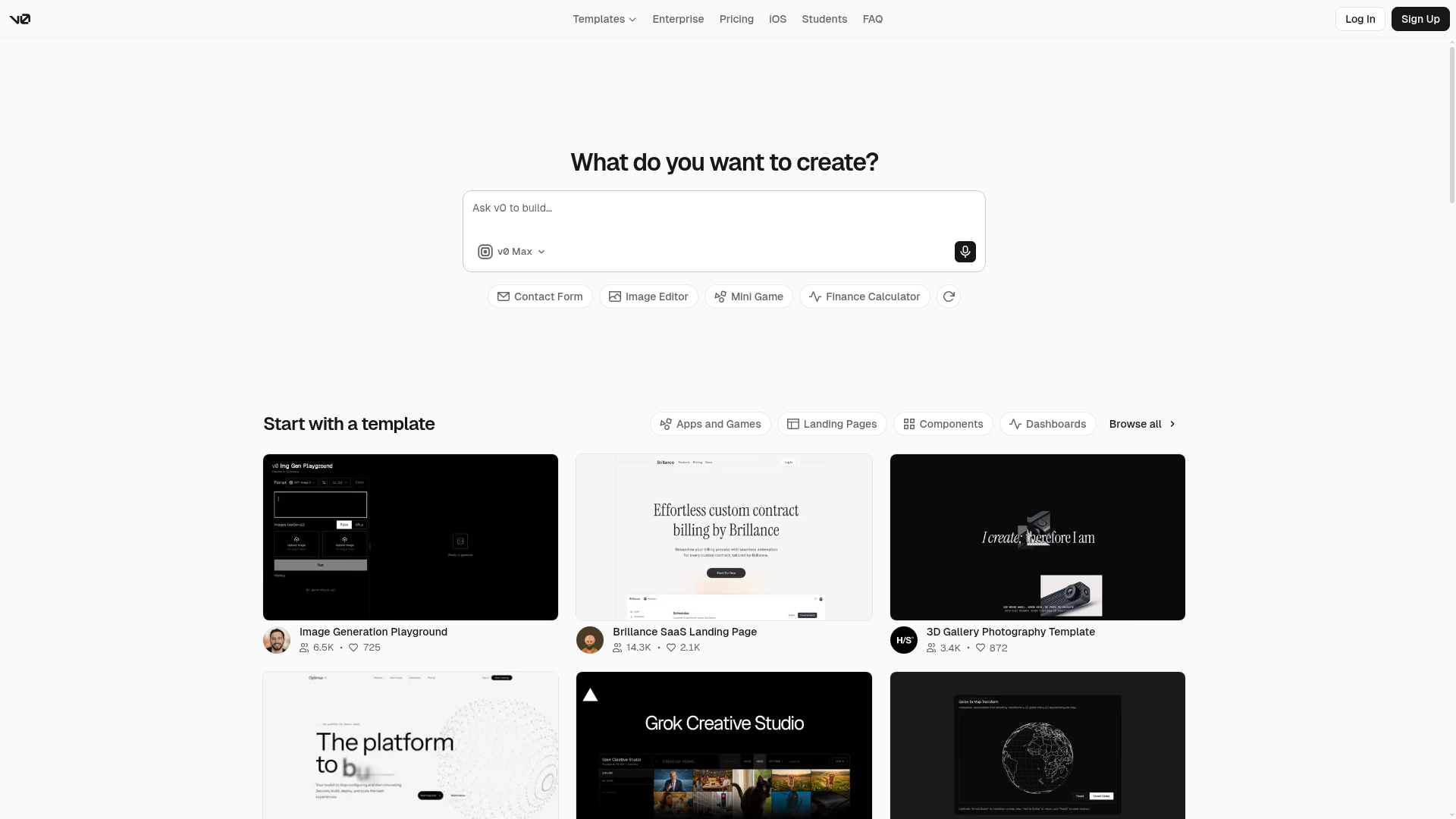
Primary action flow is ambiguous. The hero section presents 'What do you want to create?' with a text input ('Ask v0 to build...') and a model selector ('v0 Max'), but the relationship between the input field, quick-action buttons (Contact Form, Image Editor, Mini Game, Finance Calculator), and template browsing is unclear. Users must infer whether to type a prompt, click a quick action, or browse templates.
- Majorfunctional
State Design
No visible empty, loading, or error states are documented. The input field and quick-action buttons lack feedback mechanisms. Users cannot see what happens when they submit a prompt, whether the system is processing, or how errors are communicated. This creates uncertainty about whether an action succeeded.
- Majorfunctional
Cognitive Load
Template section ('Start with a template') presents 6+ template cards simultaneously with category filters (Apps and Games, Landing Pages, Components, Dashboards, Browse all) and no clear guidance on which to choose. Combined with the prompt input above, users face competing entry points without hierarchy or progressive disclosure.
More UX reviews
Browse all →How does your site score?
Get the same layer-by-layer UX review for your homepage, pricing page, or product page.