Openai website UX review
A scan-backed analysis of how Openai performs across usability, visual clarity, and UX best practices. Use it as a reference for what to borrow, what to question, and what to test on your own site.
Sensei score: 71 out of 100
Aesthetic
81Practices
70How Openai looks
The verdict
A strong visual layer masks functional friction at the entry point
OpenAI's homepage scores 71/100 overall, with a notable split: aesthetic design earns 81/100, while functional clarity drops to 61/100. This gap reveals a common pattern in high-stakes product pages—visual polish can obscure navigation and task ambiguity. The page presents itself confidently, but users face immediate friction when trying to understand what action to take first. The aesthetic layer works hard to compensate for unclear information architecture, but design alone cannot resolve the underlying problem of competing priorities.
Observed UX signals
- Majorfunctional
Task Clarity
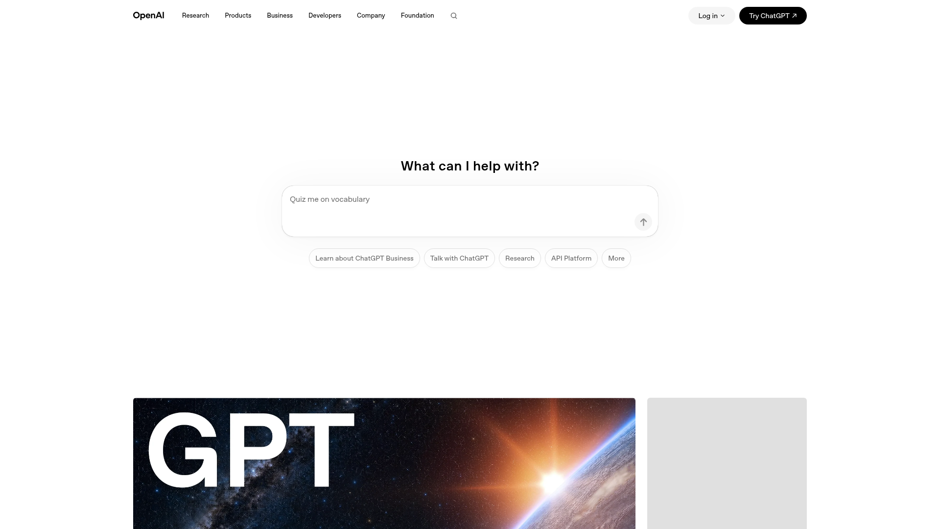
Primary action ambiguity: The page presents multiple competing CTAs without clear hierarchy. 'Try ChatGPT' appears twice in navigation, 'Learn about ChatGPT Business', 'Talk with ChatGPT', and 'Message ChatGPT' all compete for attention. Users landing on the homepage cannot immediately discern whether the primary job is to try the product, learn about business solutions, or explore research.
- Majorfunctional
Cognitive Load
Content density without progressive disclosure: The page immediately displays 5 major content sections (Recent news, Stories, Latest research, OpenAI for business, Get started with ChatGPT) with multiple cards per section. Users must process ~15+ distinct content items and navigate between 6+ different link destinations before understanding what the page offers. No clear entry point for different user personas (researchers vs. business users vs. developers).
- Majorfunctional
Accessibility
Missing alt text on 4 images undermines screen reader usability. Images include product cards ('GPT-5.6 poster', 'Jalapeño art card', 'price-performance frontier art-card') and content cards without descriptive alt text. Users relying on screen readers cannot understand the visual content or context of these featured items.
More UX reviews
Browse all →How does your site score?
Get the same layer-by-layer UX review for your homepage, pricing page, or product page.