Sensei UX Review
Character Website UX Review
A scan-backed analysis of how Character performs across usability, visual clarity, and UX best practices. Use it as a reference for what to borrow, what to question, and what to test on your own site.
Sensei Score
63/100
orange tier, scanned Jun 25, 2026Aesthetic
60Practices
66How Character looks
What the score says about Character
Overall Performance: A Mixed Foundation with Critical Gaps
Character.ai's product page scores 63/100 overall, with functional (64) and practices (66) layers slightly outpacing aesthetics (60). The spread suggests a page that has basic structural competence but struggles with clarity and user confidence. The most concerning gap is not between layers but within the functional layer itself: while some foundational elements exist, the core task of onboarding a new user to the platform is severely underserved. For a product built on an unfamiliar concept—AI-powered character conversations—this represents a strategic vulnerability. Users arriving with no prior context face a blank canvas with minimal scaffolding to understand what they're signing up for.
Where Clarity Breaks Down: Task and Concept Definition
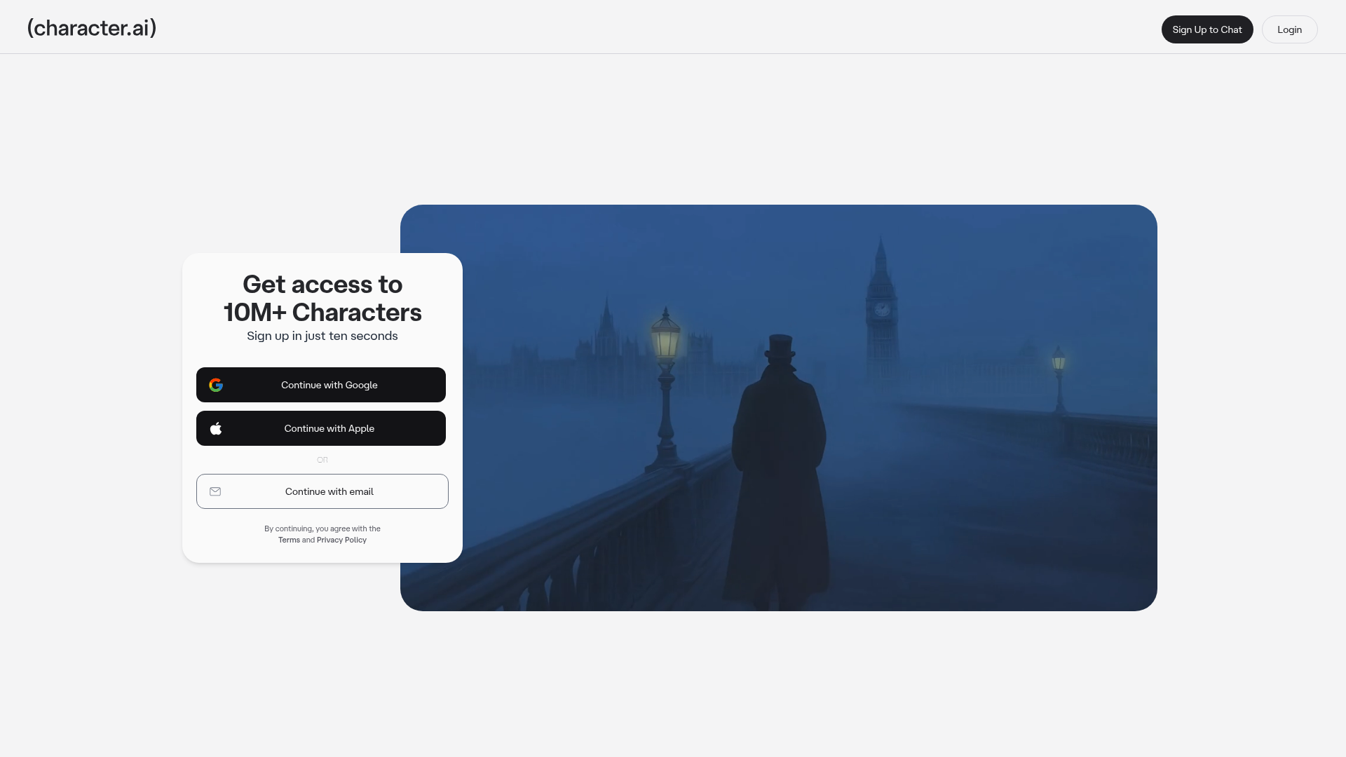
The page's most critical failure is the absence of product education before asking for commitment. The hero heading 'Get access to 10M+ Characters' leads with a number that is both truncated (rendering as '10M+' in a malformed state) and meaningless to first-time visitors. What are characters? Why should a user care about quantity? The primary CTA—'Sign Up to Chats'—compounds this by using vague language that does not articulate the outcome. 'Chats' could mean anything; the button does not communicate what the user will do next, what value awaits, or why they should proceed.
This gap is amplified by the complete absence of visual context. The hero section contains no preview, character showcase, use-case examples, or imagery that would help users mentally model the product. First-time visitors must infer the entire value proposition from two ambiguous text elements. For a platform whose core appeal likely depends on demonstrating interaction with AI characters, this is a missed opportunity to reduce cognitive load and build confidence before the signup barrier.
Functional Gaps: Support, Feedback, and Mobile Robustness
Beyond onboarding, the page exhibits three structural functional weaknesses. First, there is no in-context help or support access. Users who land on the page confused about what character.ai is cannot ask questions or access tooltips without leaving the page. Footer links to About, Safety Center, and Blog exist but are not framed as help resources within the signup context, leaving confused users without a clear path to clarification.
Second, the signup action lacks visible feedback states. The page code indicates hover states are defined (data-[hover=true]:opacity-hover), but there is no indication of loading, success, or error states. Users cannot tell if their signup attempt is processing, has succeeded, or has failed—a critical gap in user confidence during a conversion moment.
Third, mobile responsiveness is underdefined. The signup button is fixed at 356px width with no responsive breakpoints or mobile-specific adjustments documented. On smaller devices, this button may exceed screen width, creating a broken or cramped experience. For a platform likely accessed across devices, this represents a functional risk that undermines the practices score (66), which typically reflects consistency and reliability.
Aesthetic Confidence Carries the Page
The aesthetic layer (60) is the page's relative weakness, yet it is not a catastrophic failure. The score suggests the page has visual structure and design consistency but lacks the richness or clarity that would elevate user confidence. The blank-canvas problem—the absence of visual examples or character previews—directly contributes to this gap. A stronger aesthetic approach would include imagery, character cards, or interaction examples that make the product tangible and reduce the cognitive burden on the visitor.
The practices layer (66) indicates that the page follows some foundational UX conventions and patterns, but the functional layer's gaps suggest these practices are not applied consistently to the signup flow. Hover states exist, but feedback states do not. Footer resources exist, but they are not positioned as help. This inconsistency suggests the page was built with partial attention to user needs rather than a cohesive, user-centered design system.
Actionable Priorities for the Team
The path forward is clear and sequenced. First, add a concise, visual explanation of what character.ai is and what users will do after signup. This should appear above or alongside the CTA and include at least one example or preview of a character interaction. This directly addresses the blank-canvas anxiety and makes the CTA outcome tangible.
Second, clarify the CTA text. 'Sign Up to Chats' should be replaced with language that names the outcome: 'Create Your First Chat,' 'Start Chatting Now,' or similar. Test the new text with users unfamiliar with the product to ensure it reduces ambiguity.
Third, add contextual help. Include a tooltip, FAQ toggle, or 'What is Character?' link near the hero that allows users to learn more without leaving the page. This is a low-cost addition that addresses the support accessibility gap.
Fourth, implement full feedback states for the signup button: loading spinners, success messages, and error handling. This is a standard UX pattern that should be non-negotiable for any conversion flow.
Finally, audit and fix mobile responsiveness. Define responsive breakpoints for the button and layout, test on actual devices, and ensure the signup flow is equally functional on small screens.
These changes directly target the functional layer's gaps and will likely lift both the aesthetic and practices scores as a side effect, creating a more cohesive, user-centered experience.
Observed UX signals
functional / critical
Task Clarity
Primary CTA text is ambiguous and outcome-unclear. 'Sign Up to Chats' does not clearly communicate what happens next or what value the user gains. The hero heading 'Get access to 10M+ Characters' is also truncated ('10M+' appears malformed), creating confusion about the core offering.
functional / major
Onboarding & Education
Page provides zero guidance on what character.ai is or how to use it. The hero only states 'Get access to 10M+ Characters' without explaining what characters are, why they matter, or what the user will do after signing up. No contextual education or value demonstration before asking for commitment.
functional / major
Help & Support Accessibility
No in-context help, tooltips, or support access visible on the signup page. Users cannot ask questions about what character.ai is, how it works, or troubleshoot issues without leaving the page. Footer links (About, Safety Center, Blog) are present but not discoverable as help resources from the signup context.
functional / major
Feedback & Reversibility
No visible feedback states for signup actions. The page data shows button elements with hover states (data-[hover=true]:opacity-hover) but no indication of loading, success, or error states. Users cannot tell if their signup attempt succeeded, failed, or is processing.
functional / major
Mobile & Responsive
Signup buttons are fixed width (w-[356px]) which may exceed mobile screen width on smaller devices. No indication of responsive behavior for touch targets or layout adaptation. The page data shows button sizing but no responsive breakpoints or mobile-specific adjustments.
aesthetic / critical
Blank Canvas Prevention
The hero section leads with 'Get access to 10M+ Characters' but provides no visual context, imagery, or examples of what characters are or what users can do. The page lacks any preview, character showcase, or use-case guidance that would reduce blank-canvas anxiety for first-time visitors. Users must infer the product's value proposition from text alone.
More UX reviews
Browse all →Benchmark your own page
Get the same layer-by-layer UX review for your homepage, pricing page, or product page.