Frame Work website UX review
A scan-backed analysis of how Frame Work performs across usability, visual clarity, and UX best practices. Use it as a reference for what to borrow, what to question, and what to test on your own site.
Sensei score: 74 out of 100
Aesthetic
81Practices
75How Frame Work looks
The verdict
A capable product page held back by decision friction
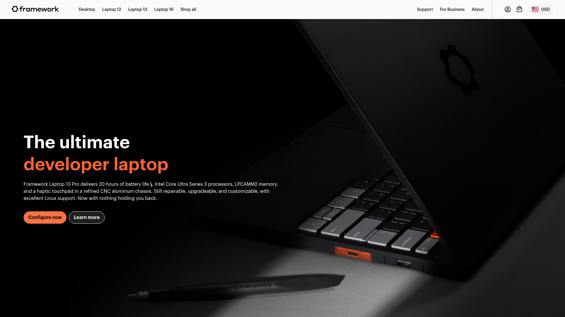
Frame.work's product page scores 74/100 overall—a solid result that masks a structural tension between aesthetic execution and functional clarity. The aesthetic layer (81/100) demonstrates confident visual design and brand presence, while the functional layer (66/100) reveals a more troubling pattern: the page asks users to make too many choices without sufficient guidance, starting with the hero section and compounding across five product lines. This gap between how the page looks and how it guides users suggests the design has prioritized visual polish over decision architecture.
Observed UX signals
- Majorfunctional
Task Clarity
Hero section presents two competing primary CTAs ('Configure now' and 'Learn more') with equal visual weight, creating choice paralysis. The page's primary job—driving configuration/purchase—is unclear from CTA hierarchy alone.
- Majorfunctional
Cognitive Load
Page displays 5 distinct product lines (Desktop, Laptop 12, Laptop 13 Pro, Laptop 16, Laptop 13) each with identical CTA patterns, creating repetitive decision fatigue. Users must evaluate and choose between similar products without clear differentiation or guidance.
- Majorfunctional
Help & Support
Support and documentation links ('Downloads and guides') are buried within each product section and only accessible after scrolling past marketing copy. Users seeking help must know which product they own first, creating a chicken-and-egg problem for new or confused users.
More UX reviews
Browse all →How does your site score?
Get the same layer-by-layer UX review for your homepage, pricing page, or product page.