Uniswap website UX review
A scan-backed analysis of how Uniswap performs across usability, visual clarity, and UX best practices. Use it as a reference for what to borrow, what to question, and what to test on your own site.
Sensei score: 72 out of 100
Aesthetic
79Practices
71How Uniswap looks
The verdict
A financial interface caught between clarity and polish
Uniswap's app scores 72/100 overall—a solid performance that masks a meaningful gap between how the page looks and how it functions. The aesthetic layer (79/100) is the strongest dimension, suggesting the visual design carries real confidence. But the functional layer (67/100) reveals friction points that matter acutely in a financial product where users are making real transactions. The 8-point gap between aesthetic and functional scores is diagnostic: the interface appears more usable than it actually is, which creates a specific kind of risk—users may attempt actions they think are clear, only to encounter ambiguity or barriers mid-task.
Observed UX signals
- Majorfunctional
Task Clarity
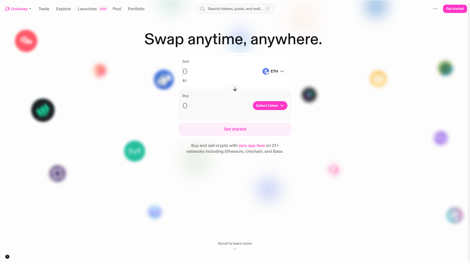
The swap interface shows input fields labeled 'Sell' and 'Buy' with placeholder values ('0', '$0') but no clear indication of what happens when users interact with these fields. The 'Select token' button is visually distinct, but the overall flow from entering an amount to executing a swap is ambiguous—users must infer that they need to fill both fields before a swap action becomes available.
- Criticalfunctional
Accessibility
10 images lack alt text, including the Uniswap logo and multiple token icons (ETH, USDC, USDT, WBTC, SOL). One input field is missing a label. These omissions create barriers for screen reader users and violate WCAG 2.1 Level A standards, undermining trust and legal compliance for a financial product.
- Majorfunctional
State Design
No visible empty, loading, error, or success states are documented. The swap interface shows static placeholder values ('0', '$0') but provides no guidance on what happens when a user initiates a swap, encounters insufficient liquidity, or completes a transaction. Users cannot anticipate system behavior or recover from errors.
More UX reviews
Browse all →How does your site score?
Get the same layer-by-layer UX review for your homepage, pricing page, or product page.