Harvey website UX review
A scan-backed analysis of how Harvey performs across usability, visual clarity, and UX best practices. Use it as a reference for what to borrow, what to question, and what to test on your own site.
Sensei score: 66 out of 100
Aesthetic
76Practices
63How Harvey looks
The verdict
A mixed performance driven by visual polish masking functional gaps
Harvey's product page scores 66/100 overall, with a notable split: aesthetic execution (76/100) substantially outpaces functional clarity (58/100) and adherence to UX practices (63/100). This gap suggests a page that looks professionally designed but fails to communicate its core purpose or guide users toward meaningful action. For a B2B legal AI platform, this mismatch is consequential—visitors cannot easily understand what Harvey does, who should use it, or how to take the next step. The page relies on visual confidence to compensate for missing foundational clarity.
Observed UX signals
- Criticalfunctional
Accessibility
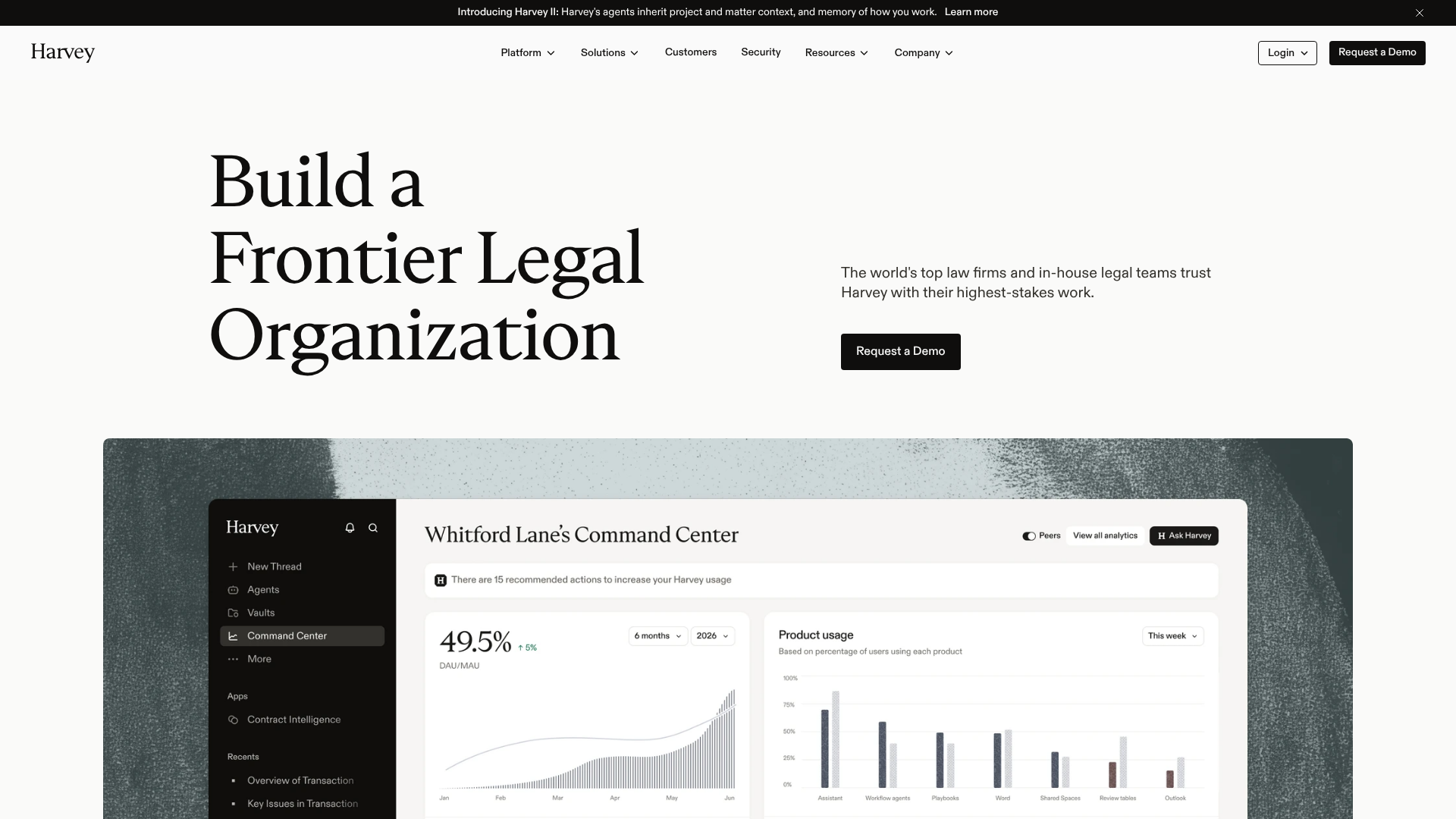
48 images lack alt text, including critical product screenshots and feature illustrations. The hero image and dashboard mockup (showing 'Whitford Lane's Command Center') have empty or missing alt attributes, blocking screen reader users from understanding core product functionality.
- Majorfunctional
Cognitive Load
Page contains 14 distinct CTA variations ('Request a Demo' appears 4 times, 'Learn More' appears 7 times) scattered across hero, feature cards, and footer without clear prioritization. Users cannot distinguish which action is most important or contextually relevant.
- Majorfunctional
TaskClarity
Hero section headline 'Build a Frontier Legal Organization' is abstract and does not clearly communicate what Harvey does or who should use it. Supporting text 'The world's top law firms and in-house legal teams trust Harvey with their highest-stakes work' assumes prior product knowledge and does not explain the core value proposition (AI-powered legal work automation).
More UX reviews
Browse all →How does your site score?
Get the same layer-by-layer UX review for your homepage, pricing page, or product page.