Farcaster website UX review
A scan-backed analysis of how Farcaster performs across usability, visual clarity, and UX best practices. Use it as a reference for what to borrow, what to question, and what to test on your own site.
Sensei score: 74 out of 100
Aesthetic
79Practices
79How Farcaster looks
The verdict
A portfolio page held back by conversion friction
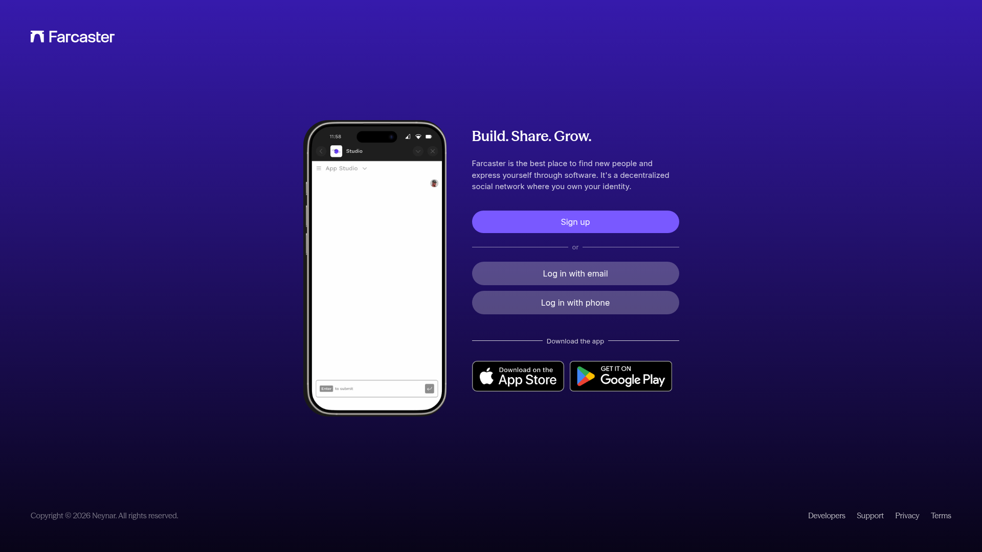
Farcaster's homepage scores 74/100 overall—a solid result that masks a meaningful split between what the page *looks* like and what it actually *does*. The aesthetic and practices layers both score 79, indicating confident visual design and adherence to modern web standards. But the functional layer drops to 65, revealing a conversion experience undermined by trust gaps and decision paralysis. For a decentralized social network competing for new users, this gap is diagnostic: the page attracts attention and presents itself professionally, but fails to move visitors toward signup with conviction.
Observed UX signals
- Majorfunctional
Trust & Credibility
No social proof, user counts, press mentions, or credibility signals visible above the fold. The page offers no evidence that Farcaster is established, trusted, or widely adopted—only a value proposition and signup CTAs.
- Majorfunctional
Conversion Optimization
Primary CTA ('Sign up') uses generic, benefit-neutral copy. Secondary CTAs ('Log in with email', 'Log in with phone') are visually prominent and compete with signup, creating choice paralysis. No risk reversal or friction-reduction messaging present.
- Majorfunctional
Trust & Credibility
Page footer shows 'Copyright © 2026 Neynar' but the page is branded as 'Farcaster.' This ownership/attribution mismatch creates confusion about who operates the service and may undermine trust in a decentralized social network context.
More UX reviews
Browse all →How does your site score?
Get the same layer-by-layer UX review for your homepage, pricing page, or product page.