Bolt New website UX review
A scan-backed analysis of how Bolt New performs across usability, visual clarity, and UX best practices. Use it as a reference for what to borrow, what to question, and what to test on your own site.
Sensei score: 80 out of 100
Aesthetic
82Practices
77How Bolt New looks
The verdict
A capable landing page held back by conversion friction
Bolt New scores 80/100 overall—a solid result that reflects genuine strengths in visual design and user experience polish. The aesthetic layer (82) and functional layer (80) are nearly aligned, suggesting the page looks and behaves well in isolation. However, the practices layer (77) reveals structural problems that undermine conversion: unclear value messaging, weak credibility signals, and accessibility violations that compound into friction. The gap between how polished the page feels and how it actually guides users toward action is the core diagnostic here.
Observed UX signals
- Majorfunctional
Clarity
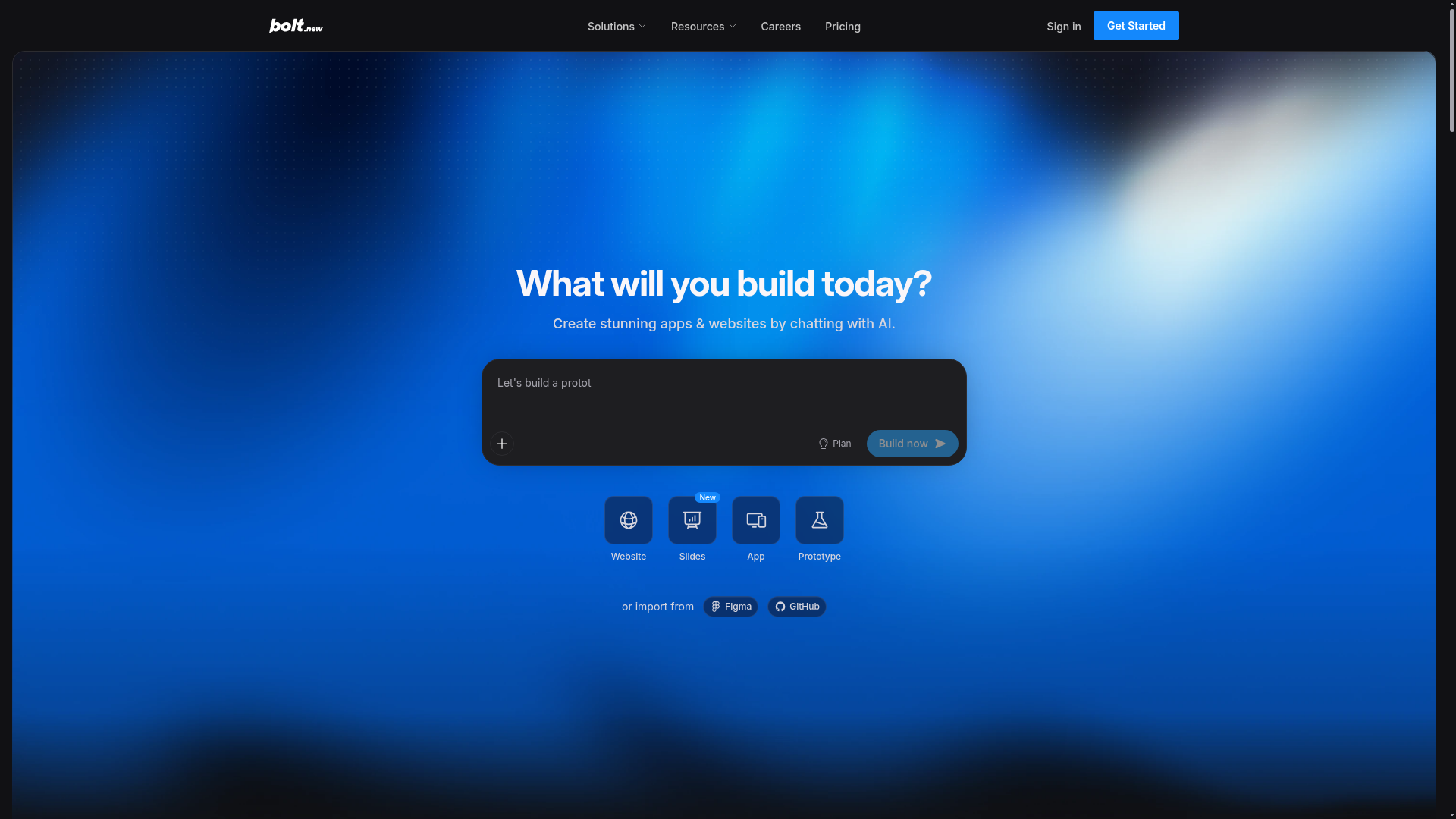
Primary value proposition is buried in subheading. Hero headline 'What will you build today?' is aspirational but does not communicate the core benefit. Subheading 'Create stunning apps & websites by chatting with AI' is the actual value, but appears secondary in visual hierarchy.
- Majorfunctional
Trust & Credibility
Social proof is present ('Trusted by Google, Microsoft, Salesforce...') but lacks quantitative credibility signals. No user count, testimonials with attribution, ratings, or specific case results visible above the fold. Logo list alone is weak without context (e.g., '10M+ projects built' or '4.8★ from 50K reviews').
- Majorfunctional
Conversion Optimization
Primary CTA copy is generic and passive. 'Build now' and 'Let's build' lack benefit-oriented language and urgency. No risk reversal visible (e.g., 'free trial,' 'no credit card required,' 'cancel anytime'). Form field 'Let's build a protot' is truncated and unclear, reducing confidence in the action.
More UX reviews
Browse all →How does your site score?
Get the same layer-by-layer UX review for your homepage, pricing page, or product page.