Clickup website UX review
A scan-backed analysis of how Clickup performs across usability, visual clarity, and UX best practices. Use it as a reference for what to borrow, what to question, and what to test on your own site.
Sensei score: 70 out of 100
Aesthetic
71Practices
66How Clickup looks
The verdict
A 70-point portfolio page with friction in the conversion funnel
ClickUp's homepage scores 70/100 overall—a strong result that reflects solid execution across functional and aesthetic layers (72 and 71 respectively), but reveals a meaningful gap in design practices (66). The page successfully communicates that ClickUp is a comprehensive work-management platform and has assembled credible social proof. However, the conversion experience is undermined by competing calls-to-action and a value proposition that leads with features rather than user outcomes. For a portfolio page whose primary job is to move visitors toward signup or demo, this friction is diagnostic: the page knows *what* to say but struggles with *how* to guide the visitor forward.
Observed UX signals
- Majorfunctional
Clarity
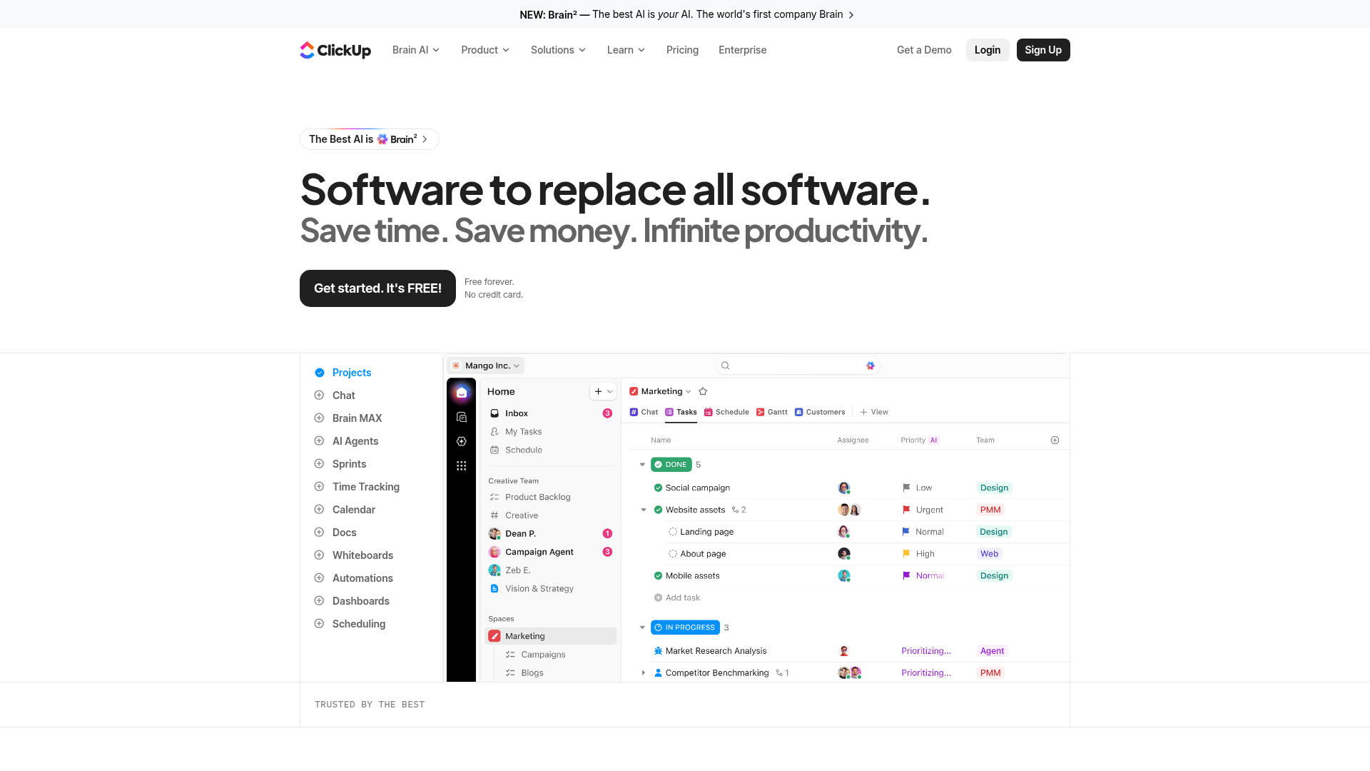
Primary value proposition is feature-focused rather than outcome-focused. Headline 'Software to replace all software' describes what the product is, not what users gain. Subheading 'Save time. Save money. Infinite productivity' lists benefits but lacks a unifying transformation narrative.
- Majorfunctional
focusHierarchy
Multiple competing CTAs above the fold create choice paralysis. Page data shows at least 3 primary-style CTAs: 'Get started. It's FREE!' (appears 4 times in hero), 'Get a Demo', and 'Sign Up' in navigation. No clear visual or semantic hierarchy distinguishes which action is primary.
- Majorfunctional
conversionOptimization
Risk reversal messaging is present ('Free forever. No credit card.') but inconsistently positioned. The CTA copy 'Get started. It's FREE!' is generic and does not communicate the specific benefit or next step. No urgency or scarcity signal is evident.
More UX reviews
Browse all →How does your site score?
Get the same layer-by-layer UX review for your homepage, pricing page, or product page.