Increase website UX review
A scan-backed analysis of how Increase performs across usability, visual clarity, and UX best practices. Use it as a reference for what to borrow, what to question, and what to test on your own site.
Sensei score: 80 out of 100
Aesthetic
80Practices
79How Increase looks
The verdict
A solid performer undermined by competing priorities
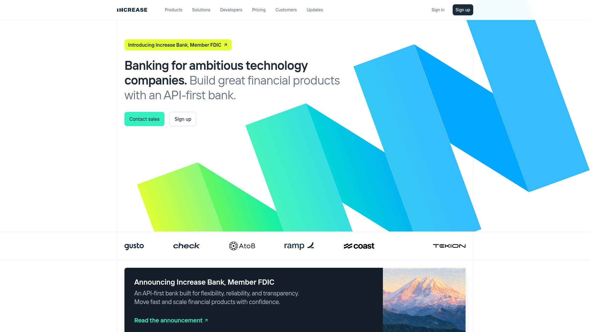
Increase lands at 80/100 across all three Sensei dimensions—functional, aesthetic, and practices—a rare consistency that suggests the page executes a coherent vision without major breakdowns in any single area. Yet the uniformity masks a structural tension: the landing page is trying to serve two user archetypes (enterprise buyers and self-serve adopters) simultaneously, and that split intent leaks into the interface. The most telling evidence appears in the functional layer, where two primary CTAs sit above the fold with nearly equal visual weight, forcing visitors to make an interpretive choice before they've fully absorbed the value proposition. This is not a catastrophic failure—the page still converts and communicates—but it is a friction point that a more decisive design would eliminate.
Observed UX signals
- Majorfunctional
Clarity
Primary CTA placement is ambiguous. Two competing CTAs appear above the fold: 'Contact sales' (link) and 'Sign up' (link). For a landing page targeting both enterprise and self-serve users, this creates decision friction and unclear next steps.
- Majorfunctional
Conversion Optimization
CTA copy lacks benefit orientation and risk reversal. 'Sign up' is generic and does not communicate what happens next or reduce signup friction. No visible mention of free trial, no credit card required, or other risk-reversal signals near the primary CTA.
- Majorfunctional
Focus & Hierarchy
Navigation menu is extensive (Products, Solutions, Developers, Pricing, Customers, Updates) and visible above the fold, competing for attention with the hero value proposition. On a conversion-focused landing page, this creates cognitive load and multiple escape routes.
More UX reviews
Browse all →How does your site score?
Get the same layer-by-layer UX review for your homepage, pricing page, or product page.
Scan your websiteSign in to run a fresh private scan