Docusign website UX review
A scan-backed analysis of how Docusign performs across usability, visual clarity, and UX best practices. Use it as a reference for what to borrow, what to question, and what to test on your own site.
Sensei score: 87 out of 100
Aesthetic
80Practices
75How Docusign looks
The verdict
Functional clarity leads for Docusign
Docusign receives a Sensei score of 87/100. Functional clarity leads at 80/100, while best-practices coverage sits at 75/100. That spread gives this landing review a concrete shape: the stronger layer establishes the page's baseline, and the lower layer identifies where another pass could be most useful.
Observed UX signals
- Majorfunctional
Clarity
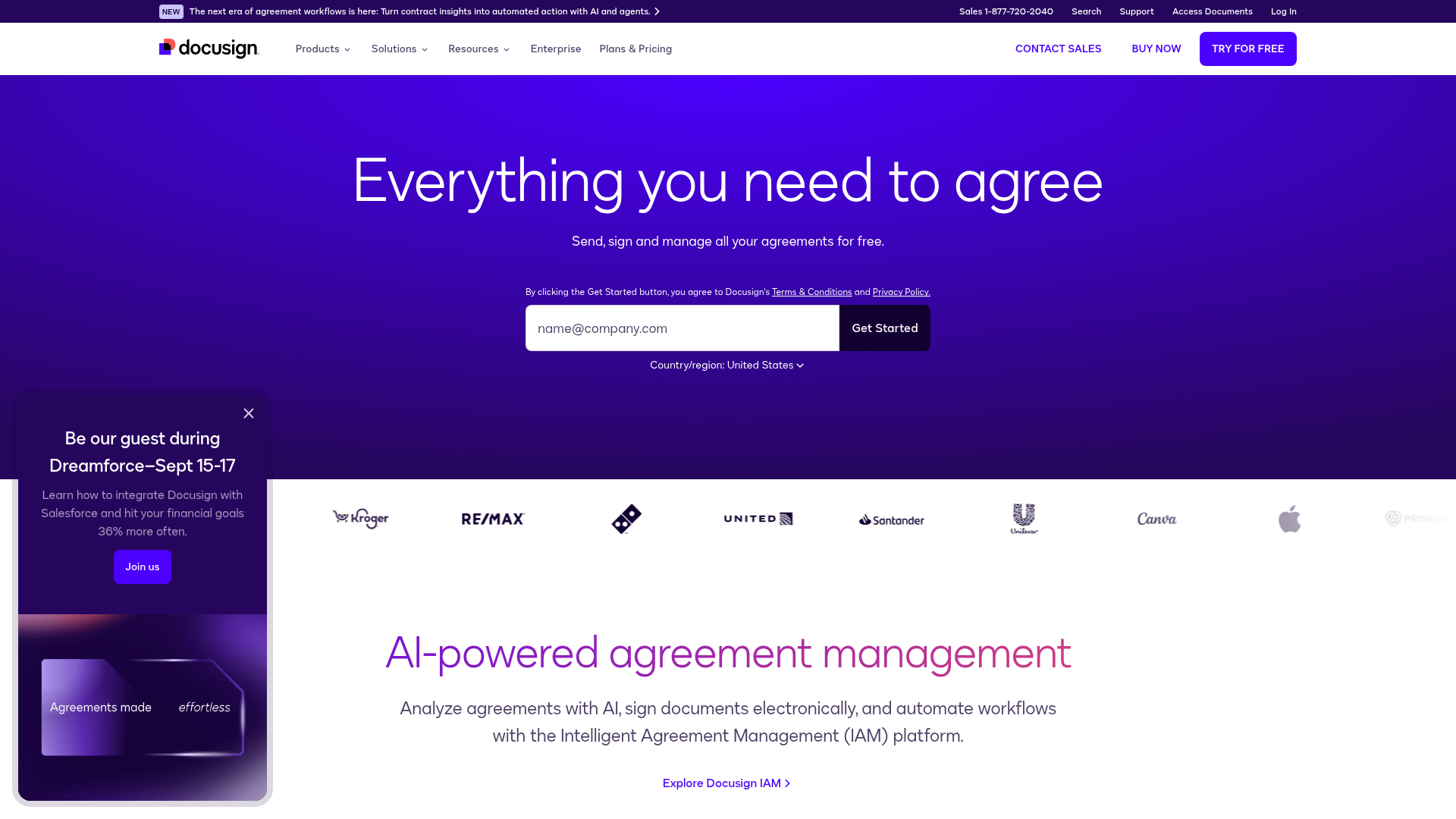
Hero section uses generic benefit copy ('Everything you need to agree') without immediately establishing what Docusign is or does. The supporting line 'Send, sign and manage all your agreements for free' requires users to infer the product category (e-signature/agreement management). For a brand homepage, this is acceptable, but the value proposition could be more direct for first-time visitors unfamiliar with Docusign.
- Majorfunctional
TrustCredibility
Customer logos (United, Santander, Unilever, Canva, Apple, etc.) are displayed without context or attribution. No statement such as 'Trusted by 1M+ companies' or 'Used by Fortune 500 companies' accompanies the logos, reducing their credibility impact. The logos alone do not communicate scale or endorsement strength.
- Minorfunctional
ConversionOptimization
Multiple CTAs with similar visual treatment ('Contact Sales', 'Buy Now', 'Try for Free') appear across the page without clear hierarchy or context. While this is typical for a multi-product homepage, users may not immediately understand which action is primary or which product each CTA routes to.
More UX reviews
Browse all →How does your site score?
Get the same layer-by-layer UX review for your homepage, pricing page, or product page.