Rive website UX review
A scan-backed analysis of how Rive performs across usability, visual clarity, and UX best practices. Use it as a reference for what to borrow, what to question, and what to test on your own site.
Sensei score: 79 out of 100
Aesthetic
81Practices
77How Rive looks
The verdict
A capable landing with friction in the conversion funnel
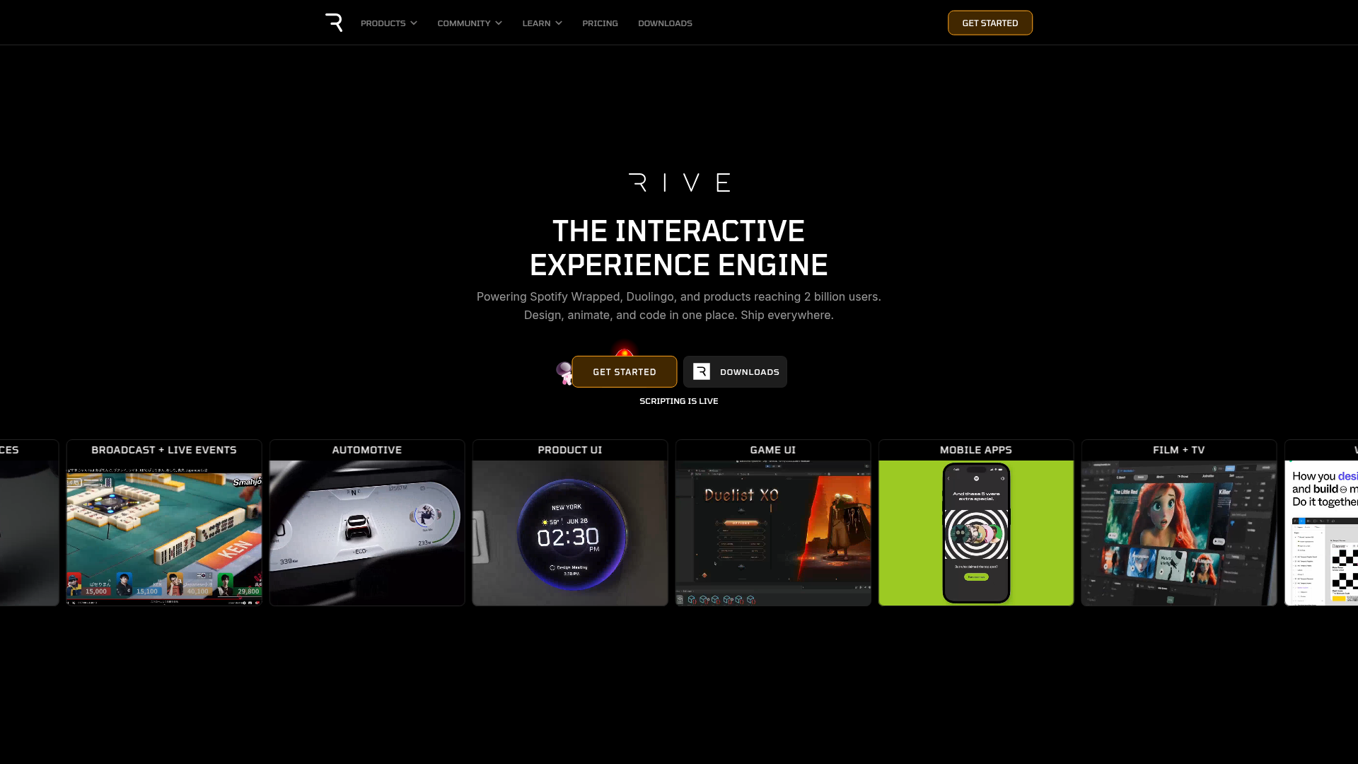
Rive's landing page scores 79/100 overall, with aesthetic design (81) outpacing functional clarity (79) and practice adherence (77). The page successfully communicates what Rive does—a collaborative design-to-code platform used by Spotify, Duolingo, and others—and the visual presentation is polished. However, the score masks a critical gap: the page offers multiple entry points without signaling which one matters most for a first-time visitor. For a product that positions itself as an all-in-one editor, the landing conflates editor signup, software downloads, pricing exploration, and documentation access into a single, undifferentiated navigation layer. This ambiguity directly undermines conversion potential.
Observed UX signals
- Majorfunctional
Clarity
Primary CTA placement and labeling is ambiguous. The hero section contains 'GET STARTED' and 'DOWNLOADS' buttons, but the page data shows only generic 'learn more' links in the content sections. Users cannot immediately distinguish between signing up, downloading the editor, or accessing documentation.
- Majorfunctional
FocusHierarchy
Multiple competing navigation paths and CTAs create cognitive load. The page offers: editor signup, downloads, pricing, docs, runtimes, and 8+ platform/framework links (Web, iOS, React, Unity, etc.) all visible or easily accessible. No clear hierarchy signals which action is primary for a first-time visitor.
- Majorfunctional
ConversionOptimization
Risk reversal and urgency signals are absent. The page emphasizes features ('Design, animate, and code in one place') and social proof (Spotify, Duolingo, 2 billion users) but does not address friction: no mention of free trial, pricing, or 'no credit card required.' Testimonials are strong but scattered; no clear call-to-action after social proof sections.
More UX reviews
Browse all →How does your site score?
Get the same layer-by-layer UX review for your homepage, pricing page, or product page.