Zed website UX review
A scan-backed analysis of how Zed performs across usability, visual clarity, and UX best practices. Use it as a reference for what to borrow, what to question, and what to test on your own site.
Sensei score: 79 out of 100
Aesthetic
80Practices
77How Zed looks
The verdict
A strong but cryptic entry point
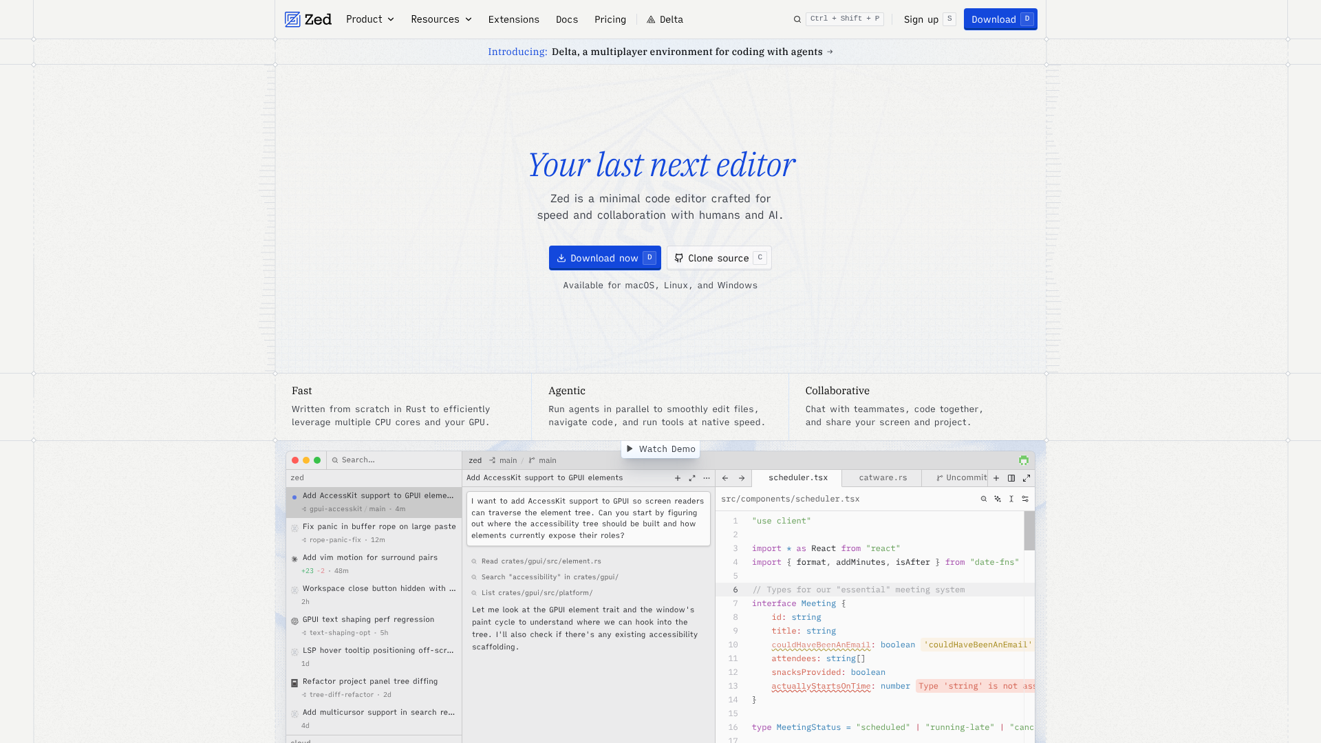
Zed's landing page scores 79/100 overall—a solid result that reflects genuine strengths in visual design and technical execution, yet masks a critical weakness in the first moment of user contact. The functional layer (79), aesthetic layer (80), and practices layer (77) cluster tightly, suggesting the page is well-built but not strategically optimized for clarity. The real issue emerges in how the page introduces itself: the hero headline 'Your last next editor' is poetic enough to appear in a design portfolio, but it fails the primary job of a landing page—communicating what the product is and why it matters. New visitors must interpret the tagline rather than understand it immediately. This gap between visual polish and message clarity is the page's defining tension.
Observed UX signals
- Majorfunctional
Clarity
Hero headline 'Your last next editor' is cryptic and does not immediately communicate the core benefit. While poetic, it requires interpretation rather than instant comprehension of what Zed does or why someone should care.
- Majorfunctional
Trust & Credibility
Social proof section 'Trusted by world-class developers & industry leading teams' is present but lacks visible company logos or user counts above the fold. Only individual avatars (José Valim, Ethan Perez, Dan Abramov, Matt Baker, Mike Bostock) are shown without context or attribution beyond names.
- Majorfunctional
Conversion Optimization
Primary CTA 'Download now' uses generic action language and does not communicate the outcome or risk reversal. No mention of free trial, no-credit-card requirement, or guarantee visible in the hero section.
More UX reviews
Browse all →How does your site score?
Get the same layer-by-layer UX review for your homepage, pricing page, or product page.