Ghost website UX review
A scan-backed analysis of how Ghost performs across usability, visual clarity, and UX best practices. Use it as a reference for what to borrow, what to question, and what to test on your own site.
Sensei score: 79 out of 100
Aesthetic
81Practices
77How Ghost looks
The verdict
A landing page with aesthetic polish but functional gaps
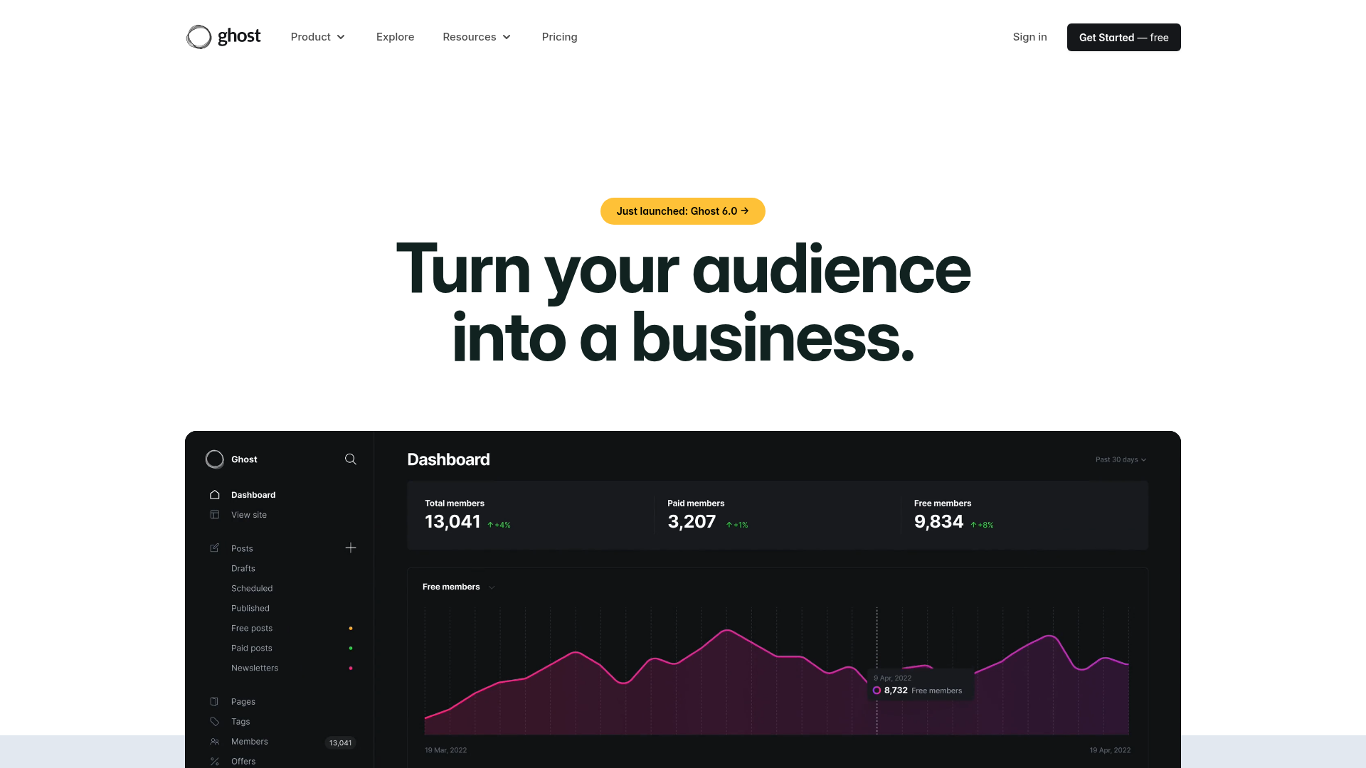
Ghost's landing page scores 79/100 overall—a solid result that masks meaningful friction in how the page converts intent into action. The aesthetic layer (81) outperforms both functional (78) and practices (77) dimensions, suggesting the page looks and feels professional but stumbles where it matters most: earning trust through specificity, guiding users toward a single clear outcome, and meeting accessibility standards. The hero headline 'Turn your audience into a business' is conceptually strong, but the page's execution around that promise reveals where design decisions have prioritized visual appeal over conversion clarity and inclusive access.
Observed UX signals
- Majorfunctional
Trust & Credibility
Social proof is present but lacks specificity and context. Publisher logos (404 Media, Tangle, Platformer, The Lever) are shown with minimal metrics—only some display MRR or member counts, and attribution is inconsistent. The '$100,000,000+ Revenue earned each year' claim lacks verification source or methodology.
- Majorfunctional
Conversion Optimization
Primary CTA copy is generic and benefit-light. 'Get Started — free' and 'Try Ghost completely free for 14 days →' are present but do not clearly communicate the transformation or outcome. The hero headline 'Turn your audience into a business' is strong, but CTAs do not reinforce this promise.
- Majorfunctional
Accessibility
One image lacks alt text (alt: 'null'). Multiple theme gallery images (30 total) are missing descriptive alt text, which undermines accessibility for screen reader users and fails WCAG 2.1 AA standards for meaningful images.
More UX reviews
Browse all →How does your site score?
Get the same layer-by-layer UX review for your homepage, pricing page, or product page.