Zora website UX review
A scan-backed analysis of how Zora performs across usability, visual clarity, and UX best practices. Use it as a reference for what to borrow, what to question, and what to test on your own site.
Sensei score: 51 out of 100
Aesthetic
58Practices
45How Zora looks
The verdict
A platform obscured by its own feed
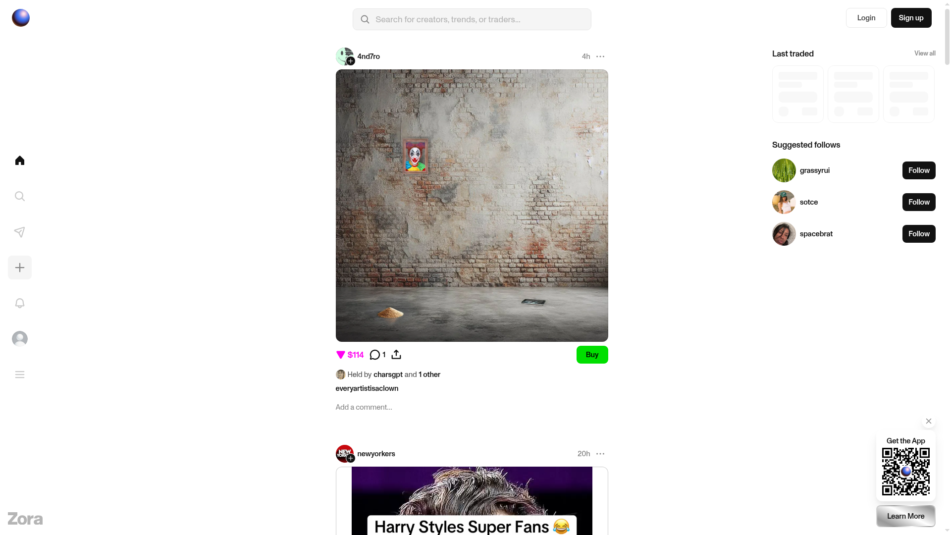
Zora lands at 51/100 on the Sensei benchmark—a weak score driven by severe functional gaps that leave new visitors without basic context. The Functional layer scores 48, the Practices layer 45, while Aesthetic manages 58. This pattern suggests the page has visual polish but lacks the foundational clarity and accessibility required for a public landing experience. The core problem is immediate: visitors see a social feed with trading activity and user-generated posts, but nowhere on the rendered page does Zora explain what it is, who it's for, or why they should engage. The value proposition exists only in the browser tab title ('Zora — Post, discover, and trade what's next') and meta tags—invisible to anyone actually viewing the site. For a platform built around discovery and commerce, this absence is a critical miss.
Observed UX signals
- Criticalfunctional
Clarity
Page lacks any visible headline or value proposition explaining what Zora is or why a visitor should use it. The title 'Zora — Post, discover, and trade what's next' appears only in the browser tab and meta tags, not in the rendered page content. Visitors see a feed of posts and trading activity with no context about the platform's purpose.
- Criticalfunctional
Accessibility
45 out of 30 images are missing alt text, including all user-generated content images in the feed. This creates a complete barrier for screen reader users and violates WCAG 2.1 Level A standards. The only image with alt text is a default avatar marked 'null'.
- Criticalfunctional
focusHierarchy
The page displays a social feed with 20+ 'Buy' buttons and multiple competing CTAs ('Login', 'Sign up', 'View all comments', 'Follow', 'Learn More') with no clear visual or functional hierarchy. A new visitor cannot distinguish between the primary action (sign up/login) and secondary actions (buying posts, following users).
More UX reviews
Browse all →How does your site score?
Get the same layer-by-layer UX review for your homepage, pricing page, or product page.