Zendesk website UX review
A scan-backed analysis of how Zendesk performs across usability, visual clarity, and UX best practices. Use it as a reference for what to borrow, what to question, and what to test on your own site.
Sensei score: 76 out of 100
Aesthetic
77Practices
74How Zendesk looks
The verdict
A solid performer with clarity gaps at the critical moment
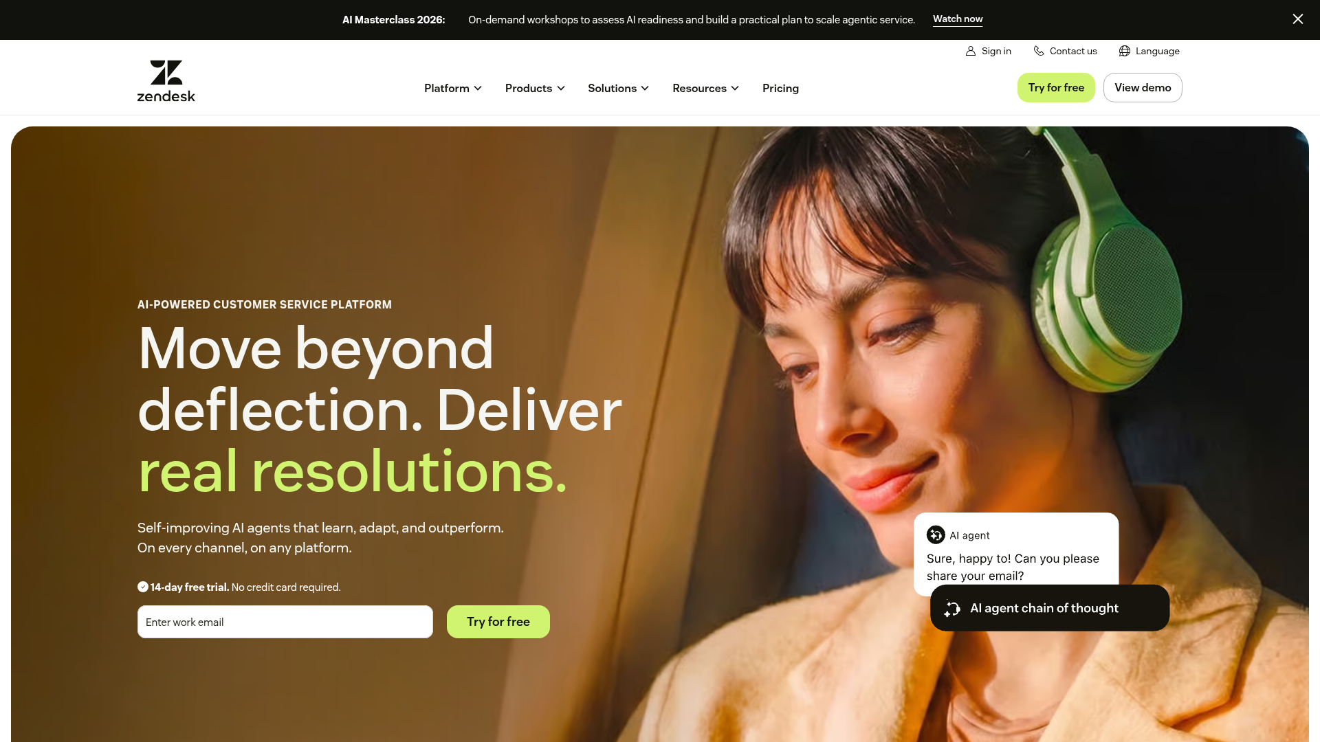
Zendesk's landing page scores 76/100 overall, with aesthetic and functional layers nearly aligned (77 and 76 respectively), suggesting the page is visually coherent and technically sound. The practices layer trails slightly at 74, pointing to gaps in conversion strategy rather than execution. The page succeeds in projecting confidence through design polish and accessibility fundamentals, but stumbles where it matters most: the first five seconds when a visitor decides whether to engage. The core tension is between what the page shows (polished AI positioning) and what it communicates (unclear problem-to-solution mapping).
Observed UX signals
- Majorfunctional
Clarity
Hero headline 'Move beyond deflection. Deliver real resolutions.' is benefit-focused but abstract. The subheading 'Self-improving AI agents that learn, adapt, and outperform. On every channel, on any platform.' uses feature language ('self-improving', 'learn, adapt') rather than concrete outcomes. A visitor must infer what problem this solves within 5 seconds.
- Majorfunctional
Focus & Hierarchy
Multiple competing CTAs above the fold: 'Try for free' button in hero, 'View demo' link in top-right navigation, and 'Watch now' link in the eyebrow banner. No clear visual or positional hierarchy distinguishes the primary conversion path. Hick's Law violation—three equally prominent choices create decision friction.
- Majorfunctional
Conversion Optimization
Email input field placeholder text 'Enter work email' is generic. No inline risk reversal or objection-handling copy visible near the signup form. The '14-day free trial. No credit card required.' appears below the form, but is not prominently integrated into the CTA or form context to reduce signup friction at the moment of decision.
More UX reviews
Browse all →How does your site score?
Get the same layer-by-layer UX review for your homepage, pricing page, or product page.