Xero website UX review
A scan-backed analysis of how Xero performs across usability, visual clarity, and UX best practices. Use it as a reference for what to borrow, what to question, and what to test on your own site.
Sensei score: 73 out of 100
Aesthetic
71Practices
74How Xero looks
The verdict
A solid performer with clarity under pressure
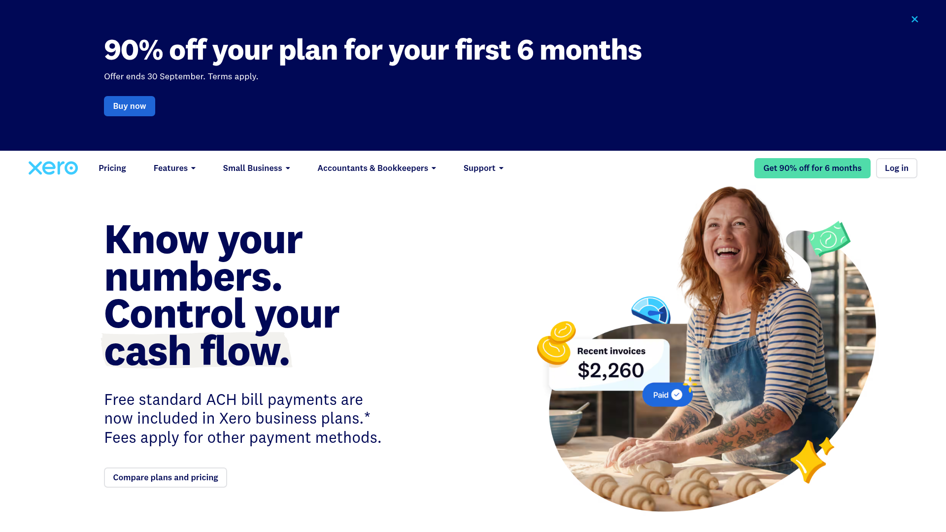
Xero's landing page scores 73/100, placing it in the strong range across all three layers: functional (75), aesthetic (71), and practices (74). The page successfully communicates a core value proposition—'Know your numbers. Control your cash flow.'—and deploys recognizable trust signals (5 million users, G2 awards). However, the score masks a structural tension: the page tries to serve multiple conversion goals simultaneously, and that multiplicity erodes the clarity it initially establishes. For a financial software vendor competing in a crowded market, this gap between stated value and actual user experience is the diagnostic center of the review.
Observed UX signals
- Majorfunctional
Clarity
Primary value proposition is benefit-focused ('Know your numbers. Control your cash flow.'), but the page immediately introduces competing messages: a promotional banner ('90% off for 6 months'), navigation to multiple product categories, and multiple CTAs ('Buy now', 'Compare plans', 'Get started'). For a visitor unfamiliar with Xero, the core job—what Xero does and why they should care—requires scrolling past the offer and navigating the feature list.
- Majorfunctional
Trust & Credibility
Social proof is present ('Used by 5 million customers worldwide', G2 award badge visible in images), but lacks specificity and context. The 5 million figure is stated without timeframe or verification link. Testimonials are absent from the visible page data—no named users, titles, or companies validating the core claims. The page relies on aggregate metrics rather than authentic customer voices.
- Majorfunctional
Conversion Optimization
The primary CTA copy is generic ('Buy now', 'Get started') rather than benefit-oriented. The 90% discount is prominent, but the page does not clearly communicate risk reversal (e.g., 'free trial', 'cancel anytime', 'money-back guarantee'). Pricing tiers are shown with discounted rates ('$2.50/month for first 6 months, then $25/month'), but the full price is not immediately visible, creating friction at the decision point. No inline objection-handling copy addresses common concerns (e.g., 'No credit card required', 'Setup takes 10 minutes').
More UX reviews
Browse all →How does your site score?
Get the same layer-by-layer UX review for your homepage, pricing page, or product page.