Workos website UX review
A scan-backed analysis of how Workos performs across usability, visual clarity, and UX best practices. Use it as a reference for what to borrow, what to question, and what to test on your own site.
Sensei score: 79 out of 100
Aesthetic
80Practices
77How Workos looks
The verdict
A capable but crowded entry point
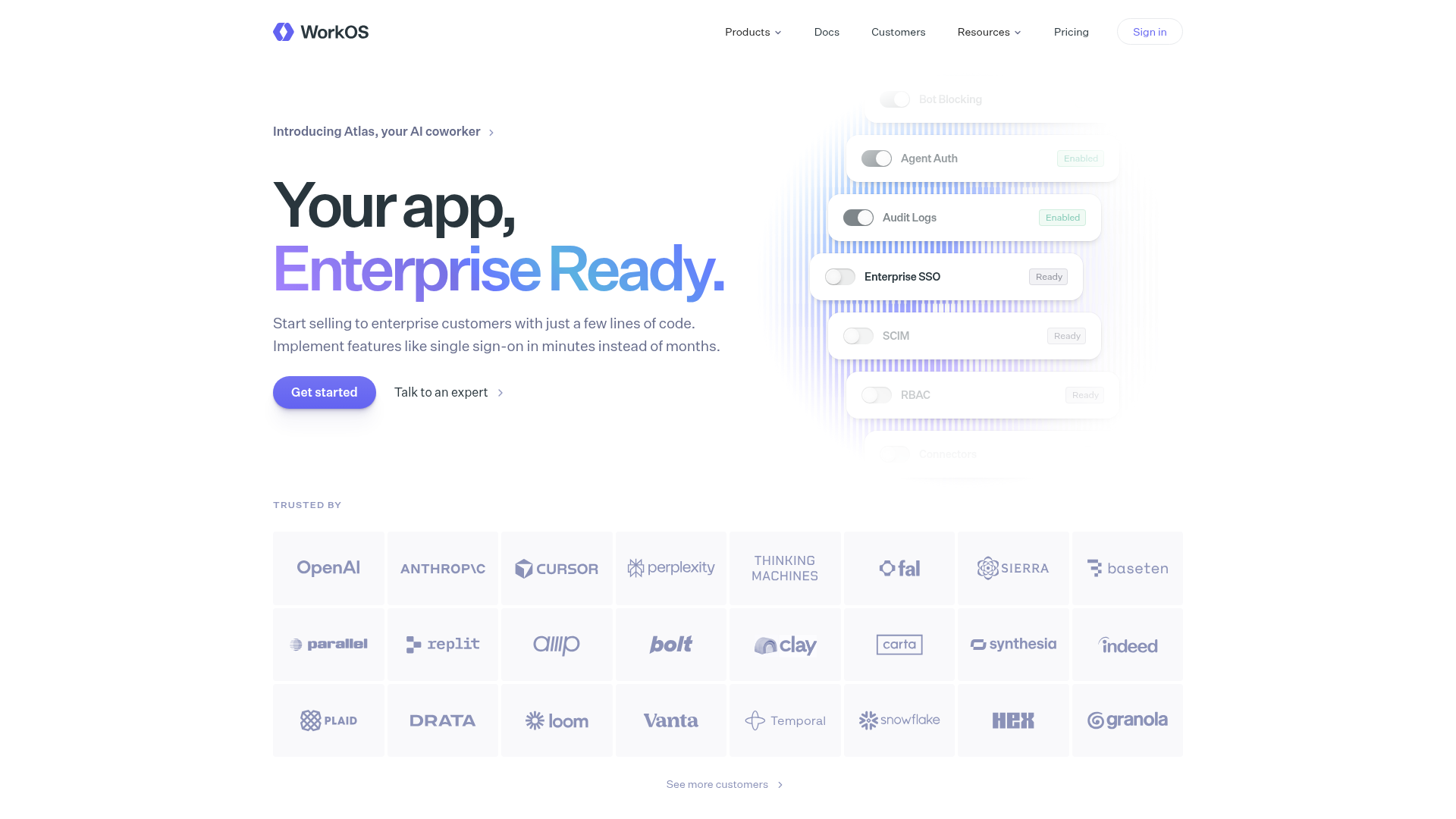
Workos scores 79/100 overall—a solid result that reflects competent execution across functional, aesthetic, and practice layers. The page demonstrates clear design intent: a benefit-focused hero, visual confidence in brand presentation, and a structured information hierarchy below the fold. However, the score masks a meaningful friction point that emerges immediately upon arrival. The hero establishes *what* the product does ('Your app, Enterprise Ready') but defers the *why* a developer should care to below the fold. For a landing page competing for attention in the B2B SaaS infrastructure space, this delay in value articulation costs clarity at the moment of highest attention. The page's 79 is not a weakness signal—it reflects a page that works—but it's also not optimized for the conversion patterns that matter most on first visit.
Observed UX signals
- Majorfunctional
Clarity
Hero headline 'Your app, Enterprise Ready' is benefit-focused and clear, but the value proposition in the subheading ('Start selling to enterprise customers with just a few lines of code') is buried below the fold in the screenshot. The immediate context for why a developer should care is not fully established in the visible hero area.
- Majorfunctional
TrustCredibility
Social proof section ('Trusted by') displays 20+ company logos, but lacks quantitative credibility signals. No user count, customer testimonials with attribution, or specific outcome metrics (e.g., 'Used by 4,000+ developers' or 'Trusted by companies processing 10M+ authentications/month') are visible in the hero or immediately below.
- Majorfunctional
FocusHierarchy
Navigation menu includes 6+ top-level items (Products, Docs, Customers, Resources, Pricing, Sign in) plus a secondary 'Dashboard' link. The product dropdown lists 14 distinct offerings (User Management, Enterprise SSO, Radar, AuthKit, Directory Sync, RBAC, MCP Auth, Admin Portal, Vault, MFA, Audit Logs, Pipes, auth.md, Atlas, Airlock). This creates significant cognitive load and competing attention paths for a first-time visitor trying to understand the primary value.
More UX reviews
Browse all →How does your site score?
Get the same layer-by-layer UX review for your homepage, pricing page, or product page.