Webflow website UX review
A scan-backed analysis of how Webflow performs across usability, visual clarity, and UX best practices. Use it as a reference for what to borrow, what to question, and what to test on your own site.
Sensei score: 76 out of 100
Aesthetic
81Practices
75How Webflow looks
The verdict
A strong aesthetic foundation undermined by functional friction
Webflow's landing page scores 76/100 overall, with aesthetic execution notably outpacing functional clarity. The visual layer (81/100) demonstrates confident design—layouts, typography, and imagery work cohesively to convey a premium product positioning. The functional layer (72/100), however, reveals a more fragmented experience. This gap suggests the page looks polished but asks too much of visitors before they understand what to do or why.
Observed UX signals
- Majorfunctional
Clarity
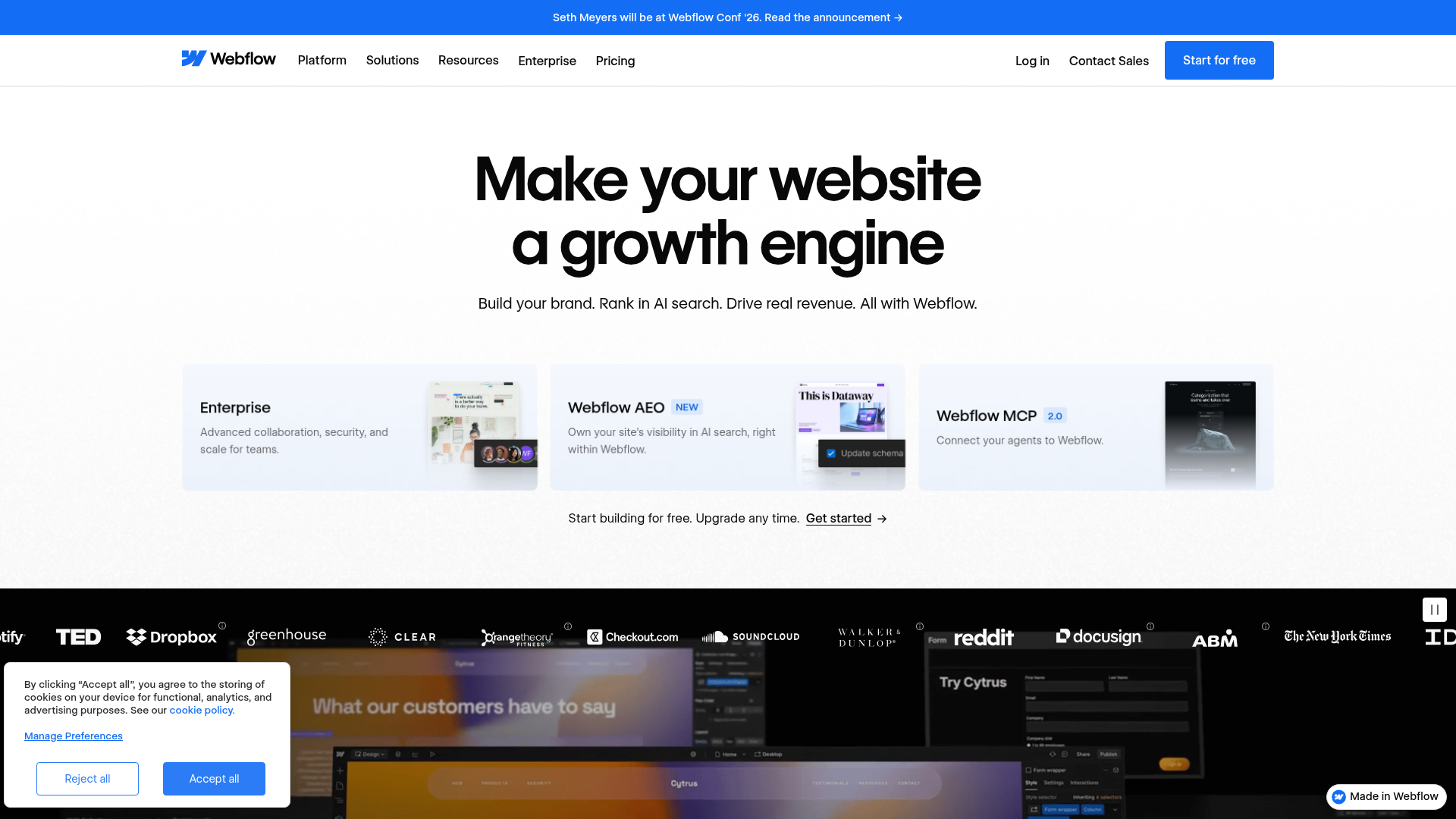
Primary value proposition is fragmented across multiple competing headlines. Hero section presents 'Make your website a growth engine' followed by 'Make websites that drive results' and then 'Build your brand. Rank in AI search. Drive real revenue.' This creates cognitive load and dilutes the core message.
- Majorfunctional
Focus & Hierarchy
Multiple competing primary CTAs above the fold create choice paralysis. 'Get started', 'Talk to sales', 'Start for free', and 'Contact Sales' appear with similar visual weight in the hero and feature sections, violating Hick's Law. Users cannot quickly identify the intended next action.
- Majorfunctional
Conversion Optimization
CTA copy lacks benefit-oriented language and risk reversal. 'Start for free' and 'Get started' are generic and do not communicate the outcome or remove friction. No explicit mention of 'no credit card required', 'cancel anytime', or similar risk-reversal language visible in the hero or near signup CTAs.
More UX reviews
Browse all →How does your site score?
Get the same layer-by-layer UX review for your homepage, pricing page, or product page.