Wealthfront website UX review
A scan-backed analysis of how Wealthfront performs across usability, visual clarity, and UX best practices. Use it as a reference for what to borrow, what to question, and what to test on your own site.
Sensei score: 76 out of 100
Aesthetic
78Practices
73How Wealthfront looks
The verdict
A 76-point landing that trades clarity for feature breadth
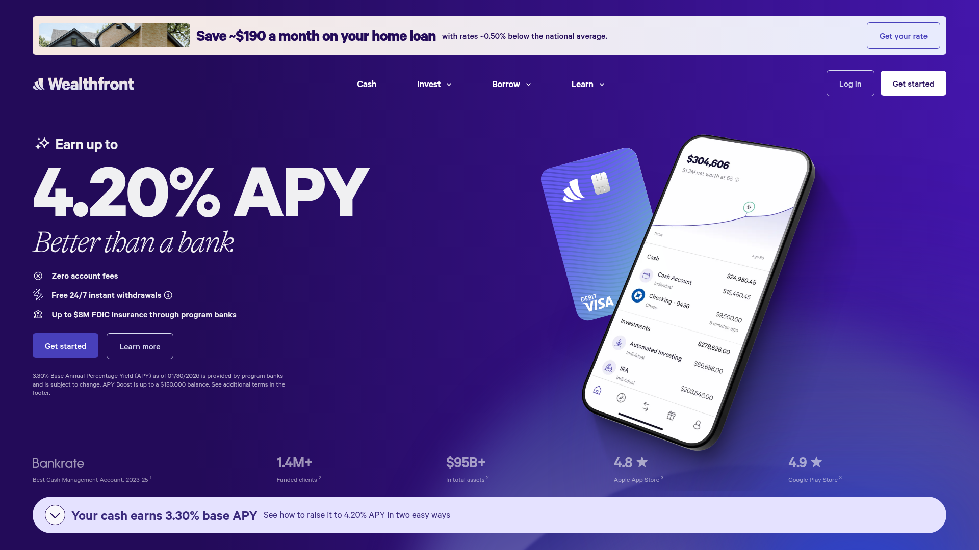
Wealthfront's homepage achieves a strong overall score (76/100) by balancing solid aesthetic and functional execution, but the gap between its 78-point aesthetic layer and 73-point practices layer reveals a common tension: the page looks polished while its information architecture and conversion strategy work against each other. The site presents itself as a multi-product platform—mortgage lending, cash accounts, and wealth management—and that ambition shows in both the design confidence and the strategic confusion. Functional and aesthetic scores cluster tightly (77 and 78), suggesting the visual and interactive systems are competent; the practices score lag signals that the page's strategic choices—what to prioritize, how to guide visitors, what to ask them to do—need recalibration.
Observed UX signals
- Majorfunctional
Focus & Hierarchy
Multiple competing primary CTAs above the fold create choice paralysis. The hero section presents 'Get your rate' (mortgage lending), 'Get started' (cash account), and 'Log in' simultaneously without clear visual hierarchy or indication of which action is primary for a new visitor.
- Majorfunctional
Conversion Optimization
CTA copy lacks benefit-oriented language. 'Get started' and 'Learn more' are generic and do not communicate the outcome. The mortgage CTA 'Get your rate' is specific, but the primary investing CTAs do not convey the value (e.g., 'Start earning 4.20% APY' or 'Build wealth automatically').
- Majorfunctional
Trust & Credibility
Testimonials lack sufficient attribution detail. Three testimonials are presented (Evelyn T., Peter & Alex, Brad B.) with only first names, client-since dates, and use-case labels. No titles, companies, or photos are visible, reducing authenticity and relatability.
More UX reviews
Browse all →How does your site score?
Get the same layer-by-layer UX review for your homepage, pricing page, or product page.
Scan your websiteSign in to run a fresh private scan