Warp website UX review
A scan-backed analysis of how Warp performs across usability, visual clarity, and UX best practices. Use it as a reference for what to borrow, what to question, and what to test on your own site.
Sensei score: 76 out of 100
Aesthetic
80Practices
74How Warp looks
The verdict
A capable landing with clarity gaps at the critical moment
Warp's landing page scores 76/100 overall—a solid result that masks a structural problem. The aesthetic layer (80) is the page's strongest dimension, suggesting confident visual design and layout discipline. The functional layer (73) and practices layer (74) reveal where the page loses momentum: not in execution quality, but in decision-making at the conversion threshold. The page knows how to present itself visually, but struggles to guide visitors toward a single, unambiguous next step.
Observed UX signals
- Majorfunctional
Clarity
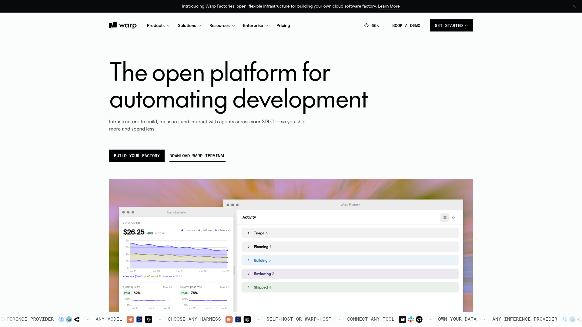
Hero headline 'The open platform for automating development' is feature-focused and abstract. Visitors cannot immediately understand what problem Warp solves or what outcome they'll achieve. The subheading mentions 'agents across your SDLC' and 'ship more and spend less,' but requires technical familiarity with SDLC terminology.
- Majorfunctional
Focus & Hierarchy
Multiple competing CTAs above the fold create choice paralysis: 'Build your factory' (primary), 'Download Warp Terminal' (secondary), and 'Learn More' link. The page promotes two distinct products (Factories and Terminal) simultaneously without clear hierarchy, forcing visitors to choose between them rather than guiding them to a single conversion path.
- Majorfunctional
Conversion Optimization
Primary CTA copy 'Build your factory' is vague and action-ambiguous. Visitors don't know if clicking leads to a free trial, a demo request, documentation, or a signup form. No risk reversal or urgency signals are present near the CTA.
More UX reviews
Browse all →How does your site score?
Get the same layer-by-layer UX review for your homepage, pricing page, or product page.