Vuoriclothing website UX review
A scan-backed analysis of how Vuoriclothing performs across usability, visual clarity, and UX best practices. Use it as a reference for what to borrow, what to question, and what to test on your own site.
Sensei score: 75 out of 100
Aesthetic
79Practices
74How Vuoriclothing looks
The verdict
A visually confident landing that underperforms on trust and conversion clarity
Vuoriclothing's landing page scores 75/100 overall—a strong result anchored by solid aesthetic execution (79/100) but held back by functional gaps in credibility and conversion design (71/100). The page succeeds at presenting the brand's product range and visual identity with confidence, yet it makes no explicit effort to establish why a first-time visitor should trust the brand or which action to take first. For an apparel brand competing in a crowded athletic-wear market, this gap between visual polish and conversion readiness is diagnostic: the page looks professional but doesn't work as hard as it could to move uncertain visitors toward purchase.
Observed UX signals
- Majorfunctional
Trust & Credibility
No visible social proof, testimonials, user counts, or authority signals above the fold. The page relies entirely on brand recognition and product imagery without establishing credibility through third-party validation, press mentions, or customer testimonials.
- Majorfunctional
Conversion Optimization
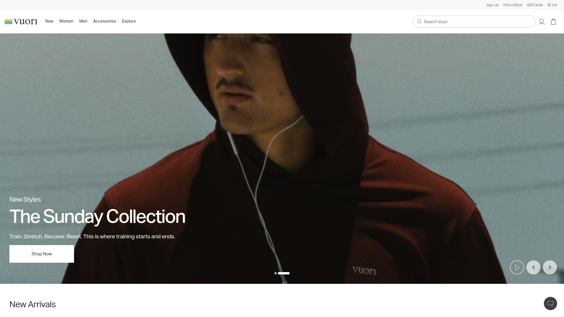
Primary CTA copy is generic ('Shop Now') and lacks benefit-oriented language. Multiple competing CTAs ('Shop Men's New', 'Shop Women's New', 'Explore') create choice paralysis without clear hierarchy or risk reversal (no free trial, guarantee, or 'try risk-free' messaging).
- Minorfunctional
Focus & Hierarchy
Navigation menu includes 5 top-level categories (New, Women, Men, Accessories, Explore) plus multiple secondary links (Our Story, DreamKnit, BlissBlend, etc.), creating moderate cognitive load. The hero section is clear, but the page below the fold introduces competing product modules (New Arrivals, Sunday Collection, Restore Collection, Popular Categories) without a clear primary conversion path.
More UX reviews
Browse all →How does your site score?
Get the same layer-by-layer UX review for your homepage, pricing page, or product page.