Usemotion website UX review
A scan-backed analysis of how Usemotion performs across usability, visual clarity, and UX best practices. Use it as a reference for what to borrow, what to question, and what to test on your own site.
Sensei score: 76 out of 100
Aesthetic
76Practices
73How Usemotion looks
The verdict
A solid performer held back by repetition
Usemotion's landing page scores 76/100 overall, with functional and aesthetic layers both in the mid-to-high range (78 and 76 respectively). The page demonstrates competent design fundamentals and clear visual hierarchy in isolated sections—particularly the hero. However, the score masks a structural problem: the same conversion action appears 19 times across the page, creating a friction point that undermines the otherwise disciplined approach to messaging and layout. This repetition is the primary diagnostic signal that the page is optimized for clicks rather than clarity, a distinction that matters for both user experience and conversion quality.
Observed UX signals
- Majorfunctional
Focus & Hierarchy
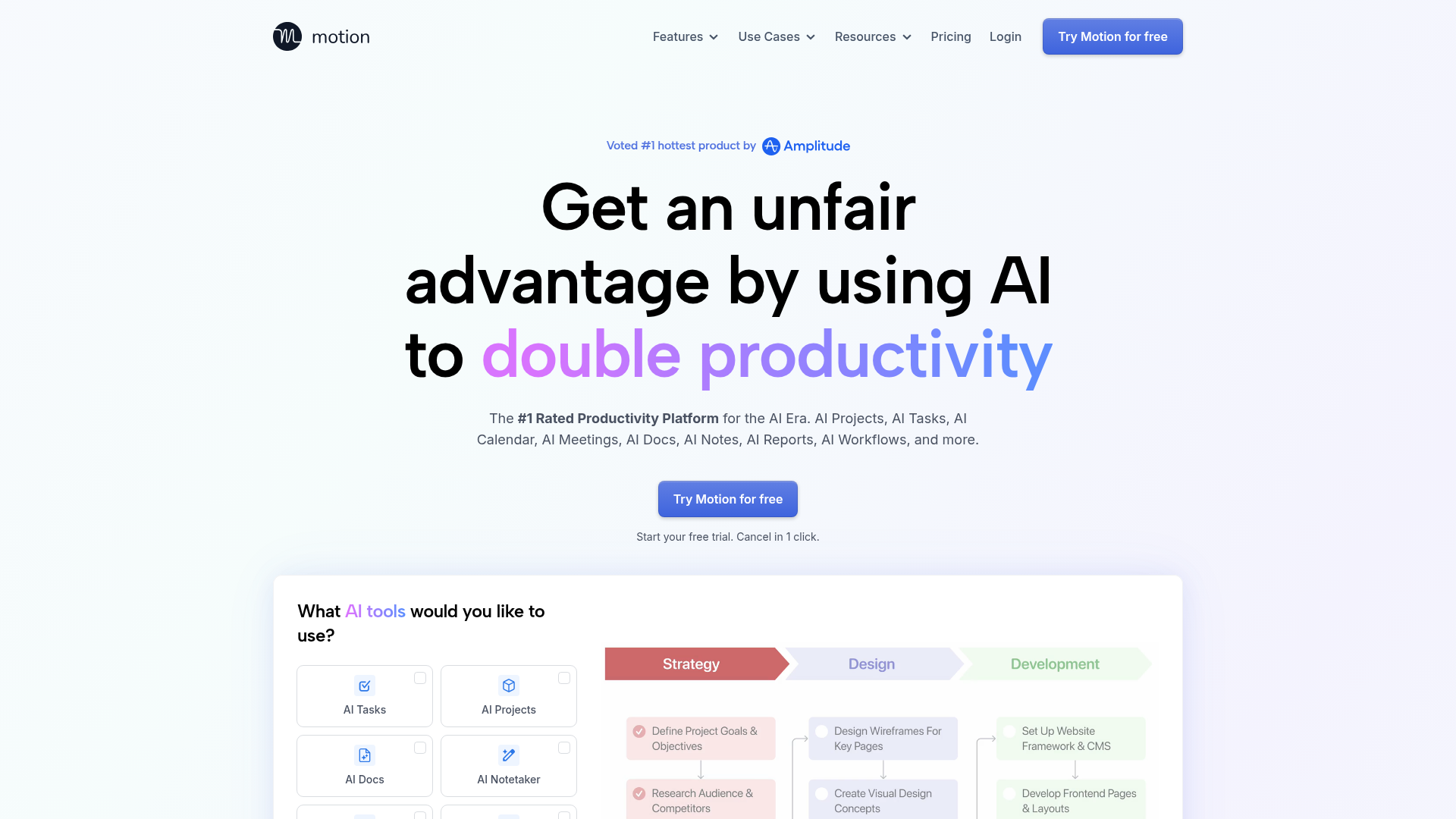
Excessive CTA repetition (19 instances of 'Try Motion for free' button) creates decision fatigue and dilutes conversion focus. Multiple identical CTAs at different scroll depths reduce the perceived importance of any single action.
- Majorfunctional
Conversion Optimization
Interactive task-selection prompt ('What AI tools would you like to use?') with 4 selectable options (AI Tasks, AI Projects, AI Docs, AI Notetaker) appears early but lacks clear next-step guidance. Users may select but unclear what happens after selection or how it advances conversion.
- Minorfunctional
Trust & Credibility
Social proof includes 4 testimonials with names and titles, but lacks company logos or employee counts. 'Over 1 million top performers and teams trust Motion' is stated but not visually reinforced with logos or specific customer names (e.g., 'Used by Slack, Figma, etc.').
More UX reviews
Browse all →How does your site score?
Get the same layer-by-layer UX review for your homepage, pricing page, or product page.