Together website UX review
A scan-backed analysis of how Together performs across usability, visual clarity, and UX best practices. Use it as a reference for what to borrow, what to question, and what to test on your own site.
Sensei score: 76 out of 100
Aesthetic
80Practices
72How Together looks
The verdict
A capable but unfocused entry point
Together's landing page scores 76/100 overall—a solid result that masks meaningful friction in how it communicates value and guides visitors. The aesthetic layer (80/100) performs strongest, suggesting the visual design and layout craft are competent. But functional clarity (74/100) and best-practice alignment (72/100) reveal a page that asks visitors to work harder than necessary. The gap between these layers is diagnostic: Together has built something that looks polished but doesn't yet convert as efficiently as its visual presentation suggests it could.
Observed UX signals
- Majorfunctional
Clarity
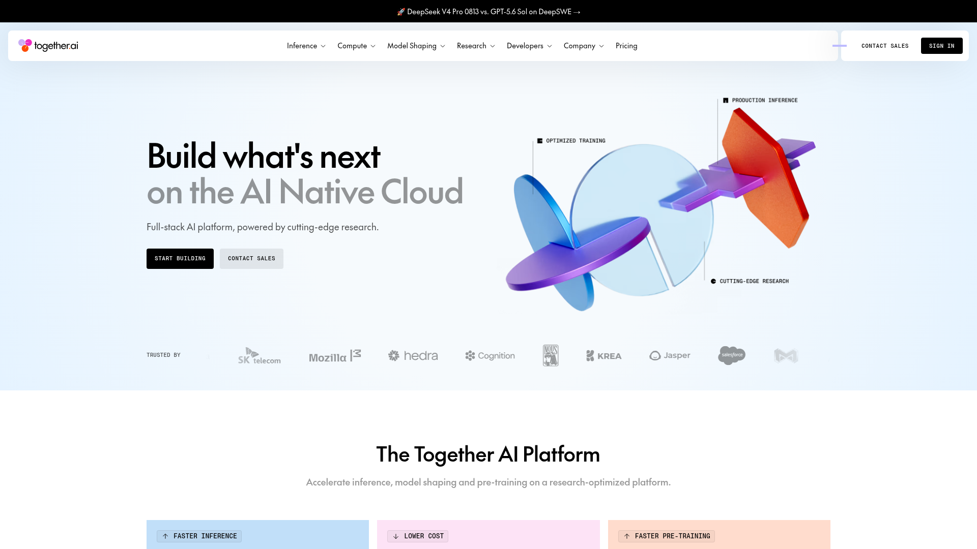
Hero headline 'Build what's next on the AI Native Cloud' is abstract and feature-focused rather than benefit-focused. Visitors must infer the value proposition from the subheading alone ('Full-stack AI platform, powered by cutting-edge research'), which requires technical knowledge to parse.
- Majorfunctional
focusHierarchy
Navigation menu contains 6 top-level dropdown categories (Inference, Compute, Model Shaping, Research, Developers, Company) plus Pricing, Contact Sales, and Sign In. This creates significant cognitive load and competing attention at the top of the page. The hero CTAs ('Start building', 'Contact Sales', 'Talk to an expert') are clear, but the navigation above them dilutes focus.
- Majorfunctional
conversionOptimization
Primary CTA copy is generic ('Start building', 'Contact Sales'). Secondary CTAs throughout the page use equally generic language ('Learn more', 'Learn how'). These do not communicate the specific outcome or reduce friction for different user segments (e.g., 'Try free inference', 'Schedule a demo', 'Explore pricing').
More UX reviews
Browse all →How does your site score?
Get the same layer-by-layer UX review for your homepage, pricing page, or product page.