Temporal website UX review
A scan-backed analysis of how Temporal performs across usability, visual clarity, and UX best practices. Use it as a reference for what to borrow, what to question, and what to test on your own site.
Sensei score: 78 out of 100
Aesthetic
81Practices
76How Temporal looks
The verdict
A strong visual presentation undermined by unclear positioning
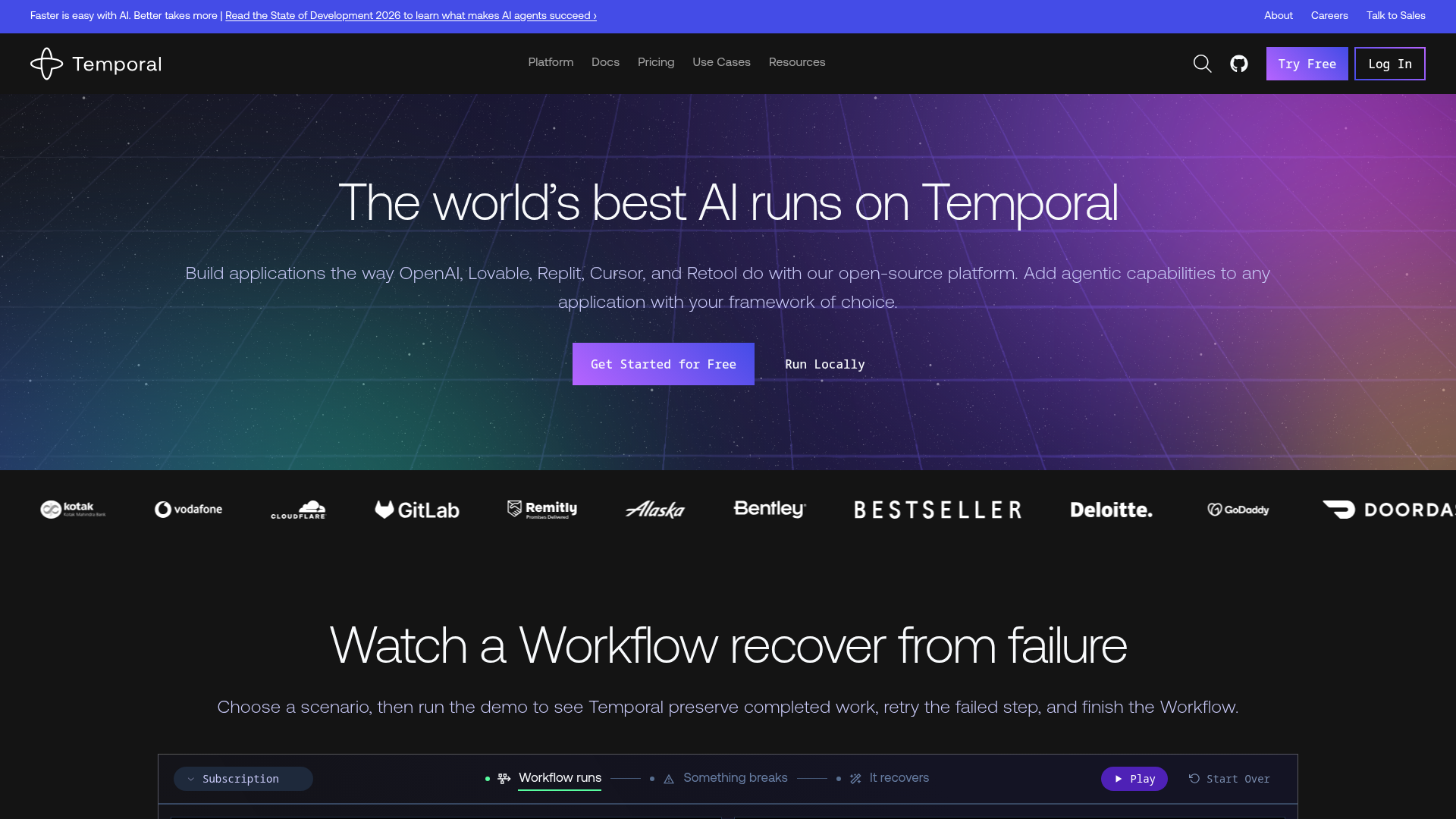
Temporal's landing page scores 78/100 overall, with aesthetic execution notably outpacing functional clarity. The design layer (81/100) demonstrates confident visual craft—the page includes polished imagery, video assets, and an interactive demo component that signal investment in presentation. However, both the functional (76/100) and practices (76/100) layers reveal a more serious problem: the page assumes visitors already understand what Temporal does. The hero headline leads with 'The world's best AI runs on Temporal,' a superlative claim about AI adoption rather than a statement of what the platform actually solves. For a visitor encountering Temporal for the first time, the answer to 'what is this for?' remains unclear within the critical first five seconds.
Observed UX signals
- Majorfunctional
Clarity
Hero headline 'The world's best AI runs on Temporal' leads with a superlative claim about AI rather than the core value proposition. The subheading mentions 'open-source platform' and 'agentic capabilities,' but the primary job—durable execution for reliability—is not immediately clear. A visitor unfamiliar with Temporal cannot answer 'what does this do for me?' within 5 seconds.
- Majorfunctional
Clarity
The term 'Durable Execution' appears in the page title and meta description but is never defined in the hero or early content. The page assumes familiarity with this concept. The closest explanation comes much later: 'Temporal Workflows automatically capture state at every step, and in the event of failure, can pick up exactly where they left off.' This should be in the hero.
- Majorfunctional
ConversionOptimization
Primary CTA 'Get Started for Free' lacks risk-reversal language or clarity on what 'free' means. No mention of free credits, trial duration, or 'no credit card required.' The secondary CTA 'Run Locally' competes for attention without clear differentiation. A visitor cannot quickly decide which path to take.
More UX reviews
Browse all →How does your site score?
Get the same layer-by-layer UX review for your homepage, pricing page, or product page.