Synthesia website UX review
A scan-backed analysis of how Synthesia performs across usability, visual clarity, and UX best practices. Use it as a reference for what to borrow, what to question, and what to test on your own site.
Sensei score: 77 out of 100
Aesthetic
80Practices
75How Synthesia looks
The verdict
A solid landing page undermined by accessibility debt
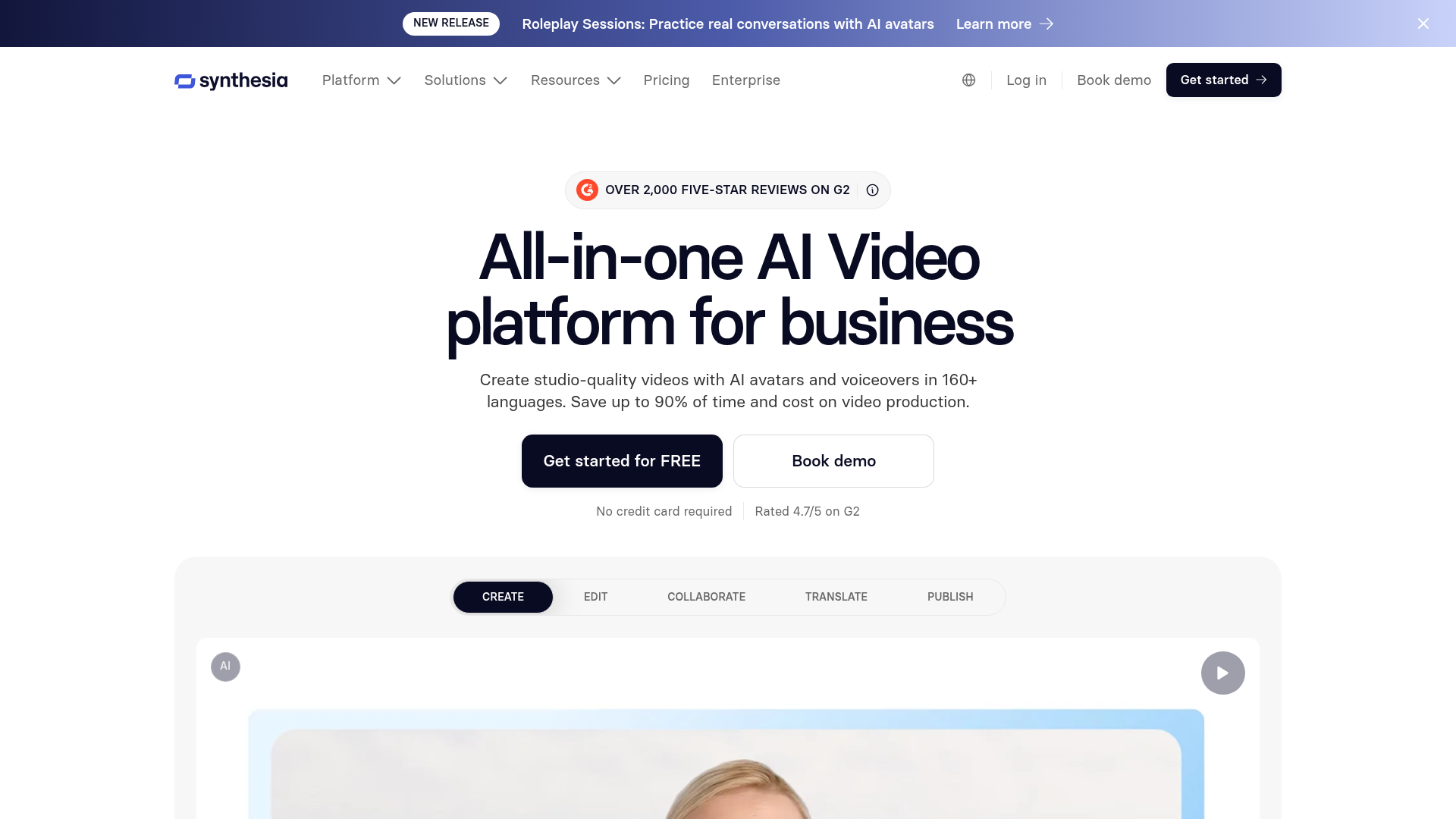
Synthesia's landing page scores 77/100 overall, with aesthetic design (80) outpacing functional clarity (75) and established practices (75). The gap is diagnostic: the page looks polished and visually confident, but foundational accessibility violations and competing conversion paths create friction that a high-performing SaaS landing page should not tolerate. For a product positioned as an AI video generator for enterprises—claiming trust from over 50,000 companies—the accessibility failures are particularly costly. They exclude users relying on assistive technology and signal incomplete quality control to accessibility-conscious buyers.
Observed UX signals
- Criticalfunctional
Accessibility
45 images lack alt text, including critical product demonstration images and feature icons. This severely impacts screen reader users and violates WCAG standards. Additionally, 15 form inputs lack associated labels, making the free video generator form inaccessible to keyboard and assistive technology users.
- Majorfunctional
Trust & Credibility
While the page displays 'OVER 2,000 FIVE-STAR REVIEWS ON G2' and 'Rated 4.7/5 on G2', the testimonial shown ('Zach F., Senior Learning & Development Analyst') appears twice in the visible content without variation. The page claims 'Trusted by over 50,000 companies' but provides no logos, case studies, or specific company names to substantiate this claim.
- Majorfunctional
Focus & Hierarchy
The page presents multiple competing primary CTAs above the fold: 'Get started for FREE', 'Create free AI video', and 'Book demo'. The navigation menu (Platform, Solutions, Resources, Pricing, Enterprise) plus secondary links (Log in, Book demo, Get started) create cognitive load. Users must choose between free trial and demo without clear guidance on which path suits their need.
More UX reviews
Browse all →How does your site score?
Get the same layer-by-layer UX review for your homepage, pricing page, or product page.