Surveymonkey website UX review
A scan-backed analysis of how Surveymonkey performs across usability, visual clarity, and UX best practices. Use it as a reference for what to borrow, what to question, and what to test on your own site.
Sensei score: 79 out of 100
Aesthetic
80Practices
78How Surveymonkey looks
The verdict
A solid performer held back by audience ambiguity
Surveymonkey's landing page scores 79/100 overall, with balanced strength across functional (79), aesthetic (80), and practices (78) layers. The page succeeds in establishing immediate credibility and visual polish, but falters on a more fundamental problem: it tries to serve six distinct use cases without signaling which one matters most. The result is a page that feels competent and trustworthy but leaves visitors uncertain about whether they're in the right place. For a platform built on listening, the page itself doesn't listen well enough to visitor intent.
Observed UX signals
- Majorfunctional
Clarity
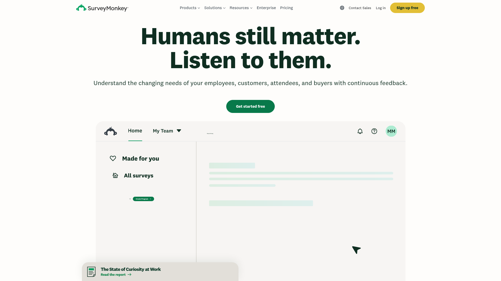
Hero headline 'Humans still matter. Listen to them.' is benefit-focused and compelling, but the subheading 'Understand the changing needs of your employees, customers, attendees, and buyers with continuous feedback' is dense and lists four distinct audiences without clear prioritization, creating ambiguity about the primary use case.
- Majorfunctional
TrustCredibility
Social proof is present above the fold ('260K+ organizations', '97B+ questions answered', '41M+ global users', '18K+ 5-star reviews'), but lacks visual attribution. The numbers are strong, but no logos, customer names, or recognizable brands are shown in the hero section to anchor credibility immediately.
- Majorfunctional
FocusHierarchy
The page presents six distinct use cases ('Employee feedback', 'Customer feedback', 'Market research', 'Product development', 'Event management', 'Online forms') in a horizontal navigation or module layout without clear visual hierarchy. This creates choice paralysis and dilutes focus from the primary conversion goal.
More UX reviews
Browse all →How does your site score?
Get the same layer-by-layer UX review for your homepage, pricing page, or product page.