Substack website UX review
A scan-backed analysis of how Substack performs across usability, visual clarity, and UX best practices. Use it as a reference for what to borrow, what to question, and what to test on your own site.
Sensei score: 68 out of 100
Aesthetic
71Practices
65How Substack looks
The verdict
A platform identity buried under competing signals
Substack's landing page scores 68/100 overall—a mixed result that reflects a fundamental tension between aesthetic polish and functional clarity. The aesthetic layer (71/100) performs noticeably better than functional (68/100) and practices (65/100), suggesting the page looks composed but fails to guide visitors toward a clear understanding of what Substack is or how to use it.
Observed UX signals
- Majorfunctional
Clarity
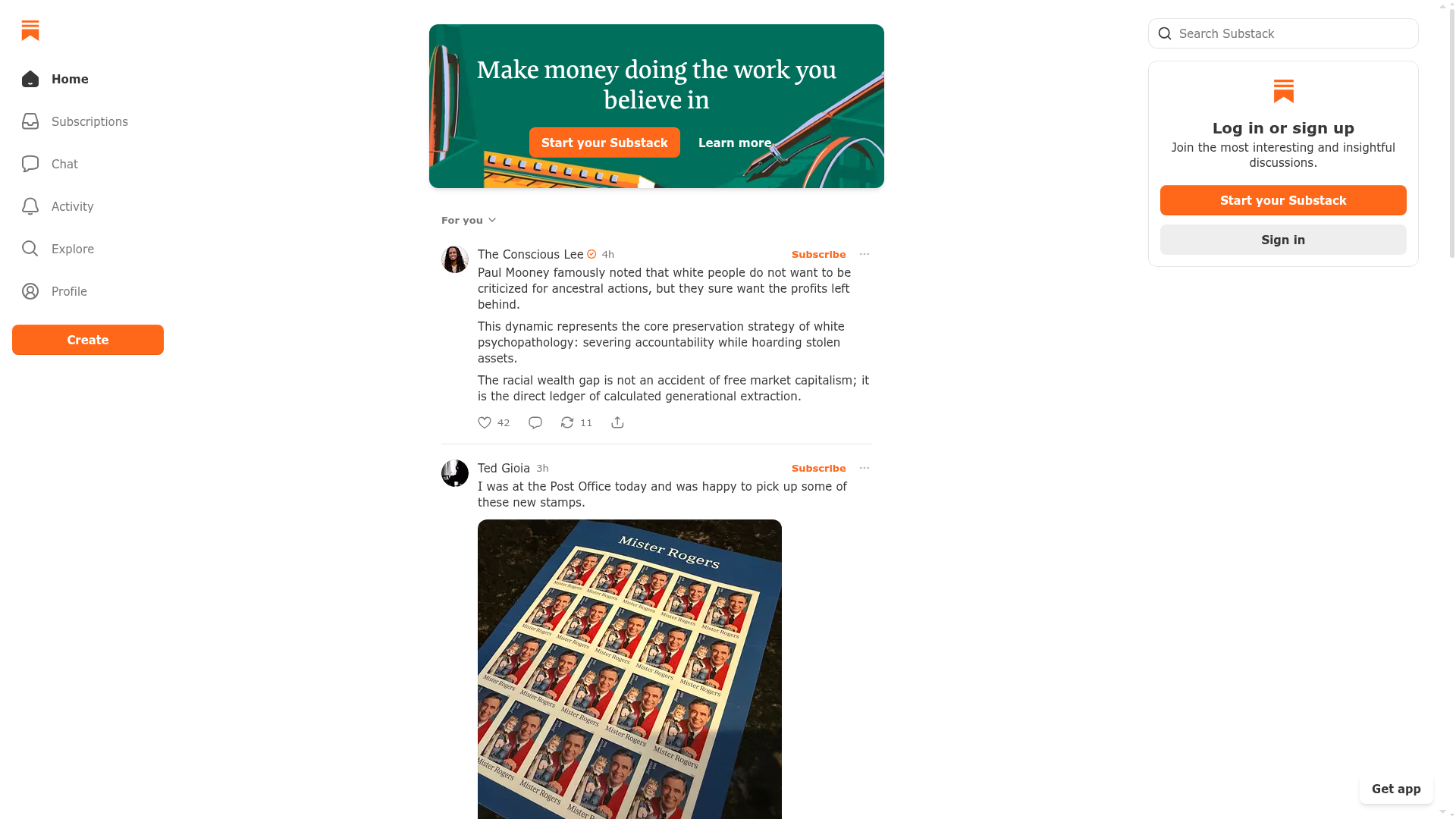
Primary value proposition 'Make money doing the work you believe in' is benefit-oriented but lacks specificity about *how* or *who* this is for. The page immediately shows a social feed (user-generated content) rather than explaining Substack's core function as a publishing/subscription platform. A visitor unfamiliar with Substack must infer the product from navigation and scattered CTAs.
- Majorfunctional
Focus & Hierarchy
Multiple competing CTAs above and within the fold create choice paralysis: 'Start your Substack' (orange button in hero), 'Learn more' (secondary button), 'Create' (left sidebar), and 'Sign in' (top right). No clear visual or positional hierarchy distinguishes the primary conversion path from secondary actions. The social feed content (posts from The Conscious Lee, Ted Gioia, etc.) also competes for attention with the value proposition.
- Majorfunctional
Trust & Credibility
No visible social proof, user counts, or credibility signals above the fold. The page shows user-generated content (posts from named creators like Jameela Jamil, Hamish McKenzie) but does not contextualize them as proof of platform scale or success. No mention of total users, publications, or revenue generated. The 'Log in or sign up' section states 'Join the most interesting and insightful discussions' but provides no evidence (testimonials, metrics, press mentions) to support this claim.
More UX reviews
Browse all →How does your site score?
Get the same layer-by-layer UX review for your homepage, pricing page, or product page.