Spotify website UX review
A scan-backed analysis of how Spotify performs across usability, visual clarity, and UX best practices. Use it as a reference for what to borrow, what to question, and what to test on your own site.
Sensei score: 74 out of 100
Aesthetic
79Practices
73How Spotify looks
The verdict
A landing page caught between two audiences
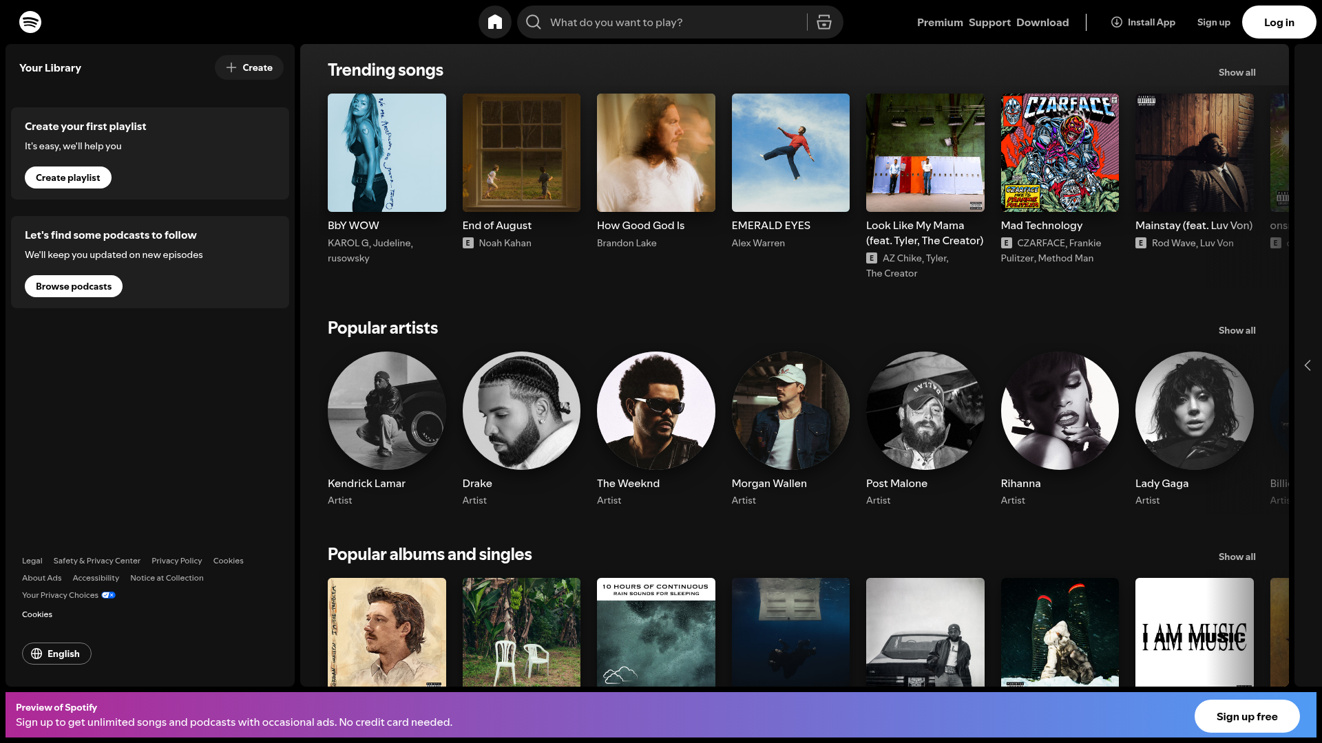
Open Spotify scores 74/100 overall—a solid result that masks a fundamental tension in its design. The page performs well on aesthetic coherence (79/100), with polished visual presentation and confident typography, but stumbles on functional clarity (70/100) and design practices (73/100). The core problem is structural: the page is built for logged-in users browsing trending content, yet it's the first touchpoint for new visitors who don't yet understand what Spotify offers or why they should sign up. This mismatch cascades through every layer of the interface, from navigation complexity to buried value propositions.
Observed UX signals
- Majorfunctional
Clarity
Page purpose is ambiguous for logged-out users. The hero section shows 'Home' heading with a search bar ('What do you want to play?'), which assumes user familiarity with Spotify's interface. For new visitors, the primary value proposition is buried in a small footer banner: 'Sign up to get unlimited songs and podcasts with occasional ads. No credit card needed.' This benefit-focused copy should be more prominent above the fold.
- Majorfunctional
Conversion Optimization
Multiple competing CTAs without clear hierarchy: 'Sign up' (top nav), 'Log in' (top nav), 'Install App' (top nav), 'Create playlist' (sidebar), 'Browse podcasts' (sidebar), and 'Sign up free' (footer banner). For a logged-out user, the primary conversion goal is unclear. The 'Sign up free' CTA in the footer is benefit-rich but visually subordinate to navigation links that don't drive conversion.
- Majorfunctional
Focus & Hierarchy
The page displays content modules (Trending songs, Popular artists, Popular albums, Popular radio) with equal visual weight and no clear hierarchy. Each section uses identical heading styles and layout, making it unclear which content is most important or which action users should prioritize. The sidebar 'Create your first playlist' and 'Browse podcasts' CTAs compete with the main content feed.
More UX reviews
Browse all →How does your site score?
Get the same layer-by-layer UX review for your homepage, pricing page, or product page.