Spline website UX review
A scan-backed analysis of how Spline performs across usability, visual clarity, and UX best practices. Use it as a reference for what to borrow, what to question, and what to test on your own site.
Sensei score: 76 out of 100
Aesthetic
79Practices
74How Spline looks
The verdict
A capable platform held back by conversion friction
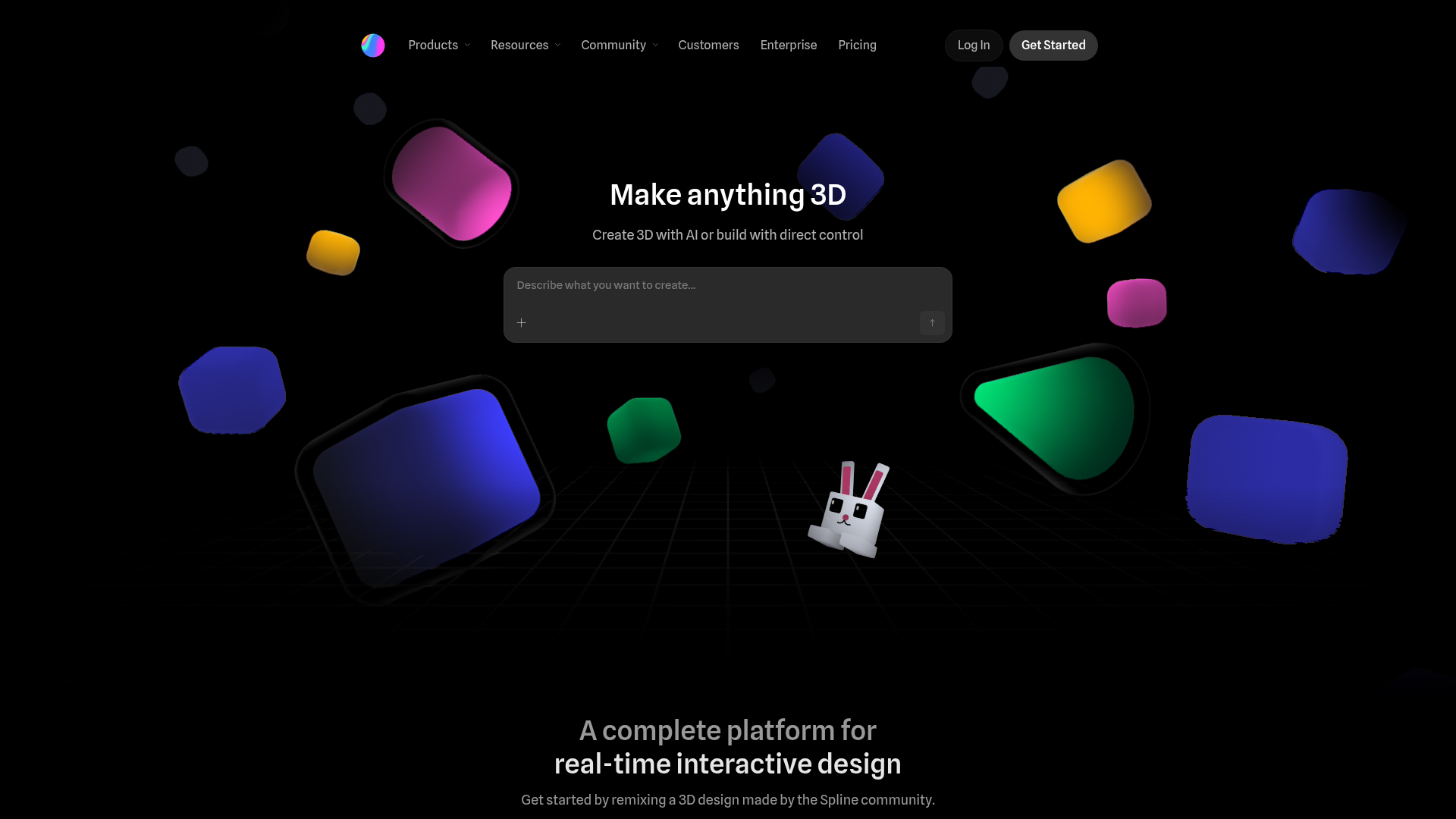
Spline's landing page scores 76/100—a solid performance that reflects genuine strengths in visual design and baseline functionality. The aesthetic layer (79) and functional layer (75) sit close together, suggesting a page that looks polished but stumbles on the mechanics of moving visitors toward signup. The real diagnostic gap emerges in practices (74), where strategic choices around messaging clarity and conversion optimization fall short of what the visual presentation promises. This is not a broken page; it's one where the design system and copywriting are working at cross purposes, creating unnecessary friction at the moment that matters most.
Observed UX signals
- Majorfunctional
Clarity
Primary value proposition is split across two separate headings without clear connection. Hero reads 'Make anything 3D' (feature) followed by 'Create 3D with AI or build with direct control' (method), but the core benefit—why someone should care—is buried in secondary copy: 'A complete platform for real-time interactive design.' Users must infer the transformation rather than being told it upfront.
- Majorfunctional
Conversion Optimization
Primary CTA 'Get Started' lacks benefit-oriented copy and risk reversal. The page states 'Get started — it's free' only in footer copy, not near the hero CTA. Users encounter the signup link without immediate reassurance about cost or commitment, creating friction at the conversion moment.
- Majorfunctional
Trust & Credibility
Social proof is present but lacks quantitative specificity. Testimonials include names, titles, and companies (Andrew Pons, Zeh Fernandes, Pavel Dergachev), which is strong, but the page offers no visible user counts, adoption metrics, or press mentions above the fold. The heading 'Empowering individuals and teams at world's leading organizations' is vague and unsupported by logos or numbers.
More UX reviews
Browse all →How does your site score?
Get the same layer-by-layer UX review for your homepage, pricing page, or product page.