Sofi website UX review
A scan-backed analysis of how Sofi performs across usability, visual clarity, and UX best practices. Use it as a reference for what to borrow, what to question, and what to test on your own site.
Sensei score: 64 out of 100
Aesthetic
64Practices
56How Sofi looks
The verdict
A broad portfolio creating friction at the entry point
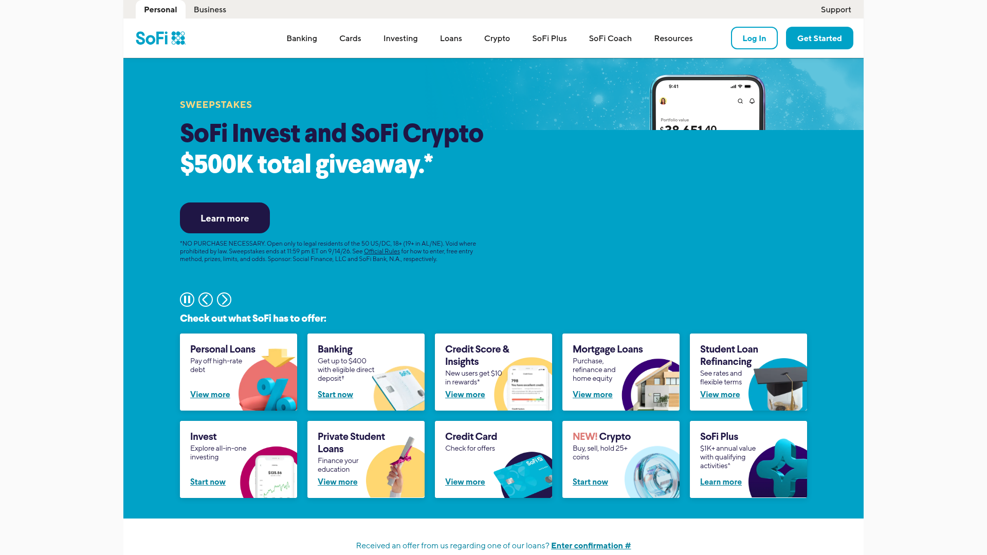
SoFi's landing page scores 64/100 overall—a mixed result that masks a fundamental tension between breadth and clarity. The functional layer (71) performs adequately, but the aesthetic (64) and practices layers (56) reveal structural problems rooted in how the page introduces users to a 10-product ecosystem. The site is not broken; it is overloaded. With 10 product categories presented without hierarchy—Invest, Personal Loans, Student Loan Refinancing, Banking, Mortgages, Credit Card, Private Student Loans, Insurance, Credit Score & Budgeting, and Auto Loan Refinancing—the hero section violates basic principles of decision design. The generic message 'Select a product to get started' explicitly asks users to choose rather than guiding them toward a primary entry point. This is a design choice that prioritizes comprehensiveness over conversion, and the metrics reflect the cost.
Observed UX signals
- Majorfunctional
Focus & Hierarchy
Hero message 'Select a product to get started' is generic and does not communicate a clear primary value proposition. The page presents 10+ product options (Invest, Personal Loans, Student Loan Refinancing, Banking, Mortgages, Credit Card, Private Student Loans, Insurance, Credit Score & Budgeting, Auto Loan Refinancing) without hierarchy, forcing users to choose rather than guiding them to the most relevant entry point.
- Majorfunctional
Conversion Optimization
Multiple competing CTAs with identical or near-identical labels ('Get Started', 'Learn more', 'Start now', 'View more') appear across the page without clear differentiation of outcome. Users cannot predict what happens when they click each button—whether it leads to signup, product details, or a calculator.
- Majorfunctional
Clarity
Page content is heavily duplicated (sweepstakes, SoFi Plus, SoFi Coach, mortgage messaging, and student guide sections repeat multiple times in the extracted content), creating confusion about what is the primary message and whether the page has loaded correctly or is showing cached/stale content.
More UX reviews
Browse all →How does your site score?
Get the same layer-by-layer UX review for your homepage, pricing page, or product page.