Slack website UX review
A scan-backed analysis of how Slack performs across usability, visual clarity, and UX best practices. Use it as a reference for what to borrow, what to question, and what to test on your own site.
Sensei score: 78 out of 100
Aesthetic
80Practices
76How Slack looks
The verdict
A strong visual and functional baseline undermined by conversion friction
Slack's landing page scores 78/100—a solid result that reflects genuine strengths in visual design and core functionality. The aesthetic layer (80/100) and functional layer (79/100) are nearly aligned, suggesting the page is well-crafted as a visual artifact. However, the practices layer (76/100) reveals a meaningful gap: the page is built competently but not optimized for its primary job—moving unfamiliar visitors toward a commitment. For a B2B SaaS homepage, this gap between craft and conversion strategy is diagnostic. The page looks and behaves well, but it doesn't remove the friction that stops prospects from signing up.
Observed UX signals
- Majorfunctional
Clarity
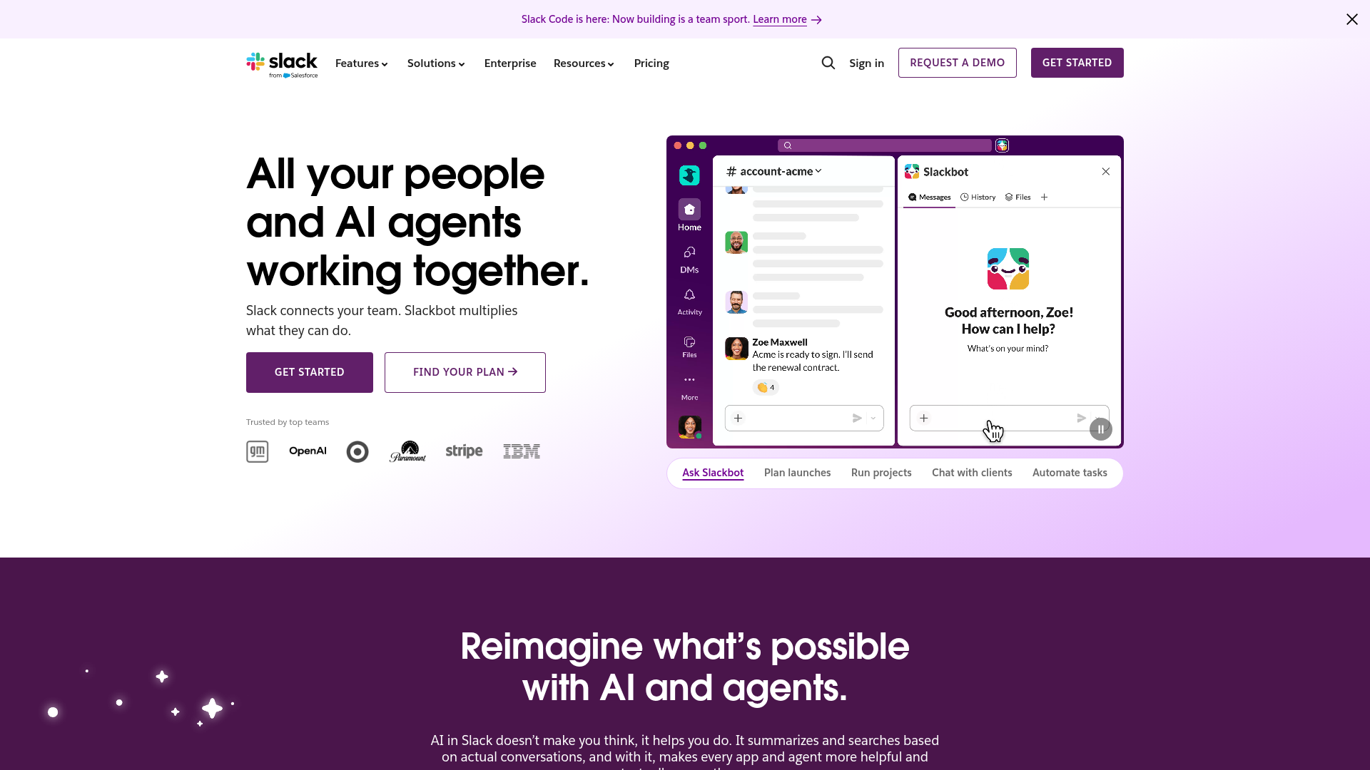
Hero headline 'All your people and AI agents working together' is benefit-focused but abstract. Subheading 'Slack connects your team. Slackbot multiplies what they can do' clarifies the mechanism, but the value outcome (time saved, faster decisions, reduced friction) is not explicit in the hero section. For a visitor unfamiliar with Slack, the immediate payoff is unclear.
- Majorfunctional
Conversion Optimization
Primary CTA above the fold is 'Get started' (generic), paired with secondary 'Find your plan'. Neither uses benefit-oriented language or addresses the primary objection (cost, complexity, time to value). No risk reversal visible (free trial, money-back guarantee, 'cancel anytime'). The page assumes visitors are ready to commit without friction reduction.
- Majorfunctional
Trust Credibility
Social proof is present ('Trusted by top teams' with logos: OpenAI, Stripe, IBM, etc.) but lacks quantitative anchors. No user count, company count, or adoption metric visible above the fold. Testimonials appear lower on the page (e.g., 'Kate Jenson, Head of Americas, Anthropic') but are sparse and not prominently featured. For a B2B SaaS homepage, the absence of 'X million users' or 'Y% of Fortune 500' near the hero weakens immediate credibility.
More UX reviews
Browse all →How does your site score?
Get the same layer-by-layer UX review for your homepage, pricing page, or product page.