Settle website UX review
A scan-backed analysis of how Settle performs across usability, visual clarity, and UX best practices. Use it as a reference for what to borrow, what to question, and what to test on your own site.
Sensei score: 79 out of 100
Aesthetic
80Practices
79How Settle looks
The verdict
A solid performer with conversion friction at the threshold
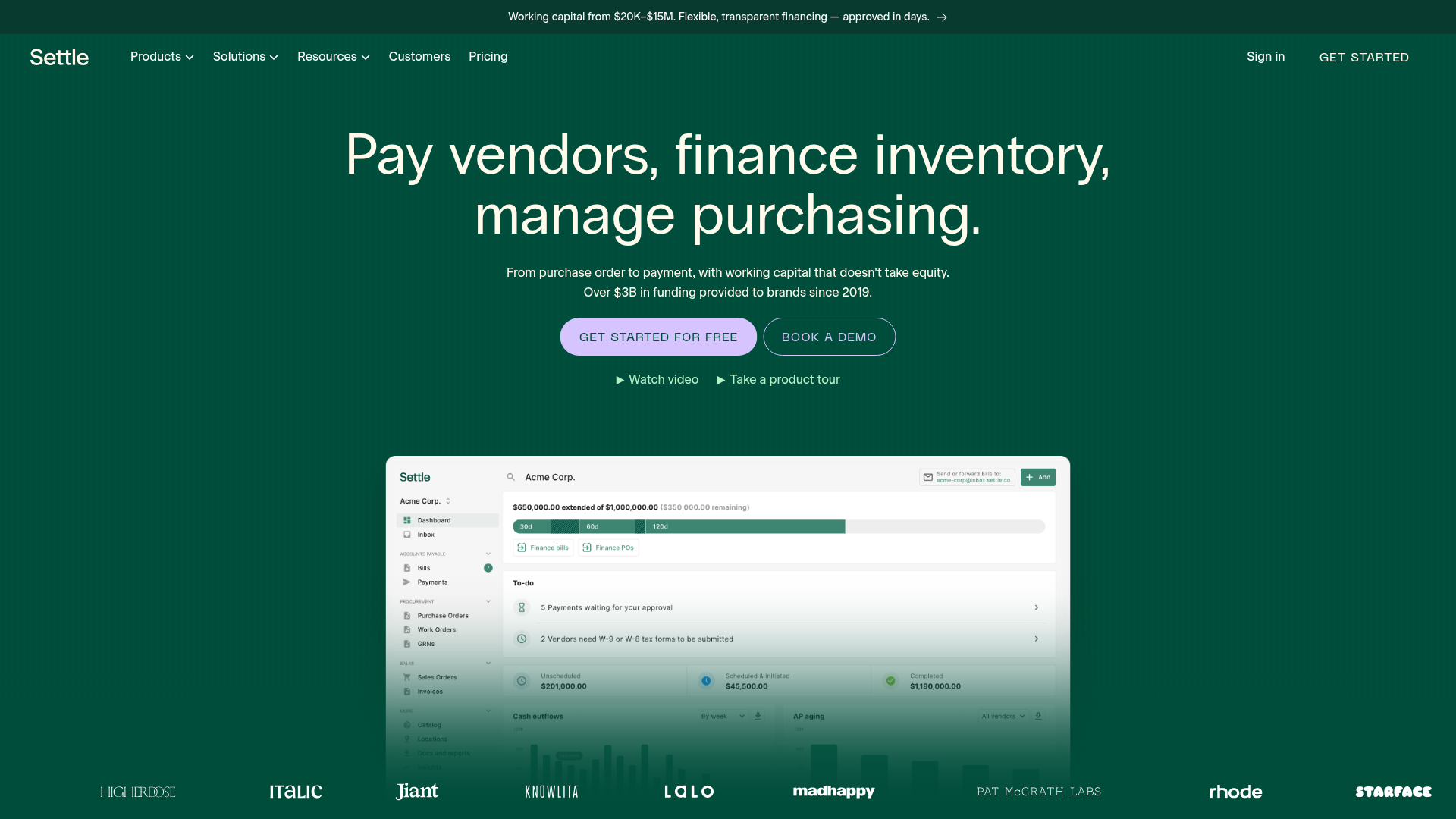
Settle's landing page scores 79/100 overall, with aesthetic execution (80) leading functional clarity (77) and practice consistency (79). The page demonstrates competent design fundamentals and visual restraint—the teal and dark green palette avoids noise—but stumbles where it matters most for a B2B financing product: removing friction from the conversion path. The gap between what the page communicates and what users must do to act reveals the core diagnostic: Settle knows its value proposition but hasn't fully aligned its messaging and interaction design to address the specific anxieties that prevent working-capital buyers from signing up.
Observed UX signals
- Majorfunctional
Conversion Optimization
The primary CTA copy 'GET STARTED FOR FREE' lacks benefit-oriented language and does not address the core objection for a financing/working capital product: risk and approval friction. The page emphasizes 'approved in days' in the banner but the CTA does not reinforce this risk reversal.
- Majorfunctional
Conversion Optimization
Form friction is not visible in the page data, but the signup flow redirects to an external URL (app.settle.co/sign-up/payers/product) without inline indication of required fields, expected time, or what happens after submission. Users cannot assess signup effort before committing.
- Minorfunctional
Clarity
The headline 'Pay vendors, finance inventory, manage purchasing' is feature-focused rather than benefit-focused. It lists what the product does, not what outcome the user achieves. The subhead 'From purchase order to payment, with working capital that doesn't take equity' is stronger but appears secondary.
More UX reviews
Browse all →How does your site score?
Get the same layer-by-layer UX review for your homepage, pricing page, or product page.