Sentry website UX review
A scan-backed analysis of how Sentry performs across usability, visual clarity, and UX best practices. Use it as a reference for what to borrow, what to question, and what to test on your own site.
Sensei score: 78 out of 100
Aesthetic
80Practices
75How Sentry looks
The verdict
A capable page held back by messaging clarity
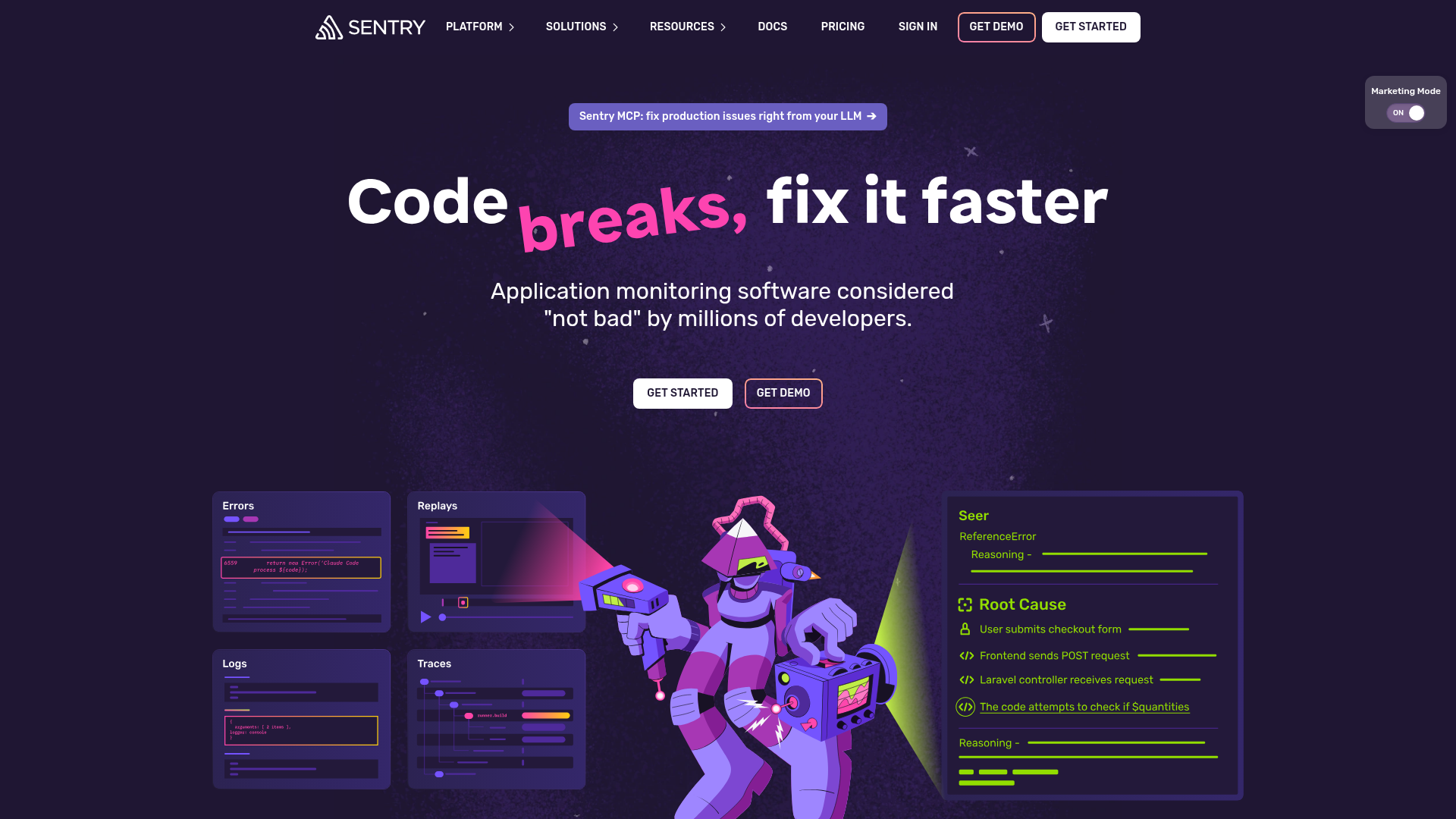
Sentry's landing page scores 78/100 overall—a solid result that reflects genuine strengths in visual design and technical execution, yet masks a critical gap in how it communicates value. The Functional layer (79) and Aesthetic layer (80) are closely matched, suggesting the page looks and behaves well. The Practices layer (75) lags by five points, a gap that points to a specific problem: the page knows *what* to show, but struggles with *why* it matters to a visitor in the first few seconds.
Observed UX signals
- Majorfunctional
Clarity
Hero headline 'Code breaks, fix it faster' is benefit-focused and clear, but the subheading 'Application monitoring software considered "not bad" by millions of developers' uses self-deprecating humor that undermines credibility and obscures the actual value proposition. A visitor cannot immediately understand what problem Sentry solves or why they should choose it.
- Majorfunctional
Trust & Credibility
Social proof is present (logos of Lyft, Disney, Anthropic, Instacart, etc.) but lacks quantitative anchors. The page shows company logos and one testimonial quote from Anthropic, but does not surface key trust signals above the fold: user count, adoption rate, or uptime/reliability metrics. The testimonial section ('Loved by developers worldwide') appears lower on the page and includes only three attributed quotes.
- Majorfunctional
Focus & Hierarchy
The page presents multiple competing feature modules ('Monitor in five lines,' 'Automatically root-cause any issue,' 'Babysit the bots,' 'Stay in the flow') with equal visual weight and repeated headings. This creates cognitive load and dilutes focus from the primary conversion goal. Navigation menu includes 10+ product links (Platform, Solutions, Resources, Docs, Pricing, Sign In) plus two CTAs (Get Demo, Get Started), creating choice paralysis.
More UX reviews
Browse all →How does your site score?
Get the same layer-by-layer UX review for your homepage, pricing page, or product page.