Rothys website UX review
A scan-backed analysis of how Rothys performs across usability, visual clarity, and UX best practices. Use it as a reference for what to borrow, what to question, and what to test on your own site.
Sensei score: 70 out of 100
Aesthetic
79Practices
68How Rothys looks
The verdict
A visually confident page undermined by accessibility and trust gaps
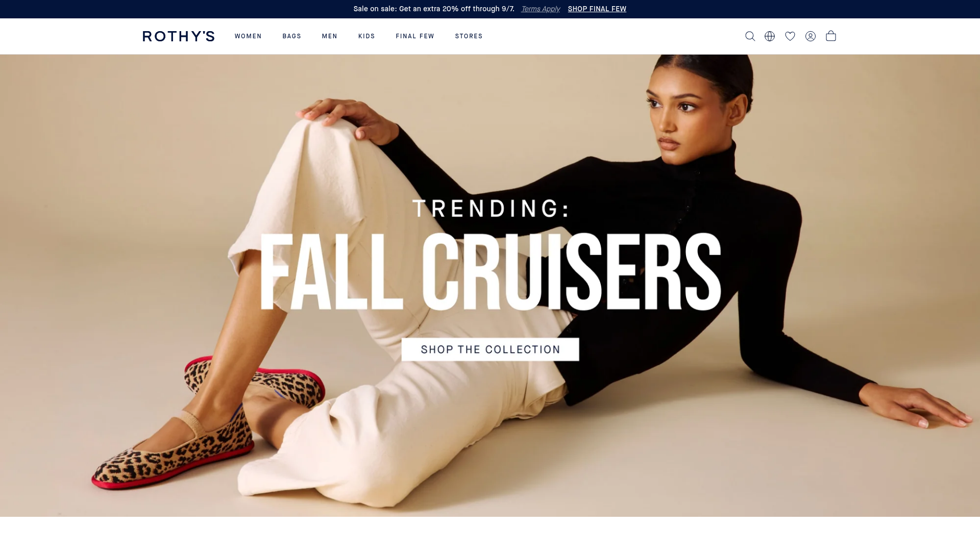
Rothys' landing page scores 70/100 overall, with a notable split: the aesthetic layer (79/100) substantially outperforms functional (64/100) and practices (68/100). The visual design carries the page—product imagery, layout, and color treatment read as polished and intentional. But beneath that surface, critical accessibility failures and missing trust signals create friction that no amount of design refinement can overcome. The page presents a familiar e-commerce pattern: hero sale messaging, product grid, navigation breadcrumbs. Execution matters here, and the execution has structural problems that affect both usability and conversion.
Observed UX signals
- Criticalfunctional
Accessibility
49 of 50 images lack alt text (alt: 'null'). This includes navigation product images and hero imagery. Screen reader users cannot identify products, collections, or visual content.
- Criticalfunctional
Accessibility
6 inputs lack associated labels. Form fields for search, country selection, and cart interactions are not properly labeled, violating WCAG 2.1 Level A standards and breaking screen reader functionality.
- Majorfunctional
Trust & Credibility
No social proof, testimonials, ratings, or trust badges visible above the fold. The page shows product listings and a sale banner but provides no evidence of customer satisfaction, brand authority, or third-party validation.
More UX reviews
Browse all →How does your site score?
Get the same layer-by-layer UX review for your homepage, pricing page, or product page.