Robinhood website UX review
A scan-backed analysis of how Robinhood performs across usability, visual clarity, and UX best practices. Use it as a reference for what to borrow, what to question, and what to test on your own site.
Sensei score: 75 out of 100
Aesthetic
77Practices
71How Robinhood looks
The verdict
A visually confident page undermined by unclear intent
Robinhood's landing page scores 75/100—a solid result that masks a fundamental tension. The aesthetic layer (77) and functional layer (75) are nearly aligned, suggesting the page looks polished and organized. But the practices score (71) reveals a gap between visual presentation and strategic clarity. The page is well-designed as a container, but what it's asking visitors to do, and why they should do it, remains ambiguous. This is not a technical failure; it's a strategic one. The visual confidence obscures a lack of conversion clarity.
Observed UX signals
- Majorfunctional
Clarity
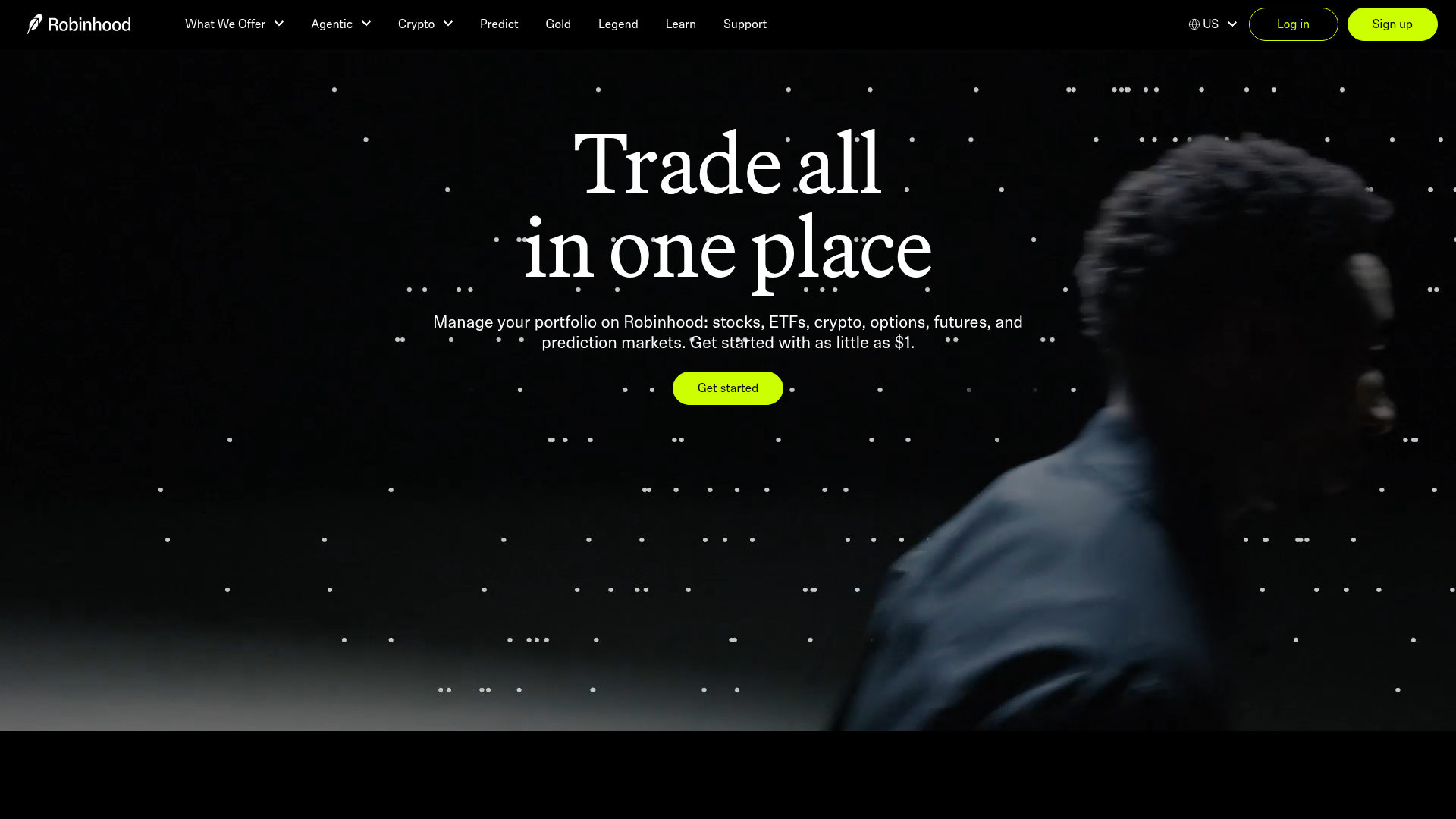
Hero headline 'Trade all in one place' is feature-focused and generic; it does not communicate the core benefit or why a visitor should choose Robinhood over competitors. The subheading mentions asset classes but not the outcome (e.g., democratized access, low barriers to entry).
- Majorfunctional
Clarity
Multiple competing primary CTAs above the fold ('Get started' appears at least 3 times in the hero and early sections) without clear visual or functional hierarchy. Users must infer which action is the main conversion goal.
- Majorfunctional
Trust & Credibility
No visible social proof, user counts, ratings, or testimonials above the fold. The page mentions 'Join a new generation of investors' but provides no quantitative evidence (e.g., '10M+ users', '4.8★ rating'). Trust badges and authority signals are absent from the hero section.
More UX reviews
Browse all →How does your site score?
Get the same layer-by-layer UX review for your homepage, pricing page, or product page.
Scan your websiteSign in to run a fresh private scan