Ro website UX review
A scan-backed analysis of how Ro performs across usability, visual clarity, and UX best practices. Use it as a reference for what to borrow, what to question, and what to test on your own site.
Sensei score: 69 out of 100
Aesthetic
71Practices
67How Ro looks
The verdict
A middle-ground performer with misaligned messaging priorities
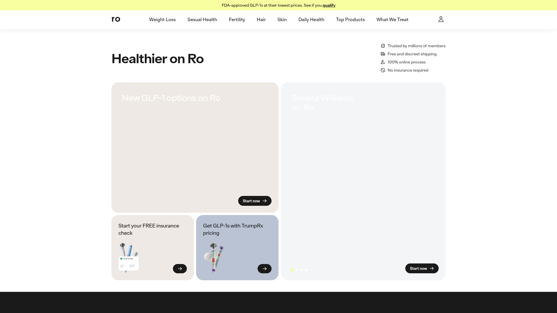
Ro's landing page scores 69/100—a mixed result that reflects genuine tension between visual polish and functional clarity. The Aesthetic layer (71) and Functional layer (70) sit close together, but the Practices score (67) signals that conversion-focused fundamentals are lagging. The core issue isn't technical execution; it's strategic. The page prioritizes celebrity endorsement as its lead narrative over a clear articulation of what Ro does and why a visitor should act. This choice cascades into downstream problems: weak CTAs, absent risk reversal, and decision overload that leaves users uncertain about the primary conversion path.
Observed UX signals
- Majorfunctional
Clarity
Primary value proposition is buried and fragmented. Hero section leads with celebrity testimonials ('Serena Williams on Ro') rather than a clear benefit statement. The actual value—'Healthier on Ro'—appears as a secondary heading without context about what problems Ro solves or why users should care.
- Majorfunctional
Conversion Optimization
CTA copy is generic and lacks benefit framing. Most CTAs use 'Get started', 'Start now', or 'Learn more'—which do not communicate the outcome or reduce friction. Risk reversal is absent from the hero and primary conversion paths. No mention of 'free trial', 'money-back guarantee', 'cancel anytime', or other trust-building assurances near the main CTAs.
- Majorfunctional
Trust & Credibility
Social proof is present but lacks specificity and attribution. Testimonials show only first names and 'Ro member' title—no photos, companies, or detailed outcomes visible in the data. The claim '3,000,000+ members' is specific, but '95% love their experience' lacks a source or methodology. Celebrity endorsements (Serena Williams, Charles Barkley, Chrissy Metz) are powerful but not contextualized with their specific use case or outcome.
More UX reviews
Browse all →How does your site score?
Get the same layer-by-layer UX review for your homepage, pricing page, or product page.