Rho website UX review
A scan-backed analysis of how Rho performs across usability, visual clarity, and UX best practices. Use it as a reference for what to borrow, what to question, and what to test on your own site.
Sensei score: 78 out of 100
Aesthetic
80Practices
78How Rho looks
The verdict
A polished surface with friction underneath
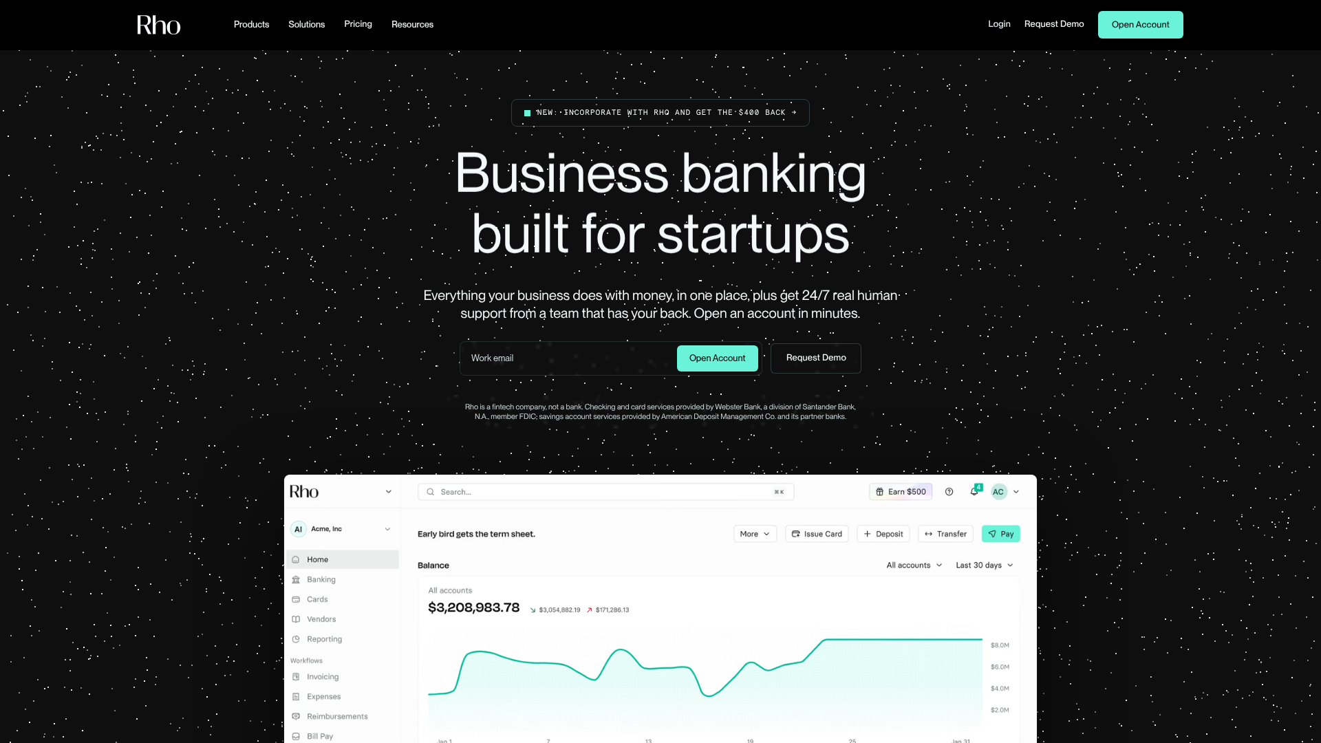
Rho's landing page scores 78/100—a solid result that masks a structural tension between visual confidence and functional clarity. The aesthetic layer (80) outperforms the functional layer (76), suggesting the page looks assured but asks too much of visitors before they commit. For a fintech company competing on trust and simplicity, this gap matters. The page presents itself as a unified platform for business money management, but the navigation and call-to-action architecture work against that promise of clarity.
Observed UX signals
- Majorfunctional
Trust & Credibility
Social proof is present but lacks specificity and prominence. Testimonials include names and titles (Atul Raghunathan, Founder & CRO; James Jiang, Co-founder & CEO) but no company names, making attribution difficult to verify. No quantified social proof (user count, AUM, accounts opened) visible in hero or above-fold area.
- Majorfunctional
Conversion Optimization
Primary CTA copy is generic ('Open Account', 'Apply Now') rather than benefit-oriented. No risk reversal or urgency messaging visible in hero section. The disclaimer 'Rho is a fintech company, not a bank' appears early but lacks reassurance about FDIC protection prominence.
- Majorfunctional
Focus & Hierarchy
Navigation menu contains 50+ links across Products, Solutions, Learn, and Opportunities sections. While organized by category, this creates significant cognitive load and competing attention paths. The hero section has two equally prominent CTAs ('Open Account' and 'Request Demo'), creating choice paralysis.
More UX reviews
Browse all →How does your site score?
Get the same layer-by-layer UX review for your homepage, pricing page, or product page.
Scan your websiteSign in to run a fresh private scan