Retool website UX review
A scan-backed analysis of how Retool performs across usability, visual clarity, and UX best practices. Use it as a reference for what to borrow, what to question, and what to test on your own site.
Sensei score: 75 out of 100
Aesthetic
79Practices
71How Retool looks
The verdict
A landing page caught between clarity and ambition
Retool's homepage scores 75/100—a solid result that masks a fundamental tension. The aesthetic layer (79) is the page's strongest asset: visual design, layout rhythm, and interface presentation all land above the functional baseline. But that strength is undermined by functional choices (75) and practice-level decisions (71) that scatter user attention and obscure what the product actually does. The gap between aesthetic confidence and functional clarity is the diagnostic signal here. A visitor lands on a visually polished page but encounters jargon, competing actions, and unclear outcomes—the opposite of what a strong landing page should deliver.
Observed UX signals
- Majorfunctional
Clarity
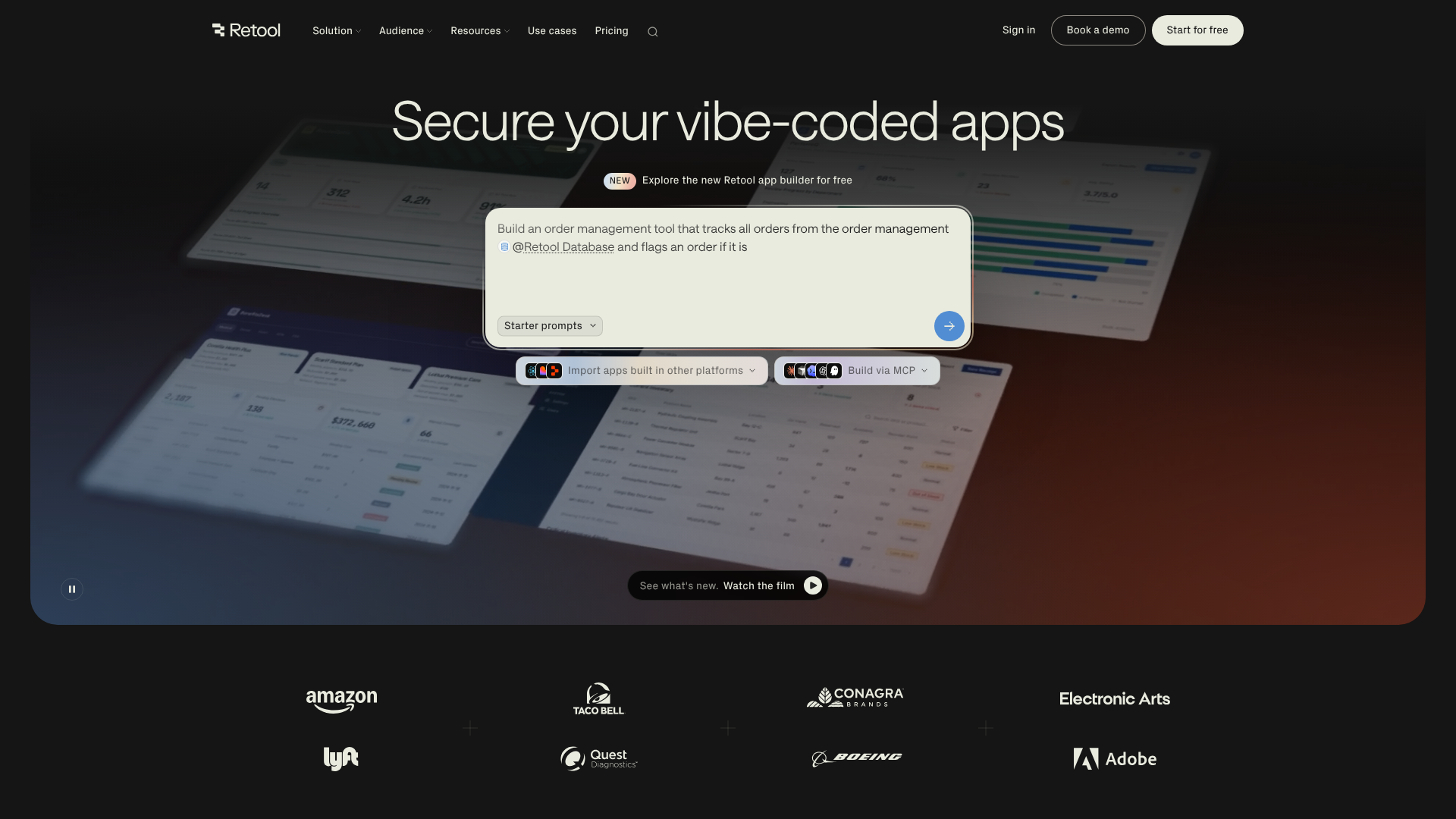
Hero headline 'Secure your vibe-coded apps' uses product jargon ('vibe-coded') that is not immediately explained. The term lacks clarity for first-time visitors unfamiliar with Retool's terminology. The meta description 'Build internal software better, with AI' is clearer but buried below the fold.
- Majorfunctional
Conversion Optimization
Primary CTAs lack benefit-oriented copy. 'Start for free' and 'Book a demo' are generic and do not communicate the outcome. The hero also features 'Starter prompts' as a competing action without clear hierarchy or explanation of what happens next.
- Majorfunctional
Focus & Hierarchy
Multiple competing CTAs appear in the hero section without clear visual hierarchy. 'Starter prompts', 'Import', and 'Build via MCP' are presented as equal options, creating choice paralysis. Navigation menu is extensive (50+ links), adding cognitive load above the fold.
More UX reviews
Browse all →How does your site score?
Get the same layer-by-layer UX review for your homepage, pricing page, or product page.