Replit website UX review
A scan-backed analysis of how Replit performs across usability, visual clarity, and UX best practices. Use it as a reference for what to borrow, what to question, and what to test on your own site.
Sensei score: 76 out of 100
Aesthetic
80Practices
72How Replit looks
The verdict
A conversational interface competing with marketing clarity
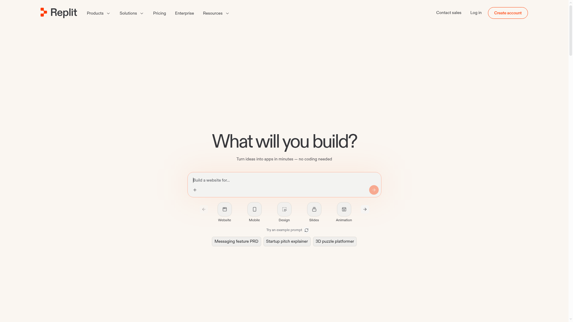
Replit's landing page scores 76/100 overall, with aesthetic execution notably stronger (80) than functional clarity (74) and design practices (72). The page attempts an unconventional entry point: a conversational prompt field ('What will you build?') positioned as the hero, inviting users to initiate a task rather than absorb a value proposition. This choice reflects the product's core interaction model—AI-powered app building through natural language—but creates an immediate tension. The core benefit (building apps without coding, powered by AI) is relegated to subtext, meaning visitors must infer the product's purpose from context clues rather than a direct statement. For a landing page competing for attention, this indirectness is a functional liability, even if it feels authentic to how the product works.
Observed UX signals
- Majorfunctional
Clarity
Hero section uses a conversational prompt interface ('What will you build?') as the primary entry point, but the value proposition is buried in subtext. The headline frames the page as a task-initiation tool rather than leading with the core benefit (AI-powered app building without coding).
- Majorfunctional
Trust & Credibility
Testimonials are attributed with names, titles, and companies (e.g., 'Ali Ghodsi, CEO, Databricks'), which is strong. However, no customer logos, user counts, or quantified social proof (e.g., 'trusted by 500K+ developers') appear above the fold. The page relies entirely on narrative testimonials without visual trust anchors.
- Majorfunctional
Conversion Optimization
Primary CTA copy is generic and task-focused ('Start', 'Try an example prompt') rather than benefit-oriented. No risk reversal is visible above the fold (e.g., 'Free trial', 'No credit card required'). The subtext mentions 'Your first prompt is free. No credit consumption,' but this is buried and not prominently featured as a trust signal.
More UX reviews
Browse all →How does your site score?
Get the same layer-by-layer UX review for your homepage, pricing page, or product page.