Render website UX review
A scan-backed analysis of how Render performs across usability, visual clarity, and UX best practices. Use it as a reference for what to borrow, what to question, and what to test on your own site.
Sensei score: 76 out of 100
Aesthetic
79Practices
75How Render looks
The verdict
A strong page undermined by foundational clarity gaps
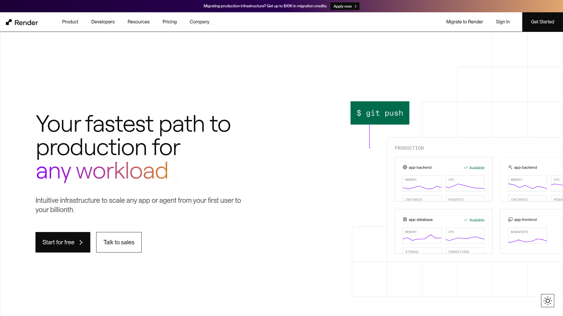
Render's landing page scores 76/100 overall, with aesthetic execution (79) outpacing functional clarity (75) and design practices (75). The gap between layers is diagnostic: the page looks polished and organized, but the core messaging and conversion architecture create friction at the moment of first impression. The hero section—the most critical real estate on any landing page—contains a corrupted headline ('Your fastest path to production forany w@') that immediately signals either a technical error or poor QA. This isn't a minor cosmetic issue. The headline is the primary vehicle for communicating product value, and truncation or malformation here breaks the fundamental contract between page and visitor. Combined with multiple competing calls-to-action and generic CTA copy, the page asks users to commit to an action before they've understood what Render actually does or why they should choose it over alternatives.
Observed UX signals
- Majorfunctional
Clarity
Hero headline is truncated or corrupted: 'Your fastest path to production forany w@' appears incomplete and contains a malformed word ('forany w@'). This undermines the primary value proposition and creates immediate confusion about what the product does.
- Majorfunctional
Conversion Optimization
Primary CTA copy is generic and lacks benefit orientation. 'Start for free' and 'Talk to sales' are standard CTAs that don't communicate the specific value or outcome (e.g., 'Deploy in 3 clicks' or 'Get your app live today').
- Majorfunctional
Focus & Hierarchy
Multiple competing CTAs above the fold create choice paralysis. 'Start for free', 'Talk to sales', 'Migrate to Render', 'Sign In', and 'Get Started' are all visually present in the hero and navigation, with unclear hierarchy between them. Users must infer which action is primary.
More UX reviews
Browse all →How does your site score?
Get the same layer-by-layer UX review for your homepage, pricing page, or product page.