Remote website UX review
A scan-backed analysis of how Remote performs across usability, visual clarity, and UX best practices. Use it as a reference for what to borrow, what to question, and what to test on your own site.
Sensei score: 79 out of 100
Aesthetic
80Practices
79How Remote looks
The verdict
A strong performer with conversion friction at the critical moment
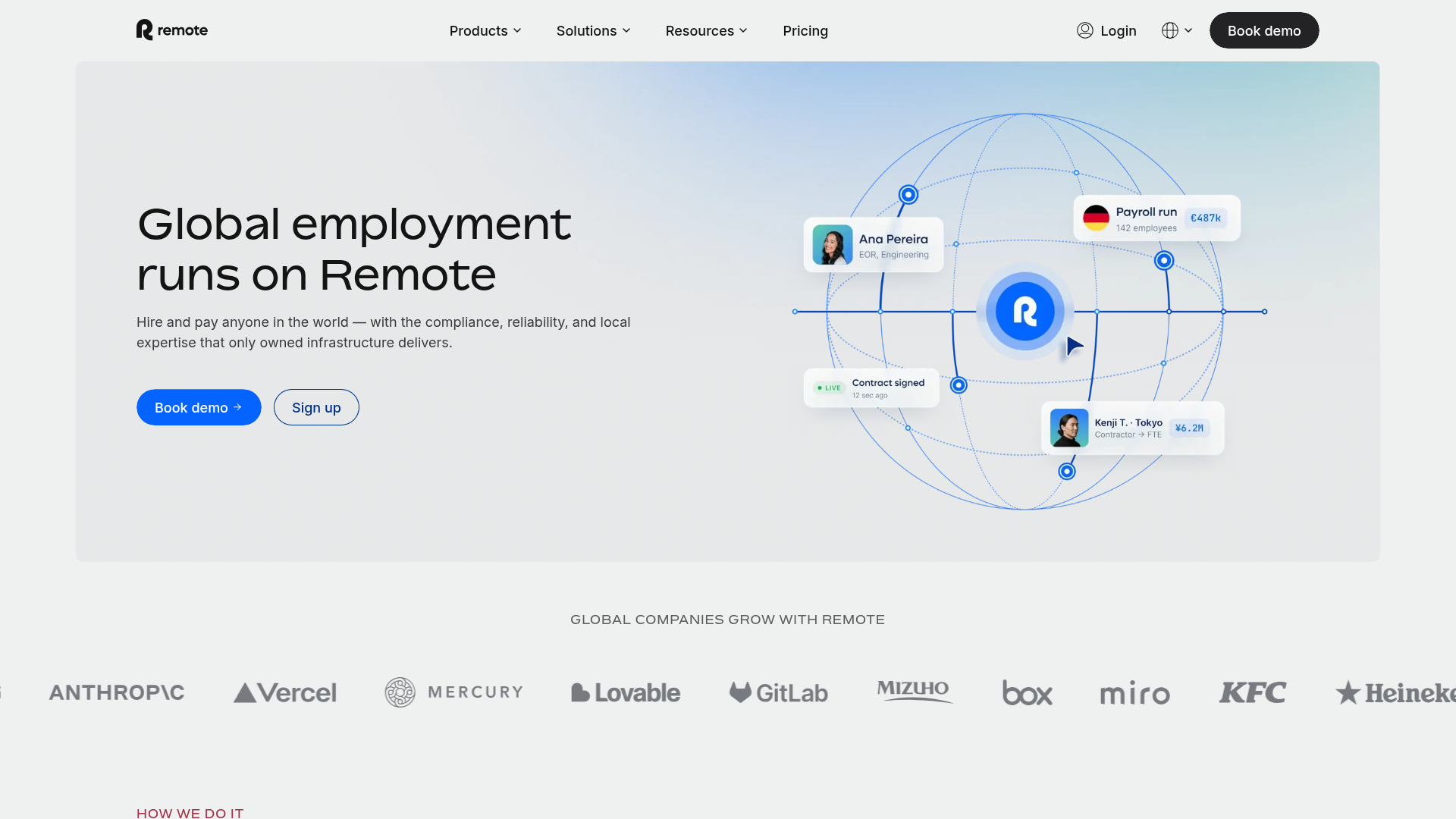
Remote's landing page scores 79/100 overall, with aesthetic execution (80) slightly outpacing functional clarity (78) and practice adherence (79). The page demonstrates solid visual and structural discipline—enough to hold a visitor's attention and communicate that the company operates at scale. But the score masks a specific, high-impact problem: the page asks users to make a choice before they understand what they're choosing between, and the language used to describe the offer doesn't answer the question most visitors arrive with: why should my business care?
Observed UX signals
- Majorfunctional
Clarity
Hero subheading uses feature-focused language ('compliance, reliability, and local expertise that only owned infrastructure delivers') rather than outcome-focused benefit. Users must infer why this matters to their business.
- Majorfunctional
FocusHierarchy
Multiple competing CTAs above the fold ('Book demo' and 'Sign up') create choice paralysis. No clear visual or copy distinction between primary conversion path (demo booking for enterprise/mid-market) and secondary path (self-serve signup).
- Majorfunctional
ConversionOptimization
Primary CTA copy is generic ('Book demo') and does not communicate value or risk reversal. No indication of time commitment, cost, or what happens next. Secondary CTA ('Sign up') lacks context about trial length, pricing, or commitment.
More UX reviews
Browse all →How does your site score?
Get the same layer-by-layer UX review for your homepage, pricing page, or product page.