Railway website UX review
A scan-backed analysis of how Railway performs across usability, visual clarity, and UX best practices. Use it as a reference for what to borrow, what to question, and what to test on your own site.
Sensei score: 75 out of 100
Aesthetic
80Practices
75How Railway looks
The verdict
A visually confident page undermined by unclear intent
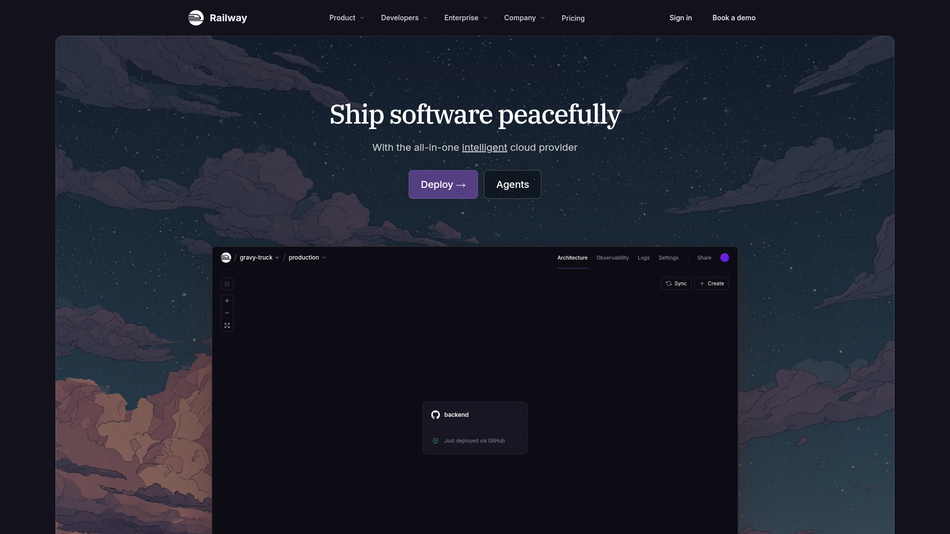
Railway's landing page scores 75/100 overall—a strong result that masks a critical misalignment between what the page looks like and what it communicates. The aesthetic layer (80/100) is the page's clearest asset: visual design, layout, and presentation instill confidence. But that confidence is hollow if visitors cannot quickly understand what problem Railway solves or which action to take first. The functional layer (70/100) reveals the real friction. Two competing primary CTAs ('Deploy →' and 'Agents') sit at equal visual weight above the fold, forcing users into unnecessary decision-making before they've grasped the core value proposition. The primary headline, 'Ship software peacefully,' is abstract and benefit-focused in tone but lacks the concrete explanation needed to anchor that promise. For a cloud infrastructure product targeting developers and engineering teams, this gap between visual polish and messaging clarity is costly.
Observed UX signals
- Majorfunctional
Clarity
Primary value proposition relies on abstract benefit ('Ship software peacefully') without concrete explanation of what problem is solved or how. Subheading 'With the all-in-one intelligent cloud provider' restates the product category rather than clarifying the outcome or use case.
- Majorfunctional
Focus & Hierarchy
Two competing primary CTAs above the fold ('Deploy →' and 'Agents') create choice paralysis. Neither is visually or textually dominant, and the relationship between them is unclear to a first-time visitor.
- Majorfunctional
Conversion Optimization
Primary CTA copy 'Deploy →' is generic and action-focused rather than benefit-oriented. It does not communicate what the user gains or reduce friction (no mention of free trial, no risk reversal, no urgency).
More UX reviews
Browse all →How does your site score?
Get the same layer-by-layer UX review for your homepage, pricing page, or product page.