Rabbit website UX review
A scan-backed analysis of how Rabbit performs across usability, visual clarity, and UX best practices. Use it as a reference for what to borrow, what to question, and what to test on your own site.
Sensei score: 75 out of 100
Aesthetic
79Practices
77How Rabbit looks
The verdict
A 75-point landing page caught between product education and sales
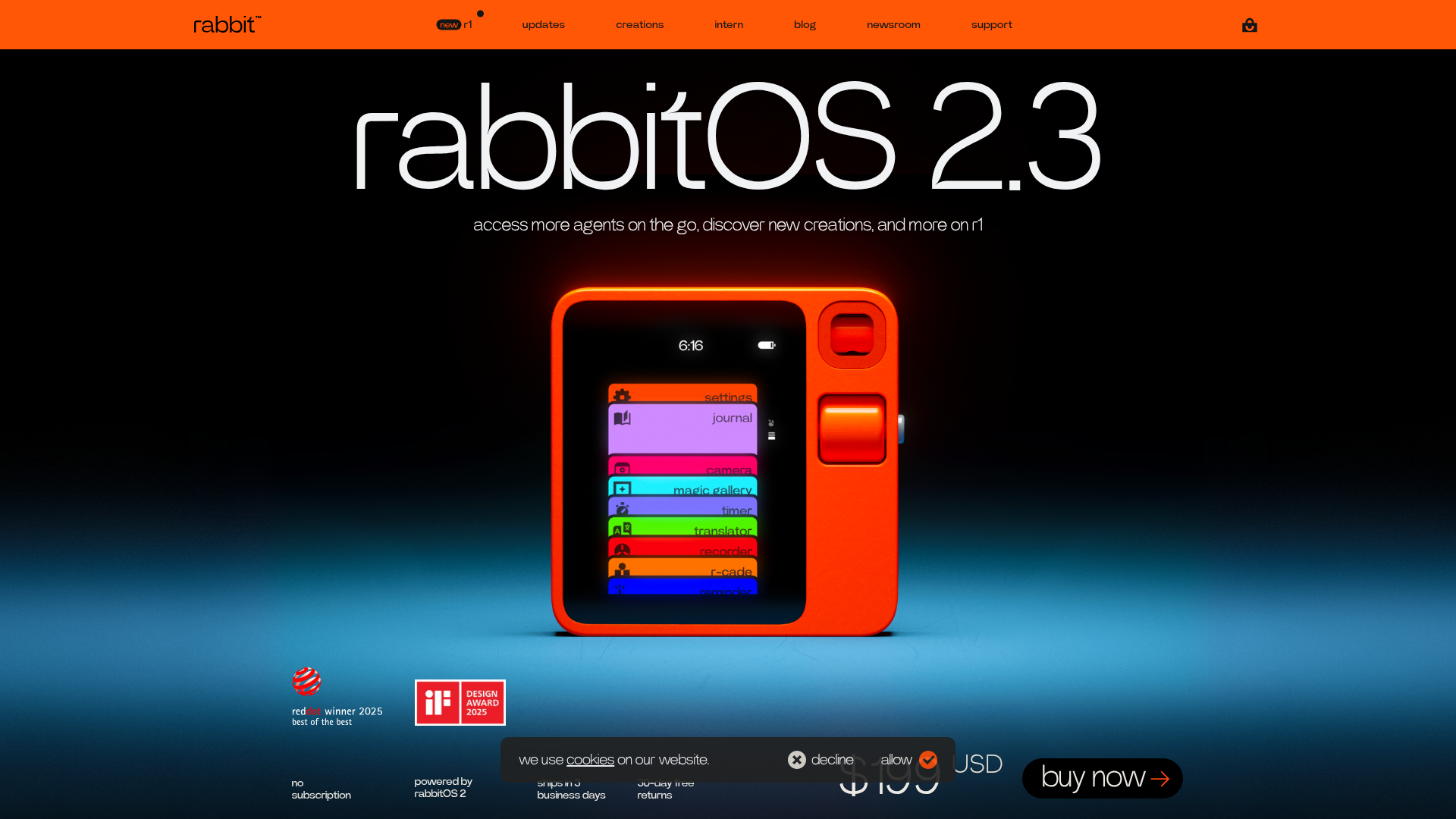
Rabbit's landing page scores 75/100 overall—a genuinely strong result—but the distribution of its layer scores reveals a specific tension. Aesthetic execution (79) and design practices (77) are both solid; functional clarity (70) lags noticeably behind. This gap is not accidental. The page appears designed to showcase multiple product capabilities and use cases, which works well for demonstrating sophistication and breadth. It works poorly for guiding a visitor toward a single, clear decision. The hero section leads with 'rabbitOS 2.3' and feature-focused language ('access more agents on the go, discover new creations'), not with a problem statement or outcome promise. A first-time visitor cannot immediately answer the question: what does r1 do for me, and why should I buy it?
Observed UX signals
- Majorfunctional
Clarity
Primary value proposition is fragmented across multiple feature-focused sections. The hero states 'rabbitOS 2.3' with subheading 'access more agents on the go, discover new creations, and more on r1' — this describes features (agents, creations) rather than the core benefit or use case. A visitor cannot immediately understand what problem r1 solves or why they should care.
- Majorfunctional
Trust & Credibility
Social proof is present (Red Dot Design Award, iF Design Award logos visible) but lacks context and specificity. No user count, testimonials, or quantified adoption metrics are provided. The disclaimer text about AI accuracy is extensive and risk-focused, which may undermine confidence rather than build it.
- Majorfunctional
Conversion Optimization
Primary CTA is 'buy now' (visible in button), but the page offers multiple competing actions: 'learn more→' (agents), 'learn more→' (voice recorder), 'try DLAM→', 'explore the gallery→', 'visit magic gallery', and 'View cart' (appears twice). No clear risk reversal or urgency is communicated. The '$199 USD' price is stated, but no guarantee, trial period, or return policy is highlighted near the CTA.
More UX reviews
Browse all →How does your site score?
Get the same layer-by-layer UX review for your homepage, pricing page, or product page.