Public website UX review
A scan-backed analysis of how Public performs across usability, visual clarity, and UX best practices. Use it as a reference for what to borrow, what to question, and what to test on your own site.
Sensei score: 73 out of 100
Aesthetic
79Practices
68How Public looks
The verdict
A strong visual identity masking structural confusion
Public's landing page scores 73/100 overall, with aesthetic execution notably outpacing functional clarity. The 79-point aesthetic layer suggests confident visual design, color hierarchy, and typography—enough to hold attention on first view. But this surface strength obscures a deeper problem: the page asks visitors to navigate 20+ product offerings and multiple value propositions without a coherent narrative or clear primary action. The functional score of 71 and practices score of 68 reveal where the friction lives. The page performs well enough to feel professional, but not well enough to guide visitors toward conversion or even basic understanding of what Public does differently.
Observed UX signals
- Majorfunctional
Clarity
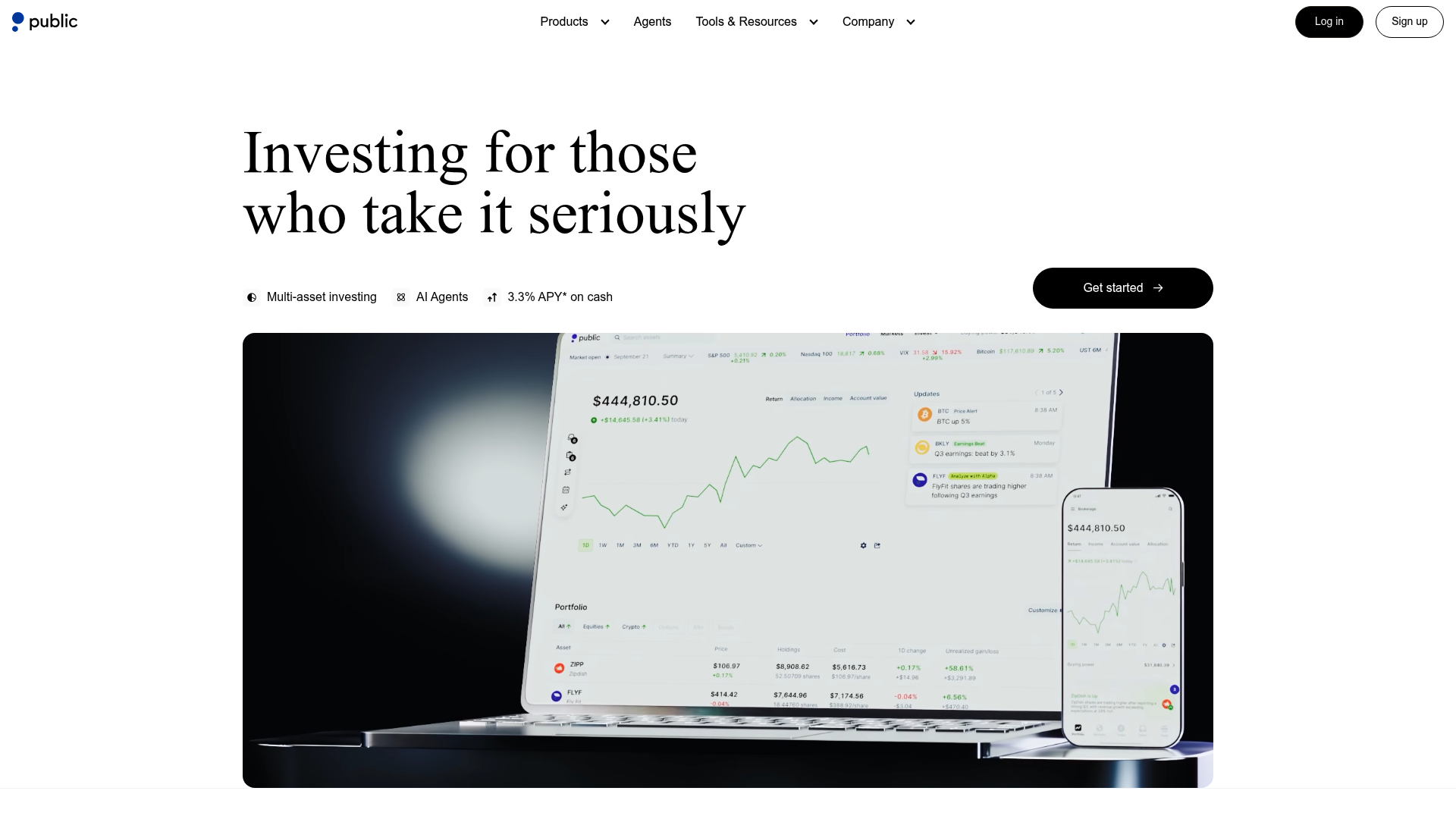
Hero headline 'Investing for those who take it seriously' is benefit-adjacent but vague—it doesn't explain what makes Public different or why a visitor should act now. The subheading 'Multi-asset investing AI Agents 3.3% APY* on cash' stacks features without a clear narrative thread, forcing users to infer the value proposition.
- Majorfunctional
focusHierarchy
The page presents 20+ product modules (Stocks, Crypto, ETFs, Options, Bonds, Direct Indexing, Generated Assets, API, Bond Account, High-Yield Cash, Treasuries, Margin, IRAs, Crypto IRAs, Business Accounts, Trust Accounts, etc.) with equal visual weight and multiple 'Learn more' CTAs. This violates Hick's Law—users must choose between competing paths without clear guidance on which is primary.
- Majorfunctional
trustCredibility
No social proof, user testimonials, or third-party validation visible above the fold. The page lists security features ('Regulated in the US', 'Insurance coverage', '99.994% uptime') but provides no evidence: no user count, no press mentions, no ratings, no customer quotes. Claims like 'world's first agentic brokerage' lack supporting proof.
More UX reviews
Browse all →How does your site score?
Get the same layer-by-layer UX review for your homepage, pricing page, or product page.