Posthog website UX review
A scan-backed analysis of how Posthog performs across usability, visual clarity, and UX best practices. Use it as a reference for what to borrow, what to question, and what to test on your own site.
Sensei score: 71 out of 100
Aesthetic
71Practices
70How Posthog looks
The verdict
A strong performer with a clarity problem at the top
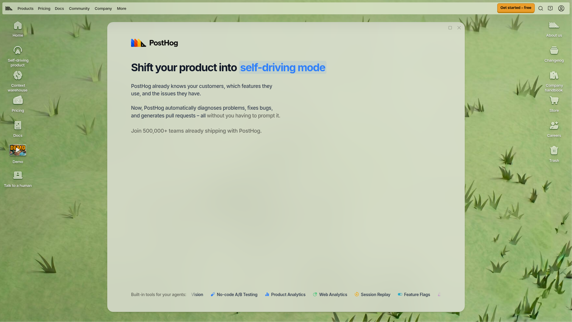
PostHog's landing page scores 71/100 overall, with functional and aesthetic layers both in the low-70s and practices slightly lower at 70. The page demonstrates competent design execution—visual hierarchy, layout, and component polish are evident—but stumbles on a foundational problem: users cannot quickly understand what PostHog does. The headline 'Shift your product into self-driving mode' is benefit-oriented and emotionally resonant, but it relies on metaphor. Three paragraphs of reading are required before the actual value emerges: 'automatically diagnoses problems, fixes bugs, and generates pull requests.' For a B2B SaaS landing page competing for attention, this delay is costly. The gap between what users see and what they understand creates friction at the moment when first impressions matter most.
Observed UX signals
- Majorfunctional
Clarity
Primary value proposition relies on metaphor ('self-driving mode') without immediate functional explanation. Users must read three paragraphs to understand what PostHog actually does: 'automatically diagnoses problems, fixes bugs, and generates pull requests.' The headline 'Shift your product into self-driving mode' is benefit-adjacent but abstract.
- Majorfunctional
Accessibility
Six images lack alt text (marked as 'null' or missing entirely), including what appear to be product screenshots and logos. This blocks screen reader users from understanding key visual content and violates WCAG 2.1 Level A standards.
- Majorfunctional
TrustCredibility
Social proof section states 'Join 500,000+ teams already shipping with PostHog' but provides no visible customer logos, testimonials, or attribution above the fold. The section heading 'Yes they actually use us, no it's not just some random engineer who tried us out 2+ years ago' is self-aware but does not substitute for concrete proof (names, logos, quotes).
More UX reviews
Browse all →How does your site score?
Get the same layer-by-layer UX review for your homepage, pricing page, or product page.