Planetscale website UX review
A scan-backed analysis of how Planetscale performs across usability, visual clarity, and UX best practices. Use it as a reference for what to borrow, what to question, and what to test on your own site.
Sensei score: 76 out of 100
Aesthetic
78Practices
72How Planetscale looks
The verdict
A technically confident page hampered by conversion clarity
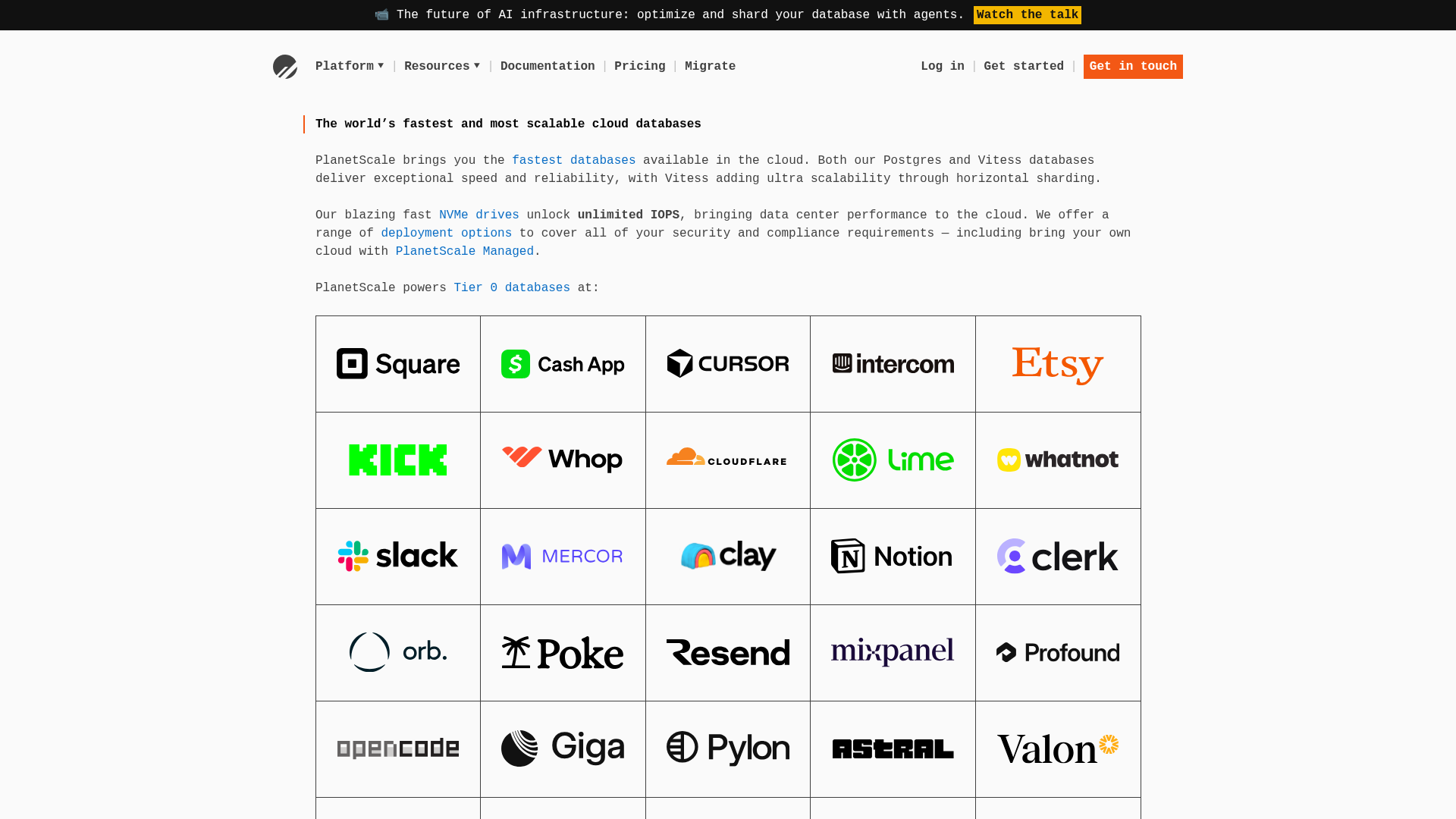
Planetscale's landing page scores 76/100 overall—a strong result that masks a meaningful tension between what the page communicates and what it asks visitors to do. The aesthetic layer (78) and functional layer (77) sit close together, but the practices layer (72) lags noticeably, signaling that execution choices around conversion design and information hierarchy are dragging down an otherwise well-crafted page. The core issue is not visual polish or technical accuracy; it's that the page assumes too much baseline knowledge from its audience while simultaneously offering too many escape routes for someone who might otherwise convert.
Observed UX signals
- Majorfunctional
Clarity
Primary value proposition relies on technical jargon ('Vitess', 'horizontal sharding', 'NVMe drives') without immediate benefit translation. A visitor unfamiliar with database infrastructure may not understand why 'fastest and most scalable' matters to them or what problem it solves.
- Majorfunctional
Conversion Optimization
Primary CTA placement and copy are unclear. 'Get started' and 'Get in touch' are both present in the navigation, but there is no single, benefit-driven primary CTA above the fold that creates urgency or removes friction (e.g., no 'Start free trial', 'Try for 14 days', or risk-reversal language).
- Majorfunctional
Focus & Hierarchy
Multiple competing CTAs in the navigation ('Log in', 'Get started', 'Get in touch') create choice paralysis. For a conversion-focused landing page, this dilutes focus from the primary goal. Additionally, the page includes 15+ secondary CTAs ('Read case study', 'Read blog post', 'Learn Vitess', 'Pricing') scattered throughout, which may distract from the main conversion path.
More UX reviews
Browse all →How does your site score?
Get the same layer-by-layer UX review for your homepage, pricing page, or product page.