Pinecone website UX review
A scan-backed analysis of how Pinecone performs across usability, visual clarity, and UX best practices. Use it as a reference for what to borrow, what to question, and what to test on your own site.
Sensei score: 75 out of 100
Aesthetic
77Practices
73How Pinecone looks
The verdict
A technically sound page caught between clarity and ambition
Pinecone's landing page scores 75/100 overall—a solid result that masks a specific tension. The aesthetic layer (77) and functional layer (74) are closely aligned, suggesting the page is visually competent and mostly navigable. But the practices layer (73) trails both, indicating gaps in how the page is structured to guide visitors and convert them. The gap is small enough that the page functions, but large enough to signal missed opportunity. For a B2B SaaS product in the AI infrastructure space, where buyer sophistication varies widely, this middle-ground performance reflects a common pitfall: the page assumes too much prior knowledge while simultaneously trying to serve multiple buyer personas at once.
Observed UX signals
- Majorfunctional
Clarity
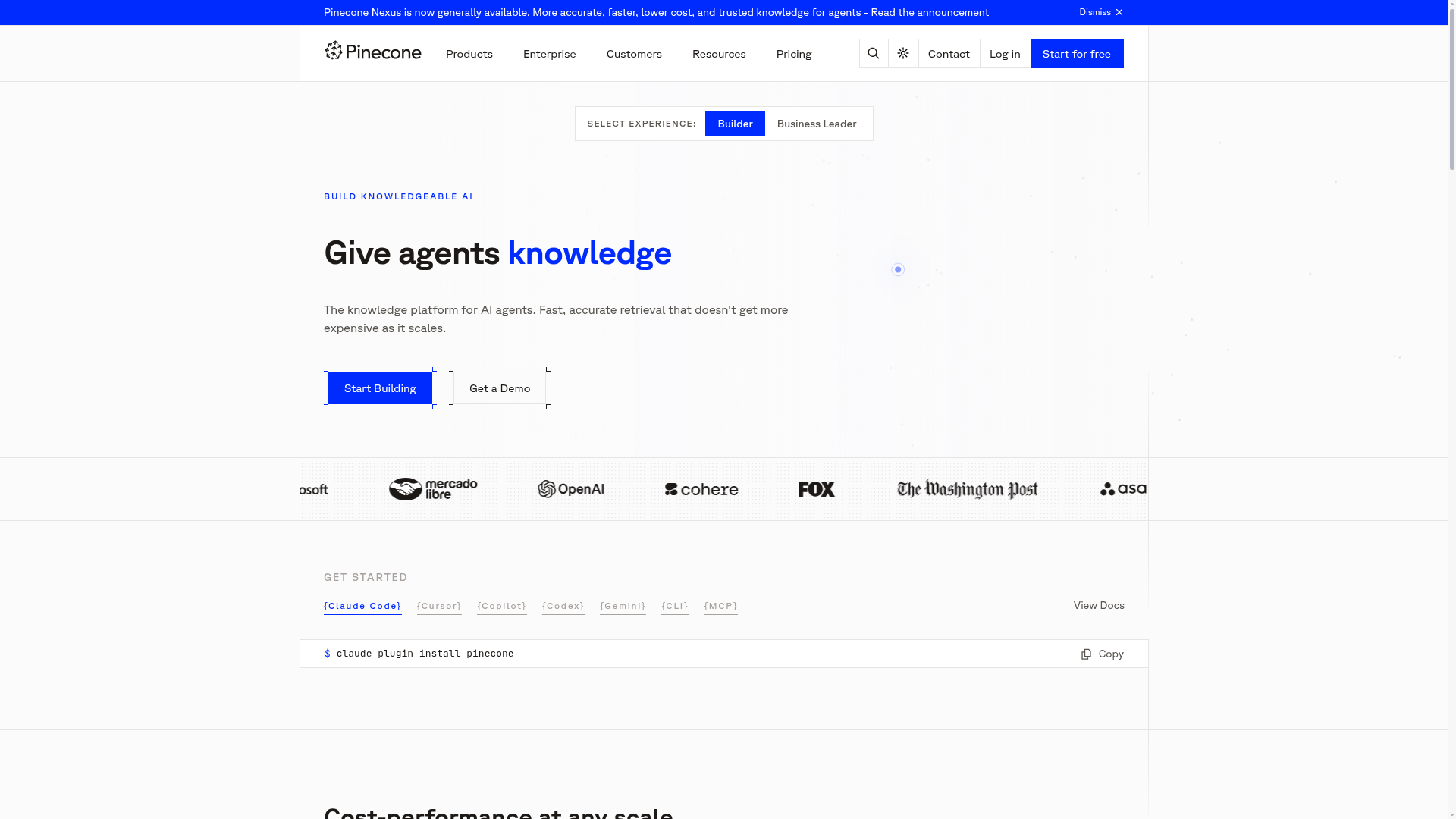
Hero headline 'Give agents knowledge' is benefit-focused but abstract. The subheading 'The knowledge platform for AI agents. Fast, accurate retrieval that doesn't get more expensive as it scales' buries the core value proposition in technical language. A visitor unfamiliar with vector databases or AI agents may not immediately understand what problem this solves or why they should care.
- Majorfunctional
TrustCredibility
Social proof is present (Mercado Libre, Fox, The Washington Post logos visible) but lacks context. No user count, deployment scale, or specific customer achievement is stated. The page shows logos twice but provides no quantified trust signal (e.g., '10,000+ teams' or 'powers 500B+ queries/month').
- Majorfunctional
ConversionOptimization
Primary CTA 'Start Building' is generic and does not communicate the benefit or risk reversal. No mention of 'free trial,' 'no credit card required,' or 'cancel anytime' appears near the CTA. The page offers multiple competing CTAs ('Start Building,' 'Get a Demo,' 'Get an estimate') without clear guidance on which path is right for different user types.
More UX reviews
Browse all →How does your site score?
Get the same layer-by-layer UX review for your homepage, pricing page, or product page.