Pave website UX review
A scan-backed analysis of how Pave performs across usability, visual clarity, and UX best practices. Use it as a reference for what to borrow, what to question, and what to test on your own site.
Sensei score: 73 out of 100
Aesthetic
76Practices
70How Pave looks
The verdict
A 73-point page held back by clarity and conversion friction
Pave's landing page scores 73/100 overall—a strong result that masks significant friction in how the page communicates value and guides visitors toward action. The aesthetic layer (76) outperforms the functional layer (72) and practices layer (70), suggesting the page looks polished but fails to make its core offer clear or easy to accept. For a B2B SaaS platform selling AI-driven compensation automation, this gap is diagnostic: visual confidence without messaging clarity leaves visitors unable to answer the most basic question—why should I care?—before encountering conversion friction.
Observed UX signals
- Majorfunctional
Clarity
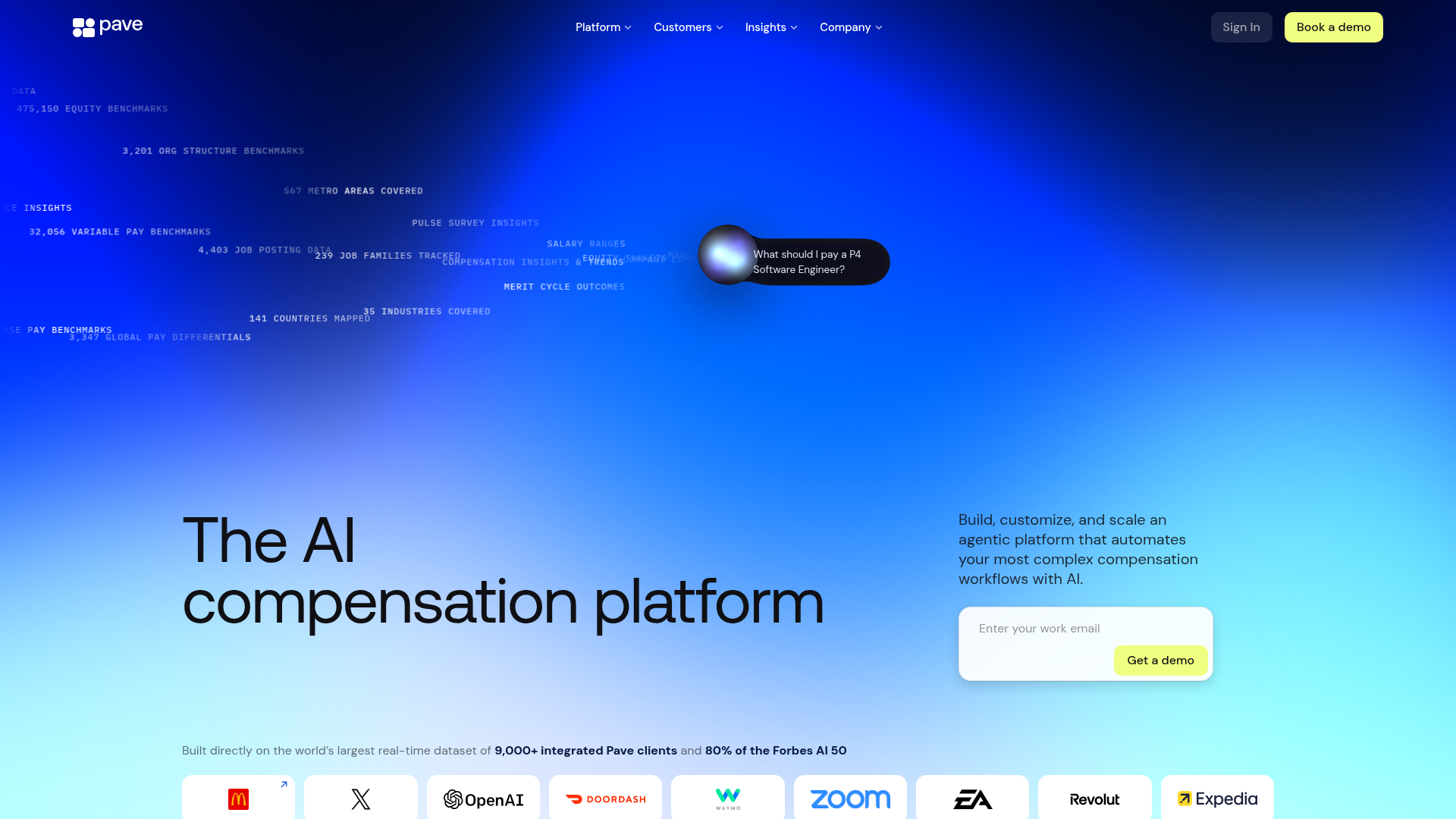
Hero headline 'The AI compensation platform' is generic and feature-focused. The subheading 'Build, customize, and scale an agentic platform that automates your most complex compensation workflows with AI' buries the core benefit (time savings, accuracy, control) under technical jargon ('agentic platform', 'workflows'). A visitor cannot quickly answer 'why should I care?' without inferring the value.
- Majorfunctional
Conversion Optimization
Primary CTA copy is generic ('Get a demo', 'Book a demo'). No risk reversal, urgency, or benefit-oriented language. The email input field placeholder 'Enter your work email' does not explain what happens next or why the user should convert. No visible guarantee, free trial offer, or 'cancel anytime' messaging near the form.
- Majorfunctional
Focus & Hierarchy
Multiple competing CTAs above the fold: 'Sign In', 'Book a demo' (top nav), 'Get a demo' (hero form), 'Create Report' (data section). No clear visual hierarchy distinguishing primary conversion action from secondary navigation. The hero form is present but not visually dominant—it competes with navigation and data visualization for attention.
More UX reviews
Browse all →How does your site score?
Get the same layer-by-layer UX review for your homepage, pricing page, or product page.