Netlify website UX review
A scan-backed analysis of how Netlify performs across usability, visual clarity, and UX best practices. Use it as a reference for what to borrow, what to question, and what to test on your own site.
Sensei score: 77 out of 100
Aesthetic
79Practices
75How Netlify looks
The verdict
A capable landing page held back by messaging clarity
Netlify's landing page scores 77/100 overall—a solid result that reflects genuine strengths in visual design and functional completeness. The aesthetic layer (79/100) and functional layer (78/100) are closely matched, suggesting the page is well-executed within its current structure. However, the practices score (75/100) signals a meaningful gap: the page's architecture and decision-making around user flows are creating friction that undermines what could otherwise be a high-converting experience. The core issue is not execution quality but strategic clarity. The page attempts to serve multiple user personas and entry points simultaneously without establishing a clear hierarchy, leaving both new users and sales-qualified leads uncertain about the intended path forward.
Observed UX signals
- Majorfunctional
Clarity
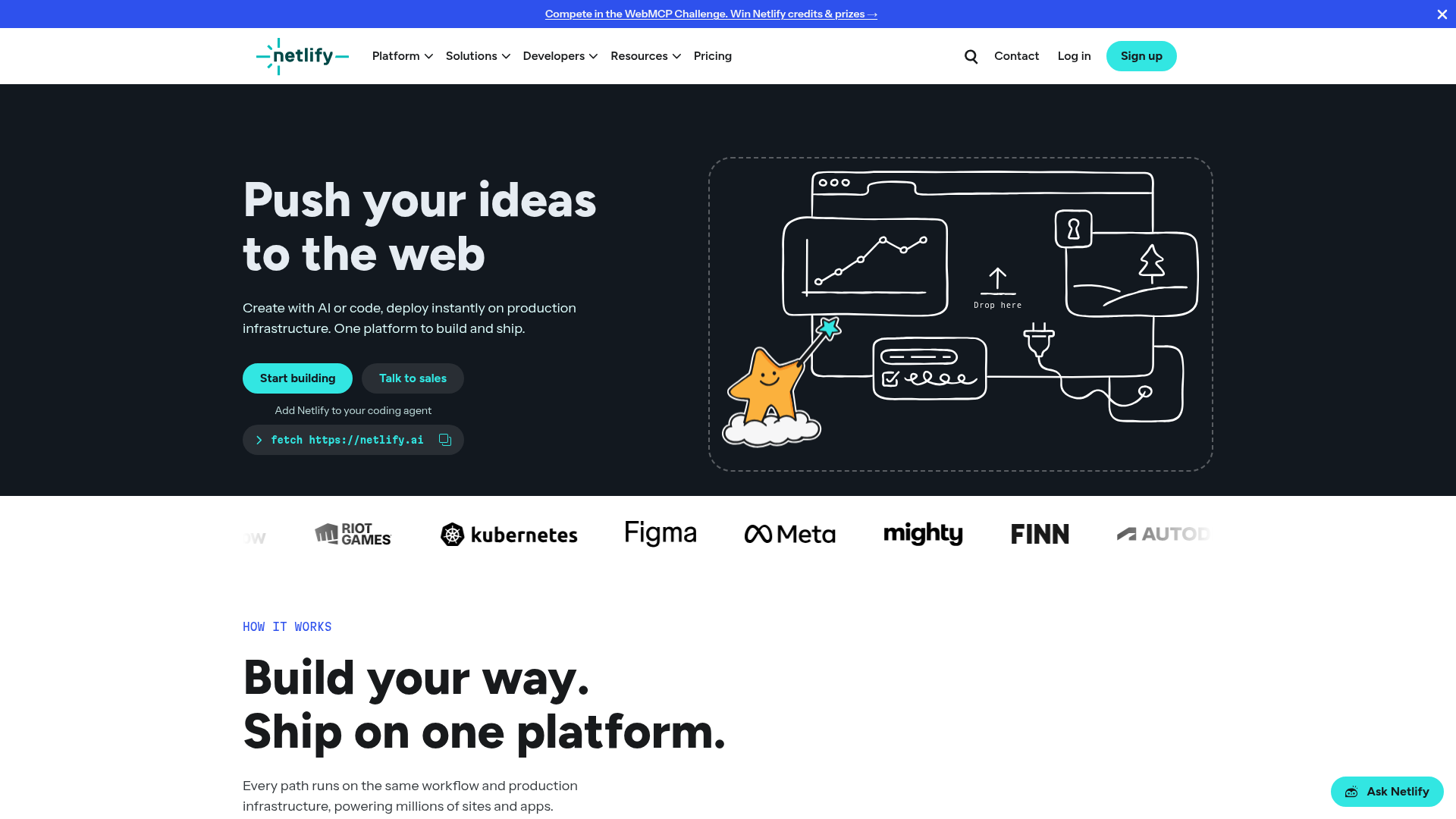
Primary value proposition is split across two competing headlines: 'Push your ideas to the web' (benefit-focused) and 'Build your way. Ship on one platform.' (feature-focused). The subheading 'Create with AI or code, deploy instantly on production infrastructure' uses technical jargon ('production infrastructure') that may not resonate with non-technical decision-makers evaluating the platform.
- Majorfunctional
Trust & Credibility
Social proof is present (customer logos: Meta, Figma, Kubernetes, Riot Games, etc.) but lacks quantitative credibility signals. No visible user count, deployment count, uptime percentage, or customer testimonial with attribution appears above the fold. The single testimonial visible ('I can push a change, and within 30 seconds the site is completely rebuilt. Jeffrey Sica Kubernetes contributor, Head of Projects at CNCF') is buried mid-page and lacks a company affiliation or photo.
- Majorfunctional
Focus & Hierarchy
Multiple competing CTAs above the fold create choice paralysis: 'Start building' (primary), 'Talk to sales' (secondary), and 'Add Netlify to your coding agent' (tertiary). The page also presents three workflow options ('Start with code or AI', 'Build fullstack apps', 'Go live everywhere') immediately after the hero, fragmenting focus before the user has committed to a primary action.
More UX reviews
Browse all →How does your site score?
Get the same layer-by-layer UX review for your homepage, pricing page, or product page.